- Subscribe to RSS Feed
- Mark Topic as New
- Mark Topic as Read
- Float this Topic for Current User
- Bookmark
- Subscribe
- Printer Friendly Page
- Mark as New
- Bookmark
- Subscribe
- Mute
- Subscribe to RSS Feed
- Permalink
- Report Inappropriate Content

Stacked bar chart to show 5-year revenue by category
Hello, I am trying to replicate the following visual which was created from a Pivot table:
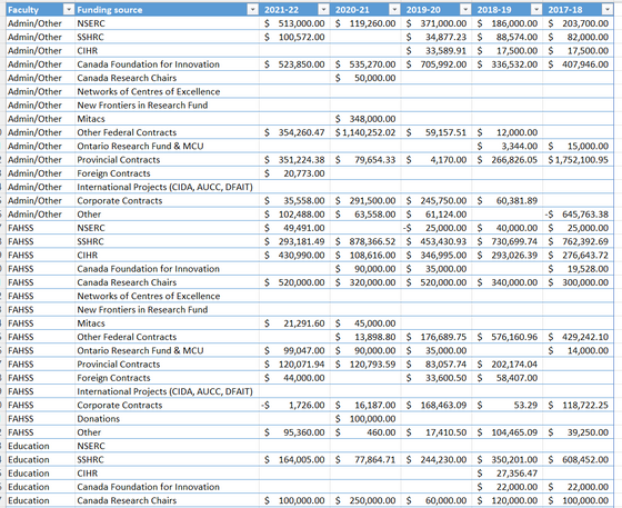
However in BI I cannot find a way to show this as an annual trend with the year along the x-axis and the amount of revenue on the y-axis. Is the issue with the way I have formatted the underlying data? A screenshot of the table is below:
In my Pivot table, Columns-=Funding source, Values=Sum of (each year) and Rows=Values, with Faculty set as a filter.
I appreciate any help and ideas. I don't know how to do macros/coding so I'm hoping this can be accomplished through tools in the UI.
Solved! Go to Solution.
- Mark as New
- Bookmark
- Subscribe
- Mute
- Subscribe to RSS Feed
- Permalink
- Report Inappropriate Content

Hi @krdavies ,
I would say that yes, the issue is with the way your table is formated. If you cannot change it, I think you would've to create one measure for every year/column, summing it separetly.
Or you could also use PowerQuery to pivot your table before creating the reports, that'll help everything that regards this columns, such as filters, measures and etc. Your life will be easier.
Regards,
Douglas.
- Mark as New
- Bookmark
- Subscribe
- Mute
- Subscribe to RSS Feed
- Permalink
- Report Inappropriate Content

Thanks, @dcrosseto . I tried a PowerQuery to unpivot my revenue columns and I am now able to produce the chart! I appreciate how fast you were able to help!
- Mark as New
- Bookmark
- Subscribe
- Mute
- Subscribe to RSS Feed
- Permalink
- Report Inappropriate Content

Hi @krdavies ,
I would say that yes, the issue is with the way your table is formated. If you cannot change it, I think you would've to create one measure for every year/column, summing it separetly.
Or you could also use PowerQuery to pivot your table before creating the reports, that'll help everything that regards this columns, such as filters, measures and etc. Your life will be easier.
Regards,
Douglas.
Helpful resources
| Subject | Author | Posted | |
|---|---|---|---|
| 05-28-2024 09:15 AM | |||
| 05-16-2024 11:30 PM | |||
| 11-05-2024 03:06 PM | |||
| 09-11-2024 02:16 AM | |||
| 11-13-2024 05:49 PM |
| User | Count |
|---|---|
| 127 | |
| 99 | |
| 82 | |
| 51 | |
| 46 |


