FabCon is coming to Atlanta
Join us at FabCon Atlanta from March 16 - 20, 2026, for the ultimate Fabric, Power BI, AI and SQL community-led event. Save $200 with code FABCOMM.
Register now!- Power BI forums
- Get Help with Power BI
- Desktop
- Service
- Report Server
- Power Query
- Mobile Apps
- Developer
- DAX Commands and Tips
- Custom Visuals Development Discussion
- Health and Life Sciences
- Power BI Spanish forums
- Translated Spanish Desktop
- Training and Consulting
- Instructor Led Training
- Dashboard in a Day for Women, by Women
- Galleries
- Data Stories Gallery
- Themes Gallery
- Contests Gallery
- QuickViz Gallery
- Quick Measures Gallery
- Visual Calculations Gallery
- Notebook Gallery
- Translytical Task Flow Gallery
- TMDL Gallery
- R Script Showcase
- Webinars and Video Gallery
- Ideas
- Custom Visuals Ideas (read-only)
- Issues
- Issues
- Events
- Upcoming Events
The Power BI Data Visualization World Championships is back! Get ahead of the game and start preparing now! Learn more
- Power BI forums
- Forums
- Get Help with Power BI
- Desktop
- Re: Stacked bar chart format
- Subscribe to RSS Feed
- Mark Topic as New
- Mark Topic as Read
- Float this Topic for Current User
- Bookmark
- Subscribe
- Printer Friendly Page
- Mark as New
- Bookmark
- Subscribe
- Mute
- Subscribe to RSS Feed
- Permalink
- Report Inappropriate Content
Stacked bar chart formatting
Hello! I've read a couple posts about conditional formatting for a stacked bar chart and the only one post was close.
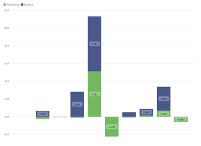
Unfortunately, it's a burden to have to conditionally format using measures, especially because the legend then has to show the those measure values which is less than elegant. I have a chart with budget and remaining stacked. I just want any remaining balances that fall below $0 to be red.
Solved! Go to Solution.
- Mark as New
- Bookmark
- Subscribe
- Mute
- Subscribe to RSS Feed
- Permalink
- Report Inappropriate Content
Hello @boyerusmc -
I've done something similar in the past, and it involves making two measures for value that could be negative:
Total Remaining Neg = var __tot = CALCULATE(SUM('Table'[Remaining]))
return IF (__tot < 0, __tot, 0)
Total Remaining Pos = var __tot = CALCULATE(SUM('Table'[Remaining]))
return IF ( __tot >= 0, __tot, 0)
Then rename them after you put them in as values, change the colors, and
I hope this helps,
David
- Mark as New
- Bookmark
- Subscribe
- Mute
- Subscribe to RSS Feed
- Permalink
- Report Inappropriate Content
I don't see any conditional format option for stacked bar chart. Can you provide a sample of what do you have now? Or what do you want to achieve.
Regards
Paul
- Mark as New
- Bookmark
- Subscribe
- Mute
- Subscribe to RSS Feed
- Permalink
- Report Inappropriate Content
Providing a visual example. I want any bar that falls below $0 to be red.
- Mark as New
- Bookmark
- Subscribe
- Mute
- Subscribe to RSS Feed
- Permalink
- Report Inappropriate Content
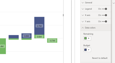
Sorry - part two: snapshot below shows there's no option for advanced controls / conditional formatting for the data colors.
- Mark as New
- Bookmark
- Subscribe
- Mute
- Subscribe to RSS Feed
- Permalink
- Report Inappropriate Content
Hello @boyerusmc -
I've done something similar in the past, and it involves making two measures for value that could be negative:
Total Remaining Neg = var __tot = CALCULATE(SUM('Table'[Remaining]))
return IF (__tot < 0, __tot, 0)
Total Remaining Pos = var __tot = CALCULATE(SUM('Table'[Remaining]))
return IF ( __tot >= 0, __tot, 0)
Then rename them after you put them in as values, change the colors, and
I hope this helps,
David
- Mark as New
- Bookmark
- Subscribe
- Mute
- Subscribe to RSS Feed
- Permalink
- Report Inappropriate Content
Thanks David, this worked like a champ!
- Mark as New
- Bookmark
- Subscribe
- Mute
- Subscribe to RSS Feed
- Permalink
- Report Inappropriate Content
- Mark as New
- Bookmark
- Subscribe
- Mute
- Subscribe to RSS Feed
- Permalink
- Report Inappropriate Content
@boyerusmc , I doubt you can do conditional formatting in stacked chart visual.
Helpful resources

Power BI Dataviz World Championships
The Power BI Data Visualization World Championships is back! Get ahead of the game and start preparing now!

| User | Count |
|---|---|
| 38 | |
| 37 | |
| 33 | |
| 32 | |
| 29 |
| User | Count |
|---|---|
| 132 | |
| 88 | |
| 82 | |
| 68 | |
| 64 |


