FabCon is coming to Atlanta
Join us at FabCon Atlanta from March 16 - 20, 2026, for the ultimate Fabric, Power BI, AI and SQL community-led event. Save $200 with code FABCOMM.
Register now!- Power BI forums
- Get Help with Power BI
- Desktop
- Service
- Report Server
- Power Query
- Mobile Apps
- Developer
- DAX Commands and Tips
- Custom Visuals Development Discussion
- Health and Life Sciences
- Power BI Spanish forums
- Translated Spanish Desktop
- Training and Consulting
- Instructor Led Training
- Dashboard in a Day for Women, by Women
- Galleries
- Data Stories Gallery
- Themes Gallery
- Contests Gallery
- Quick Measures Gallery
- Notebook Gallery
- Translytical Task Flow Gallery
- TMDL Gallery
- R Script Showcase
- Webinars and Video Gallery
- Ideas
- Custom Visuals Ideas (read-only)
- Issues
- Issues
- Events
- Upcoming Events
Calling all Data Engineers! Fabric Data Engineer (Exam DP-700) live sessions are back! Starting October 16th. Sign up.
- Power BI forums
- Forums
- Get Help with Power BI
- Desktop
- Re: Stacked bar chart formatting
- Subscribe to RSS Feed
- Mark Topic as New
- Mark Topic as Read
- Float this Topic for Current User
- Bookmark
- Subscribe
- Printer Friendly Page
- Mark as New
- Bookmark
- Subscribe
- Mute
- Subscribe to RSS Feed
- Permalink
- Report Inappropriate Content
Stacked bar chart formatting
Hello! I've read a couple posts about conditional formatting for a stacked bar chart and the only one post was close.
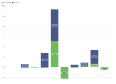
Unfortunately, it's a burden to have to conditionally format using measures, especially because the legend then has to show the those measure values which is less than elegant. I have a chart with budget and remaining stacked. I just want any remaining balances that fall below $0 to be red.
Solved! Go to Solution.
- Mark as New
- Bookmark
- Subscribe
- Mute
- Subscribe to RSS Feed
- Permalink
- Report Inappropriate Content
Hello @boyerusmc -
I've done something similar in the past, and it involves making two measures for value that could be negative:
Total Remaining Neg = var __tot = CALCULATE(SUM('Table'[Remaining]))
return IF (__tot < 0, __tot, 0)
Total Remaining Pos = var __tot = CALCULATE(SUM('Table'[Remaining]))
return IF ( __tot >= 0, __tot, 0)
Then rename them after you put them in as values, change the colors, and
I hope this helps,
David
- Mark as New
- Bookmark
- Subscribe
- Mute
- Subscribe to RSS Feed
- Permalink
- Report Inappropriate Content
I don't see any conditional format option for stacked bar chart. Can you provide a sample of what do you have now? Or what do you want to achieve.
Regards
Paul
- Mark as New
- Bookmark
- Subscribe
- Mute
- Subscribe to RSS Feed
- Permalink
- Report Inappropriate Content
Providing a visual example. I want any bar that falls below $0 to be red.
- Mark as New
- Bookmark
- Subscribe
- Mute
- Subscribe to RSS Feed
- Permalink
- Report Inappropriate Content
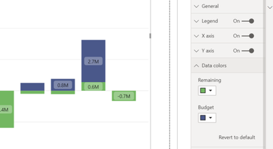
Sorry - part two: snapshot below shows there's no option for advanced controls / conditional formatting for the data colors.
- Mark as New
- Bookmark
- Subscribe
- Mute
- Subscribe to RSS Feed
- Permalink
- Report Inappropriate Content
Hello @boyerusmc -
I've done something similar in the past, and it involves making two measures for value that could be negative:
Total Remaining Neg = var __tot = CALCULATE(SUM('Table'[Remaining]))
return IF (__tot < 0, __tot, 0)
Total Remaining Pos = var __tot = CALCULATE(SUM('Table'[Remaining]))
return IF ( __tot >= 0, __tot, 0)
Then rename them after you put them in as values, change the colors, and
I hope this helps,
David
- Mark as New
- Bookmark
- Subscribe
- Mute
- Subscribe to RSS Feed
- Permalink
- Report Inappropriate Content
Thanks David, this worked like a champ!
- Mark as New
- Bookmark
- Subscribe
- Mute
- Subscribe to RSS Feed
- Permalink
- Report Inappropriate Content
- Mark as New
- Bookmark
- Subscribe
- Mute
- Subscribe to RSS Feed
- Permalink
- Report Inappropriate Content
@boyerusmc , I doubt you can do conditional formatting in stacked chart visual.
Helpful resources

FabCon Global Hackathon
Join the Fabric FabCon Global Hackathon—running virtually through Nov 3. Open to all skill levels. $10,000 in prizes!

Power BI Monthly Update - September 2025
Check out the September 2025 Power BI update to learn about new features.


