FabCon is coming to Atlanta
Join us at FabCon Atlanta from March 16 - 20, 2026, for the ultimate Fabric, Power BI, AI and SQL community-led event. Save $200 with code FABCOMM.
Register now!- Power BI forums
- Get Help with Power BI
- Desktop
- Service
- Report Server
- Power Query
- Mobile Apps
- Developer
- DAX Commands and Tips
- Custom Visuals Development Discussion
- Health and Life Sciences
- Power BI Spanish forums
- Translated Spanish Desktop
- Training and Consulting
- Instructor Led Training
- Dashboard in a Day for Women, by Women
- Galleries
- Data Stories Gallery
- Themes Gallery
- Contests Gallery
- QuickViz Gallery
- Quick Measures Gallery
- Visual Calculations Gallery
- Notebook Gallery
- Translytical Task Flow Gallery
- TMDL Gallery
- R Script Showcase
- Webinars and Video Gallery
- Ideas
- Custom Visuals Ideas (read-only)
- Issues
- Issues
- Events
- Upcoming Events
The Power BI Data Visualization World Championships is back! Get ahead of the game and start preparing now! Learn more
- Power BI forums
- Forums
- Get Help with Power BI
- Desktop
- Re: Stacked area chart
- Subscribe to RSS Feed
- Mark Topic as New
- Mark Topic as Read
- Float this Topic for Current User
- Bookmark
- Subscribe
- Printer Friendly Page
- Mark as New
- Bookmark
- Subscribe
- Mute
- Subscribe to RSS Feed
- Permalink
- Report Inappropriate Content
Stacked area chart
Hi,
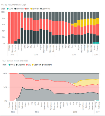
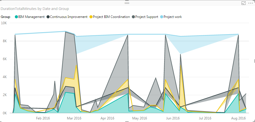
I want to use a stacked area chart with dates on the X-axes, but the rendering is off with crossing lines and gaps. I guess it is caused by missing null or zero values for each categroy at a certain point in time.
Is this considered to be a bug? If not, is there an easy way to add these missing datapoints?
Thanks!
Bart
- Mark as New
- Bookmark
- Subscribe
- Mute
- Subscribe to RSS Feed
- Permalink
- Report Inappropriate Content
I had this problem and used the following workaround:
If source data is derived for example from:
SELECT
AAA, -- The Legend
A_DATE, -- Time series
A_VALUE -- Stacked value
FROM TABLE_A;
Then replacing it with the following resolved the problem for me:
SELECT
AAA,
A_DATE,
A_VALUE
FROM TABLE_A
UNION ALL
SELECT DISTINCT
AAA,
cj.A_DATE,
0 AS A_VALUE
FROM TABLE_A
CROSS JOIN ( SELECT DISTINCT A_DATE FROM TABLE_A ) cj ;
My problem was actually as described by dedelman_clng (new legend starts mid series), but I think it should work for scattered nulls also.
- Mark as New
- Bookmark
- Subscribe
- Mute
- Subscribe to RSS Feed
- Permalink
- Report Inappropriate Content
Hello,
I would like to try this solution with my data but I an uncertain on where should I type this.
It does not seem like a measure, nor a column.
Can you please share a screenshot on how did you set it up?
Many thanks.
J
- Mark as New
- Bookmark
- Subscribe
- Mute
- Subscribe to RSS Feed
- Permalink
- Report Inappropriate Content
Extremely clever solution. Fixed my issue. Thanks for posting.
- Mark as New
- Bookmark
- Subscribe
- Mute
- Subscribe to RSS Feed
- Permalink
- Report Inappropriate Content

- Mark as New
- Bookmark
- Subscribe
- Mute
- Subscribe to RSS Feed
- Permalink
- Report Inappropriate Content
Hi,
I have the same problem. A measure did not fix it, and my data is not smooth enough (per category in the legend) to use a stacked bar chart.
Vote on this idea (found, not created by me) to increase it's likelyhood of being imlemented:
My ugly chart (just to add to what others have already shown)
- Mark as New
- Bookmark
- Subscribe
- Mute
- Subscribe to RSS Feed
- Permalink
- Report Inappropriate Content
I am facing the same issue. Were you able to find a workaround or a fix for this?
- Mark as New
- Bookmark
- Subscribe
- Mute
- Subscribe to RSS Feed
- Permalink
- Report Inappropriate Content
Not yet, unfortunately.
- Mark as New
- Bookmark
- Subscribe
- Mute
- Subscribe to RSS Feed
- Permalink
- Report Inappropriate Content
Hi all - I just encoutered this issue as well. It is a bad look when there are random white gaps just because a new "legend" started having values in the middle of the chart.
You can achieve something similar with a stacked bar chart, if your X-axis is hierarchical (e.g. Date). It gives the same general feel but certainly does not look as nice as an area chart (without gaps) would.
- Mark as New
- Bookmark
- Subscribe
- Mute
- Subscribe to RSS Feed
- Permalink
- Report Inappropriate Content
It's not a bug.
In all cubes technologies Null values are eliminated to optimize the number of cell-set return by a query.
In most cases, null values doesn't have anay sense for analytics.
But you have to view the missing point, you have to replace null by 0. This can be done directly from your query by replacing null by 0 (not recommended depending on high number of rows) or by using a calculated measure
- Mark as New
- Bookmark
- Subscribe
- Mute
- Subscribe to RSS Feed
- Permalink
- Report Inappropriate Content
Ok, too bad...
My problem is, I have no data points for certain dates in certain categories(not even null values). How can I create these missing datapoints?
cat A - 1/1/2016 - 10
cat A - 2/1/2016 - 12
cat A - 3/1/2016 - 14
cat A - 4/1/2016 - 16
cat B - 1/1/2016 - 14
cat B - 4/1/2016 - 12
In the example above I'm missing records for
cat B - 2/1/2016 - 0
cat B - 3/1/2016 - 0
Thanks!
- Mark as New
- Bookmark
- Subscribe
- Mute
- Subscribe to RSS Feed
- Permalink
- Report Inappropriate Content
I am experiencing the exact same issue, as it seems.
Any news on this matter?
Were you able to sort it?
- Mark as New
- Bookmark
- Subscribe
- Mute
- Subscribe to RSS Feed
- Permalink
- Report Inappropriate Content
Could we use a calculation to convert the measure to zero if the value is null?
Helpful resources

Power BI Dataviz World Championships
The Power BI Data Visualization World Championships is back! Get ahead of the game and start preparing now!

| User | Count |
|---|---|
| 39 | |
| 38 | |
| 38 | |
| 28 | |
| 25 |
| User | Count |
|---|---|
| 124 | |
| 87 | |
| 70 | |
| 66 | |
| 65 |


