FabCon is coming to Atlanta
Join us at FabCon Atlanta from March 16 - 20, 2026, for the ultimate Fabric, Power BI, AI and SQL community-led event. Save $200 with code FABCOMM.
Register now!- Power BI forums
- Get Help with Power BI
- Desktop
- Service
- Report Server
- Power Query
- Mobile Apps
- Developer
- DAX Commands and Tips
- Custom Visuals Development Discussion
- Health and Life Sciences
- Power BI Spanish forums
- Translated Spanish Desktop
- Training and Consulting
- Instructor Led Training
- Dashboard in a Day for Women, by Women
- Galleries
- Data Stories Gallery
- Themes Gallery
- Contests Gallery
- Quick Measures Gallery
- Notebook Gallery
- Translytical Task Flow Gallery
- TMDL Gallery
- R Script Showcase
- Webinars and Video Gallery
- Ideas
- Custom Visuals Ideas (read-only)
- Issues
- Issues
- Events
- Upcoming Events
Calling all Data Engineers! Fabric Data Engineer (Exam DP-700) live sessions are back! Starting October 16th. Sign up.
- Power BI forums
- Forums
- Get Help with Power BI
- Desktop
- Stack sum of 0 and 1 in bar chart
- Subscribe to RSS Feed
- Mark Topic as New
- Mark Topic as Read
- Float this Topic for Current User
- Bookmark
- Subscribe
- Printer Friendly Page
- Mark as New
- Bookmark
- Subscribe
- Mute
- Subscribe to RSS Feed
- Permalink
- Report Inappropriate Content
Stack sum of 0 and 1 in bar chart
Hello,
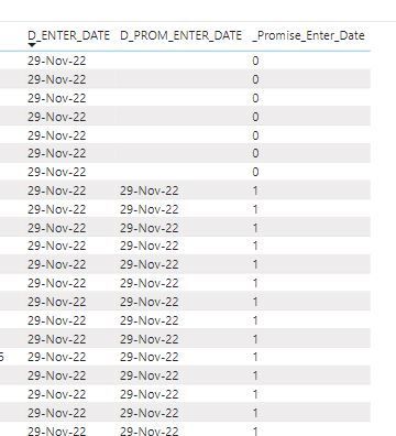
I would like to use a stacked bar chart to display the ratio between 0 and 1. I would like to use a date slicer to set the enter date. It has to count the 0 en 1 for the chosen period and show the sum of 0 and 1.
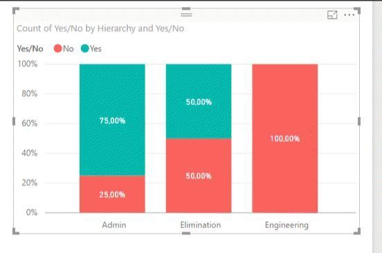
Result will look something like this:
This is an example which I found on the internet.
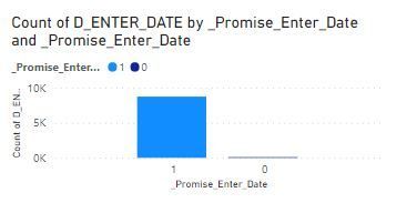
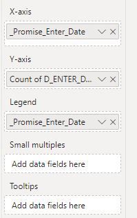
I gave it a shot but it's not what I would to have:
So for the given time span based on the date slicer, the has to sum the 0's and 1's and stack them in a bar chart.
How can I do this?
Thanks in advance.
Regards,
Solved! Go to Solution.
- Mark as New
- Bookmark
- Subscribe
- Mute
- Subscribe to RSS Feed
- Permalink
- Report Inappropriate Content
Hi @WLFRD ,
For this you need to make the countrows instead of the sum try using something similar to this:
Total 0 = COUNTROWS (FILTER(Table, Table[Column] = 0))
Total 1 = COUNTROWS (FILTER(Table, Table[Column] = 1))
Now use this two metrics on your visualization.
Regards
Miguel Félix
Did I answer your question? Mark my post as a solution!
Proud to be a Super User!
Check out my blog: Power BI em Português- Mark as New
- Bookmark
- Subscribe
- Mute
- Subscribe to RSS Feed
- Permalink
- Report Inappropriate Content
Hi @WLFRD ,
For this you need to make the countrows instead of the sum try using something similar to this:
Total 0 = COUNTROWS (FILTER(Table, Table[Column] = 0))
Total 1 = COUNTROWS (FILTER(Table, Table[Column] = 1))
Now use this two metrics on your visualization.
Regards
Miguel Félix
Did I answer your question? Mark my post as a solution!
Proud to be a Super User!
Check out my blog: Power BI em PortuguêsHelpful resources

FabCon Global Hackathon
Join the Fabric FabCon Global Hackathon—running virtually through Nov 3. Open to all skill levels. $10,000 in prizes!

Power BI Monthly Update - September 2025
Check out the September 2025 Power BI update to learn about new features.


