FabCon is coming to Atlanta
Join us at FabCon Atlanta from March 16 - 20, 2026, for the ultimate Fabric, Power BI, AI and SQL community-led event. Save $200 with code FABCOMM.
Register now!- Power BI forums
- Get Help with Power BI
- Desktop
- Service
- Report Server
- Power Query
- Mobile Apps
- Developer
- DAX Commands and Tips
- Custom Visuals Development Discussion
- Health and Life Sciences
- Power BI Spanish forums
- Translated Spanish Desktop
- Training and Consulting
- Instructor Led Training
- Dashboard in a Day for Women, by Women
- Galleries
- Data Stories Gallery
- Themes Gallery
- Contests Gallery
- Quick Measures Gallery
- Visual Calculations Gallery
- Notebook Gallery
- Translytical Task Flow Gallery
- TMDL Gallery
- R Script Showcase
- Webinars and Video Gallery
- Ideas
- Custom Visuals Ideas (read-only)
- Issues
- Issues
- Events
- Upcoming Events
Calling all Data Engineers! Fabric Data Engineer (Exam DP-700) live sessions are back! Starting October 16th. Sign up.
- Power BI forums
- Forums
- Get Help with Power BI
- Desktop
- Re: Spacing in column chart
- Subscribe to RSS Feed
- Mark Topic as New
- Mark Topic as Read
- Float this Topic for Current User
- Bookmark
- Subscribe
- Printer Friendly Page
- Mark as New
- Bookmark
- Subscribe
- Mute
- Subscribe to RSS Feed
- Permalink
- Report Inappropriate Content
Spacing in column chart
I know it's been discussed in this post
http://community.powerbi.com/t5/Desktop/Spacing-between-bars/m-p/260273#M116264
However, can anyone illustrate with dummy data and an example of setting up a category column as mentioned in post above? Thanks a lot
Kenny
Solved! Go to Solution.
- Mark as New
- Bookmark
- Subscribe
- Mute
- Subscribe to RSS Feed
- Permalink
- Report Inappropriate Content
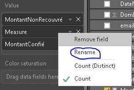
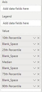
The measure name you don't need to change it
You just need to rename it while adding it to the graph :
If this worked, don't forget to mark the topic as solved
- Quentin
- Mark as New
- Bookmark
- Subscribe
- Mute
- Subscribe to RSS Feed
- Permalink
- Report Inappropriate Content
Hi @kennyyip
I personnaly use a trick to have spacing.
So what you need to do :
1 - Create a new measure with this formula :
Measure = 0
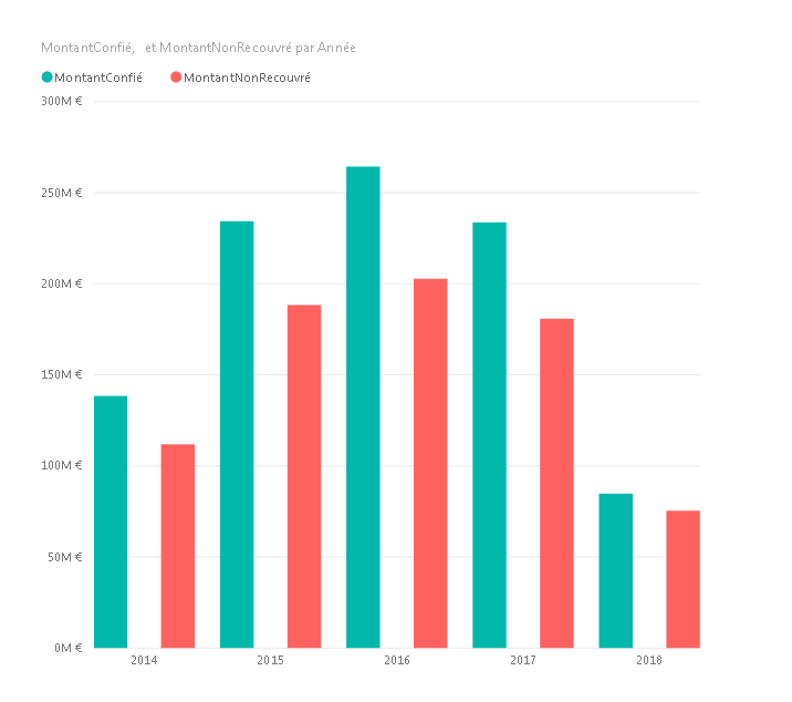
2 - Put it on the graph in the middle of the values needed
3 - Blank the name by renaming it and writing a space in the name (simply press SPACE BAR)
4 - Choose a color in data color that match the background of your graph
Et voilà !
- Quentin
- Mark as New
- Bookmark
- Subscribe
- Mute
- Subscribe to RSS Feed
- Permalink
- Report Inappropriate Content
hi, thanks for the wonderful solution.
A couple of follow up questions-
1) you use a 'clustered column chart'? There is no traditional 'column' chart on the PBI desktop?
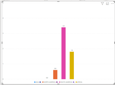
2) The X-axis labels, how you put them? For me, I can only see 'data labels' and place in/out of columns. But I need individual columns label text at the bottom. How to place that? Like the below screenshot- i want each column bottom shows ASIA, AFRICA respectively, not like a group currently.
- Mark as New
- Bookmark
- Subscribe
- Mute
- Subscribe to RSS Feed
- Permalink
- Report Inappropriate Content
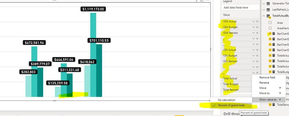
@quentin_vigne does this still work for you? If I try to add multiple of the same measure, it will only show one in the chart. See pictures below:
- Mark as New
- Bookmark
- Subscribe
- Mute
- Subscribe to RSS Feed
- Permalink
- Report Inappropriate Content
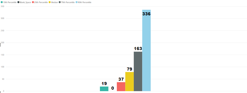
Yeah it will; but you can make multiple measures = 0 to create more. In the image, the '_' are different measures BarSpacer1 = 0 , BarSpacer2 = 0 etc., and there are two spacers next to each other on either side of the middle group of bars.
Oh yeah also, change the "Show value as" to "Percent of grand total" to get rid of those ugly "0"'s on the bottom!
I hope that helps others out too!
Mat
- Mark as New
- Bookmark
- Subscribe
- Mute
- Subscribe to RSS Feed
- Permalink
- Report Inappropriate Content
Hello @100goals,
I cant rename the measures=0 as blank using the space bar. How can i show these measures as empty so they dont show in the chart?
- Mark as New
- Bookmark
- Subscribe
- Mute
- Subscribe to RSS Feed
- Permalink
- Report Inappropriate Content
- Mark as New
- Bookmark
- Subscribe
- Mute
- Subscribe to RSS Feed
- Permalink
- Report Inappropriate Content
- Mark as New
- Bookmark
- Subscribe
- Mute
- Subscribe to RSS Feed
- Permalink
- Report Inappropriate Content
use the space bar
- Mark as New
- Bookmark
- Subscribe
- Mute
- Subscribe to RSS Feed
- Permalink
- Report Inappropriate Content
The measure name you don't need to change it
You just need to rename it while adding it to the graph :
If this worked, don't forget to mark the topic as solved
- Quentin
Helpful resources

FabCon Global Hackathon
Join the Fabric FabCon Global Hackathon—running virtually through Nov 3. Open to all skill levels. $10,000 in prizes!

Power BI Monthly Update - October 2025
Check out the October 2025 Power BI update to learn about new features.

