Get Fabric certified for FREE!
Don't miss your chance to take the Fabric Data Engineer (DP-600) exam for FREE! Find out how by watching the DP-600 session on-demand now through April 28th.
Learn more- Power BI forums
- Get Help with Power BI
- Desktop
- Service
- Report Server
- Power Query
- Mobile Apps
- Developer
- DAX Commands and Tips
- Custom Visuals Development Discussion
- Health and Life Sciences
- Power BI Spanish forums
- Translated Spanish Desktop
- Training and Consulting
- Instructor Led Training
- Dashboard in a Day for Women, by Women
- Galleries
- Data Stories Gallery
- Themes Gallery
- Contests Gallery
- QuickViz Gallery
- Quick Measures Gallery
- Visual Calculations Gallery
- Notebook Gallery
- Translytical Task Flow Gallery
- TMDL Gallery
- R Script Showcase
- Webinars and Video Gallery
- Ideas
- Custom Visuals Ideas (read-only)
- Issues
- Issues
- Events
- Upcoming Events
Join the FabCon + SQLCon recap series. Up next: Power BI, Real-Time Intelligence, IQ and AI, and Data Factory take center stage. All sessions are available on-demand after the live show. Register now
- Power BI forums
- Forums
- Get Help with Power BI
- Desktop
- Sort by Column using reference key does not work
- Subscribe to RSS Feed
- Mark Topic as New
- Mark Topic as Read
- Float this Topic for Current User
- Bookmark
- Subscribe
- Printer Friendly Page
- Mark as New
- Bookmark
- Subscribe
- Mute
- Subscribe to RSS Feed
- Permalink
- Report Inappropriate Content
Sort by Column using reference key does not work
Hey everyone,
I'm trying to show a graph of valuations over time and these timeframes are arbitrary because my different units (automobiles) are not all the same model year. I have a very simple time dimension which gives each one of my time references a key and when I sort by this key, my axis isn't showing the way I want it to. I want it to be in this order: New, 2 Years, Half Life, Low Point, Current.
The only way I can get it to sort correctly is if I include both the time key and the Key Name in my axis together and I don't want the time key number displaying on the axis. Any thoughts?
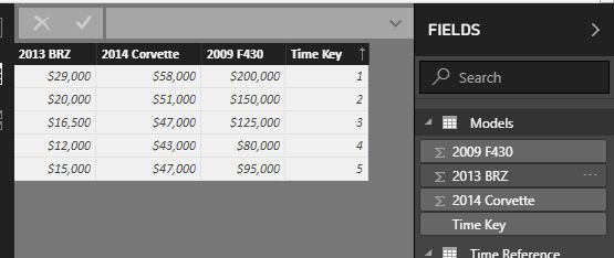
My "fact" sorted by the time key.
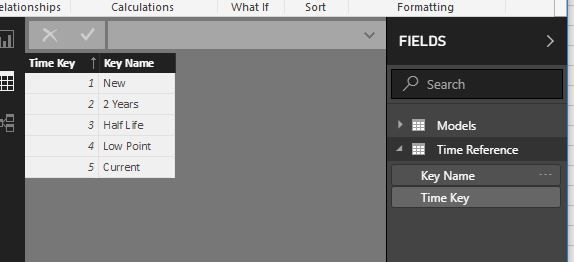
My "time dimension".
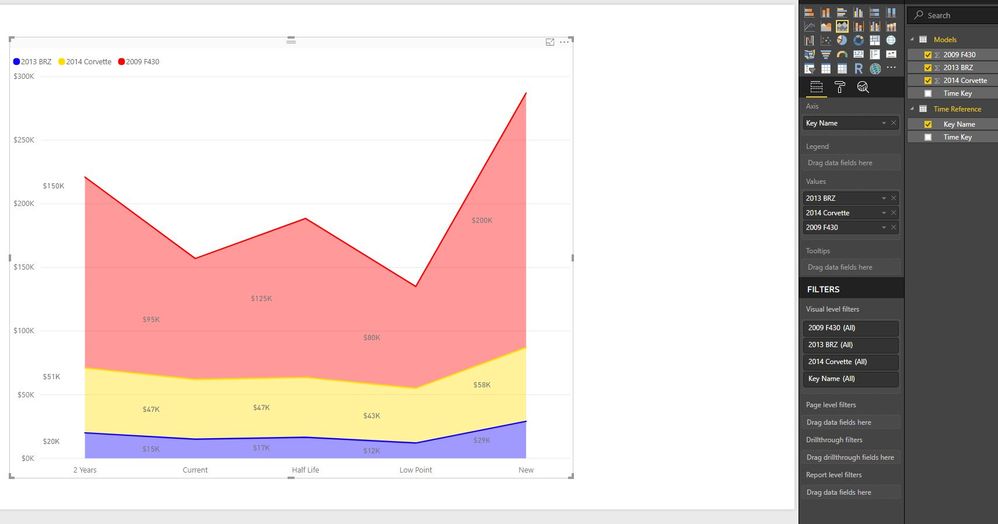
Incorrect order.
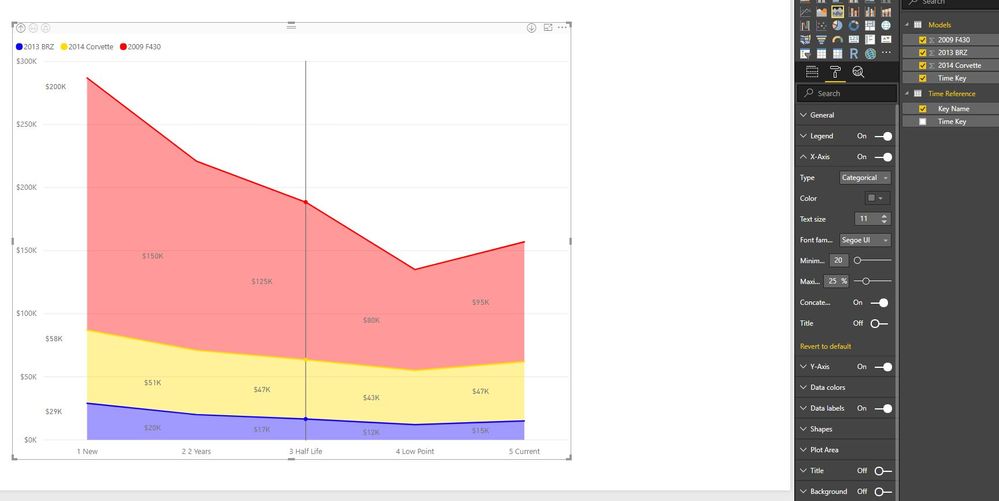
Correct axis but having to use the time key on the axis. This has also been drilled down to the lowest hierarcy.
- Mark as New
- Bookmark
- Subscribe
- Mute
- Subscribe to RSS Feed
- Permalink
- Report Inappropriate Content
Any sort you apply to the data screen is purely visual. What you want to do instead is select the field that you are using on your Axis, and go into the Modelling area of the Ribbon. In there is a "Sort By Column" selection where you can choose your Time Key field.
Helpful resources

Power BI Monthly Update - April 2026
Check out the April 2026 Power BI update to learn about new features.

New to Fabric Survey
If you have recently started exploring Fabric, we'd love to hear how it's going. Your feedback can help with product improvements.

Power BI DataViz World Championships - June 2026
A new Power BI DataViz World Championship is coming this June! Don't miss out on submitting your entry.

| User | Count |
|---|---|
| 41 | |
| 37 | |
| 34 | |
| 21 | |
| 16 |
| User | Count |
|---|---|
| 65 | |
| 62 | |
| 31 | |
| 26 | |
| 25 |


