A new Data Days event is coming soon!
This time we’re going bigger than ever. Fabric, Power BI, SQL, AI and more. We're covering it all. You won't want to miss it.
Learn more- Power BI forums
- Get Help with Power BI
- Desktop
- Service
- Report Server
- Power Query
- Mobile Apps
- Developer
- DAX Commands and Tips
- Custom Visuals Development Discussion
- Health and Life Sciences
- Power BI Spanish forums
- Translated Spanish Desktop
- Training and Consulting
- Instructor Led Training
- Dashboard in a Day for Women, by Women
- Galleries
- Data Stories Gallery
- Themes Gallery
- Contests Gallery
- QuickViz Gallery
- Quick Measures Gallery
- Visual Calculations Gallery
- Notebook Gallery
- Translytical Task Flow Gallery
- TMDL Gallery
- R Script Showcase
- Webinars and Video Gallery
- Ideas
- Custom Visuals Ideas (read-only)
- Issues
- Issues
- Events
- Upcoming Events
Level up your Power BI skills this month - build one visual each week and tell better stories with data! Get started
- Power BI forums
- Forums
- Get Help with Power BI
- Desktop
- Re: Sort Legend by Y-Axis Values
- Subscribe to RSS Feed
- Mark Topic as New
- Mark Topic as Read
- Float this Topic for Current User
- Bookmark
- Subscribe
- Printer Friendly Page
- Mark as New
- Bookmark
- Subscribe
- Mute
- Subscribe to RSS Feed
- Permalink
- Report Inappropriate Content
Sort Legend by Y-Axis Values
Hello,
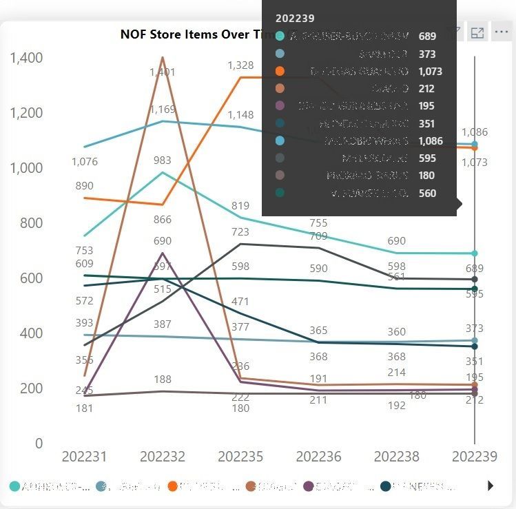
I have a Line Chart Visual currently filtered to show the top 10 legend values for the Y Axis and the X Axis is an internal fiscal year-week identifier. Right now when you hover over a particular week it will give you the values for the top 10, which is what I want to see. However, it has them sorted in alphabetical order by the company, instead of in value order of the Y-Axis (it is a count measure). So far I can only sort the legend alphabetically. How can I put these in descending order of their value?
Solved! Go to Solution.
- Mark as New
- Bookmark
- Subscribe
- Mute
- Subscribe to RSS Feed
- Permalink
- Report Inappropriate Content
Hi, @ksimpson50502
Unfortunately, sorting data in the default tooltip is currently not supported.
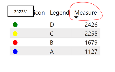
As a workaround, you can consider add a custom tooltip page. You can sort the value in tooltip page.
Create tooltips based on report pages
Please check my attached pbix for more details.
Best Regards,
Community Support Team _ Eason
If this post helps, then please consider Accept it as the solution to help the other members find it more quickly.
- Mark as New
- Bookmark
- Subscribe
- Mute
- Subscribe to RSS Feed
- Permalink
- Report Inappropriate Content
Thanks for your help - I'm confused by the Legend Icon measure. I want the icons to mimic the colors from the visual, and it is filtered to only show top 10 based on count of the value. Meaning, it could change from week to week. How can I fix this?
Helpful resources

Power BI Monthly Update - April 2026
Check out the April 2026 Power BI update to learn about new features.

Data Days 2026 coming soon!
Sign up to receive a private message when registration opens and key events begin.

New to Fabric Survey
If you have recently started exploring Fabric, we'd love to hear how it's going. Your feedback can help with product improvements.

| User | Count |
|---|---|
| 38 | |
| 29 | |
| 28 | |
| 20 | |
| 18 |
| User | Count |
|---|---|
| 66 | |
| 34 | |
| 32 | |
| 25 | |
| 23 |


