A new Data Days event is coming soon!
This time we’re going bigger than ever. Fabric, Power BI, SQL, AI and more. We're covering it all. You won't want to miss it.
Learn more- Power BI forums
- Get Help with Power BI
- Desktop
- Service
- Report Server
- Power Query
- Mobile Apps
- Developer
- DAX Commands and Tips
- Custom Visuals Development Discussion
- Health and Life Sciences
- Power BI Spanish forums
- Translated Spanish Desktop
- Training and Consulting
- Instructor Led Training
- Dashboard in a Day for Women, by Women
- Galleries
- Data Stories Gallery
- Themes Gallery
- Contests Gallery
- QuickViz Gallery
- Quick Measures Gallery
- Visual Calculations Gallery
- Notebook Gallery
- Translytical Task Flow Gallery
- TMDL Gallery
- R Script Showcase
- Webinars and Video Gallery
- Ideas
- Custom Visuals Ideas (read-only)
- Issues
- Issues
- Events
- Upcoming Events
Did you hear? There's a new SQL AI Developer certification (DP-800). Start preparing now and be one of the first to get certified. Register now
- Power BI forums
- Forums
- Get Help with Power BI
- Desktop
- Simulate Text Parameter In PowerBI
- Subscribe to RSS Feed
- Mark Topic as New
- Mark Topic as Read
- Float this Topic for Current User
- Bookmark
- Subscribe
- Printer Friendly Page
- Mark as New
- Bookmark
- Subscribe
- Mute
- Subscribe to RSS Feed
- Permalink
- Report Inappropriate Content
Simulate Text Parameter In PowerBI
While I am aware that PowerBI doesn't have the capability to use text parameters, is there anyway I can accomplish the following?:
I have a bar graph of companies ranked by revenue for a given date range. There is also a text input that allows the user to input the name of one of the companies. When the user does this and enters a name of a company, that company's entry in the bar graph should change colors in order to "highlight" where that company stands in comparison to the other companies in terms of revenue.
Is there any way to do this in PowerBI?
Thanks
Solved! Go to Solution.
- Mark as New
- Bookmark
- Subscribe
- Mute
- Subscribe to RSS Feed
- Permalink
- Report Inappropriate Content
Hi @Ad550 ,
Believe that the company name you are refering is based on values that you have has part of your axis correct?
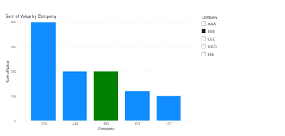
What you can do is to create a disconnected table with the name of the tables, then you can use a normal slicer~, or the find text custom visual . Then you can add a measure similar to this:
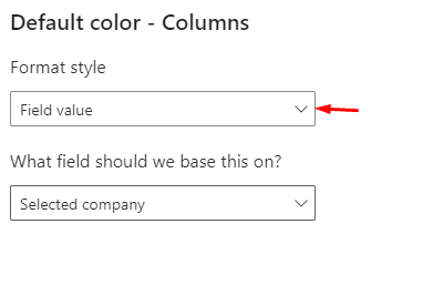
Selected company = IF(ISFILTERED(Companies[Company]) && SELECTEDVALUE('Table'[Company]) in DISTINCT(Companies[Company]), "Green")
You can then change the Green by other colour or hex code ("#FFFFFF") then use this on the condittional formatting.
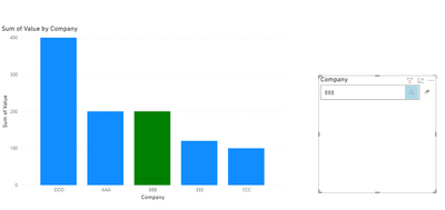
If you use the text finder you are abble to get more flexibility since it search part of text:
Regards
Miguel Félix
Did I answer your question? Mark my post as a solution!
Proud to be a Super User!
Check out my blog: Power BI em Português- Mark as New
- Bookmark
- Subscribe
- Mute
- Subscribe to RSS Feed
- Permalink
- Report Inappropriate Content
Hi @Ad550 ,
Believe that the company name you are refering is based on values that you have has part of your axis correct?
What you can do is to create a disconnected table with the name of the tables, then you can use a normal slicer~, or the find text custom visual . Then you can add a measure similar to this:
Selected company = IF(ISFILTERED(Companies[Company]) && SELECTEDVALUE('Table'[Company]) in DISTINCT(Companies[Company]), "Green")
You can then change the Green by other colour or hex code ("#FFFFFF") then use this on the condittional formatting.
If you use the text finder you are abble to get more flexibility since it search part of text:
Regards
Miguel Félix
Did I answer your question? Mark my post as a solution!
Proud to be a Super User!
Check out my blog: Power BI em PortuguêsHelpful resources

Power BI Monthly Update - April 2026
Check out the April 2026 Power BI update to learn about new features.

Data Days 2026 coming soon!
Sign up to receive a private message when registration opens and key events begin.

New to Fabric Survey
If you have recently started exploring Fabric, we'd love to hear how it's going. Your feedback can help with product improvements.

| User | Count |
|---|---|
| 36 | |
| 33 | |
| 31 | |
| 21 | |
| 16 |
| User | Count |
|---|---|
| 66 | |
| 55 | |
| 31 | |
| 24 | |
| 23 |


