- Power BI forums
- Updates
- News & Announcements
- Get Help with Power BI
- Desktop
- Service
- Report Server
- Power Query
- Mobile Apps
- Developer
- DAX Commands and Tips
- Custom Visuals Development Discussion
- Health and Life Sciences
- Power BI Spanish forums
- Translated Spanish Desktop
- Power Platform Integration - Better Together!
- Power Platform Integrations (Read-only)
- Power Platform and Dynamics 365 Integrations (Read-only)
- Training and Consulting
- Instructor Led Training
- Dashboard in a Day for Women, by Women
- Galleries
- Community Connections & How-To Videos
- COVID-19 Data Stories Gallery
- Themes Gallery
- Data Stories Gallery
- R Script Showcase
- Webinars and Video Gallery
- Quick Measures Gallery
- 2021 MSBizAppsSummit Gallery
- 2020 MSBizAppsSummit Gallery
- 2019 MSBizAppsSummit Gallery
- Events
- Ideas
- Custom Visuals Ideas
- Issues
- Issues
- Events
- Upcoming Events
- Community Blog
- Power BI Community Blog
- Custom Visuals Community Blog
- Community Support
- Community Accounts & Registration
- Using the Community
- Community Feedback
Register now to learn Fabric in free live sessions led by the best Microsoft experts. From Apr 16 to May 9, in English and Spanish.
- Power BI forums
- Forums
- Get Help with Power BI
- Desktop
- Y Axis not coherent
- Subscribe to RSS Feed
- Mark Topic as New
- Mark Topic as Read
- Float this Topic for Current User
- Bookmark
- Subscribe
- Printer Friendly Page
- Mark as New
- Bookmark
- Subscribe
- Mute
- Subscribe to RSS Feed
- Permalink
- Report Inappropriate Content
Y Axis not coherent
Hello,
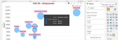
I use this Bubble / Scatter Chart - xViz - beta. For some reasons, my bubble size (and the information on it) is OK. However, the values of the Y axis are 100 times too large. Any idea ?
Louis
- Mark as New
- Bookmark
- Subscribe
- Mute
- Subscribe to RSS Feed
- Permalink
- Report Inappropriate Content
Hi Michael :
Here is what I have :
Louis
- Mark as New
- Bookmark
- Subscribe
- Mute
- Subscribe to RSS Feed
- Permalink
- Report Inappropriate Content
Did you try to change it?
Visit my blog datenhungrig which I recently started with content about business intelligence and Power BI in German and English or follow me on LinkedIn!
- Mark as New
- Bookmark
- Subscribe
- Mute
- Subscribe to RSS Feed
- Permalink
- Report Inappropriate Content
Yep
- Mark as New
- Bookmark
- Subscribe
- Mute
- Subscribe to RSS Feed
- Permalink
- Report Inappropriate Content
Hi @Louis66 ,
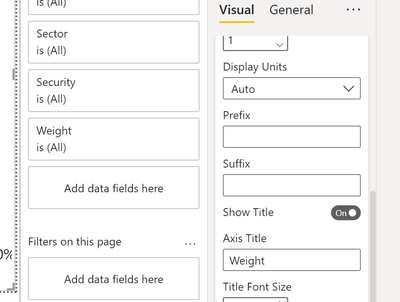
Can you please check the settings here?
Best regards
Michael
-----------------------------------------------------
If this post helps, then please consider Accept it as the solution to help the other members find it more quickly.
Appreciate your thumbs up!
@ me in replies or I'll lose your thread.
Visit my blog datenhungrig which I recently started with content about business intelligence and Power BI in German and English or follow me on LinkedIn!
- Mark as New
- Bookmark
- Subscribe
- Mute
- Subscribe to RSS Feed
- Permalink
- Report Inappropriate Content
small addon:
in the end it depends on what your values are and which options you choose in the options I showed you.
So if you values are 0.99, 0.56 and so on then setting percentage should be fine.
if your values are like 99, 56 then percentage will bring the results which you currently have.##Best regards
Michael
-----------------------------------------------------
If this post helps, then please consider Accept it as the solution to help the other members find it more quickly.
Appreciate your thumbs up!
@ me in replies or I'll lose your thread.
Visit my blog datenhungrig which I recently started with content about business intelligence and Power BI in German and English or follow me on LinkedIn!
- Mark as New
- Bookmark
- Subscribe
- Mute
- Subscribe to RSS Feed
- Permalink
- Report Inappropriate Content
Understood, but my values are OK in my bubbles !
- Mark as New
- Bookmark
- Subscribe
- Mute
- Subscribe to RSS Feed
- Permalink
- Report Inappropriate Content
indeed, I see that now 😄
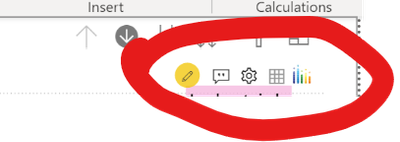
this is weitd. BUt what is also weird is the stuff you have on the top right.
what kind of visual is that? Is this maybe the reason?
Best regards
Michael
Visit my blog datenhungrig which I recently started with content about business intelligence and Power BI in German and English or follow me on LinkedIn!
- Mark as New
- Bookmark
- Subscribe
- Mute
- Subscribe to RSS Feed
- Permalink
- Report Inappropriate Content
Yes - I tried Bubble Chart by Akvelon 2.2.2.
Louis
- Mark as New
- Bookmark
- Subscribe
- Mute
- Subscribe to RSS Feed
- Permalink
- Report Inappropriate Content
Hi @Louis66
Then maybe there is somewhere a setting which you have to configure. I have not worked with it so far, sorry 😕
Best regards
Michael
Visit my blog datenhungrig which I recently started with content about business intelligence and Power BI in German and English or follow me on LinkedIn!
- Mark as New
- Bookmark
- Subscribe
- Mute
- Subscribe to RSS Feed
- Permalink
- Report Inappropriate Content
Sorry. It is not Bubble Chart by Akvelon 2.2.2. It is : Bubble / Scatter Chart - xViz - beta.
Louis
- Mark as New
- Bookmark
- Subscribe
- Mute
- Subscribe to RSS Feed
- Permalink
- Report Inappropriate Content
Sorry, I rarely work with custom visuals except Zebra BI 😕
Visit my blog datenhungrig which I recently started with content about business intelligence and Power BI in German and English or follow me on LinkedIn!
Helpful resources

Microsoft Fabric Learn Together
Covering the world! 9:00-10:30 AM Sydney, 4:00-5:30 PM CET (Paris/Berlin), 7:00-8:30 PM Mexico City

Power BI Monthly Update - April 2024
Check out the April 2024 Power BI update to learn about new features.

| User | Count |
|---|---|
| 111 | |
| 100 | |
| 80 | |
| 64 | |
| 58 |
| User | Count |
|---|---|
| 148 | |
| 111 | |
| 93 | |
| 84 | |
| 66 |


