- Subscribe to RSS Feed
- Mark Topic as New
- Mark Topic as Read
- Float this Topic for Current User
- Bookmark
- Subscribe
- Printer Friendly Page
- Mark as New
- Bookmark
- Subscribe
- Mute
- Subscribe to RSS Feed
- Permalink
- Report Inappropriate Content
Showing 0 on new ribbon chart
I can't see this asked/answered anywhere else so forgive me if my search missed an answer and point me in the right direction.
I've seen asolution to get a calculated value to include 0's where there are nulls in the data (simply add 0 to the calculation). However, from what I can see this does not work on the new ribbon chart visual. Instead of showing a trend that drops to 0 then rises again to the new count where it again exceeds 0, the ribbon chart just looks like a bar chart. Anyone know how to force it to reflect a drop to 0 or is this a 'bug' in the chart design. Surely I can't be the only one who wants to see the full trend instead of a broken flow?
Solved! Go to Solution.
- Mark as New
- Bookmark
- Subscribe
- Mute
- Subscribe to RSS Feed
- Permalink
- Report Inappropriate Content
I understand what you mean. But I haven't found any similar ribbon chart in visual market. I would suggest you submit the idea here to help power bi improve.
Community Support Team _ Jimmy Tao
If this post helps, then please consider Accept it as the solution to help the other members find it more quickly.
- Mark as New
- Bookmark
- Subscribe
- Mute
- Subscribe to RSS Feed
- Permalink
- Report Inappropriate Content
Solved this problem by adding an insignificant value for the periods where the measure value is 0
In my case it looks like this:

- Mark as New
- Bookmark
- Subscribe
- Mute
- Subscribe to RSS Feed
- Permalink
- Report Inappropriate Content
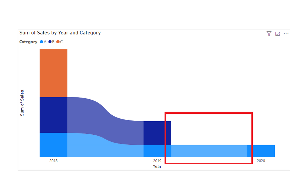
I have made a test but couldn't reproduce your issue. The ribbon is continuous on my side as below. Please update power bi desktop to the latest version, if this issue persists, could you please share a sample file by sharing a onedrive link?

Community Support Team _ Jimmy Tao
If this post helps, then please consider Accept it as the solution to help the other members find it more quickly.
- Mark as New
- Bookmark
- Subscribe
- Mute
- Subscribe to RSS Feed
- Permalink
- Report Inappropriate Content
You have actually reproduced it. You have values that go to 0 (orange bar in 2019, orange and blue in2020), but as you don't have values in 2020 they just stop. If you had a value in 2020 for the orange bar I suspect you'd see exactly what I do.
What I'm saying is that if there is a value that has a 0 month, I'd expect the ribbon to narrow done to zero, then expand again to the new value.
I can't share ther actual data as its sensitive (hence I took the data labels off my screenshot). I can use a dummy dataset but that's going to look exactly like my screenshot and yours. I thnk its the way the visual is designed and what it probably should have is a flag to choose to show 0 values or not.
- Mark as New
- Bookmark
- Subscribe
- Mute
- Subscribe to RSS Feed
- Permalink
- Report Inappropriate Content
Actually, in revisiting this with dummy data I see the problem and can maybe illustrate it. Probably need a new/similar visual. Instead of the ribbon chart holding the order of a stack like a stacked area chart would it crosses the ribbons (insert Ghostbusters joke here). So it can;t really show 0 as a zero height ribbon. In the attached I set up a sample file with one set of values in the orders column and a second set with +1 to the value. Imagine on the second that the ribbon going down to 1 was actually 0 height and you might get what I originally meant; can we display 0 as a 'disappearing ribbon' instead of a gap. Like I say, I'm presumably looking for a different visual to the ribbon chart.
- Mark as New
- Bookmark
- Subscribe
- Mute
- Subscribe to RSS Feed
- Permalink
- Report Inappropriate Content
With image this time!
- Mark as New
- Bookmark
- Subscribe
- Mute
- Subscribe to RSS Feed
- Permalink
- Report Inappropriate Content
I understand what you mean. But I haven't found any similar ribbon chart in visual market. I would suggest you submit the idea here to help power bi improve.
Community Support Team _ Jimmy Tao
If this post helps, then please consider Accept it as the solution to help the other members find it more quickly.
- Mark as New
- Bookmark
- Subscribe
- Mute
- Subscribe to RSS Feed
- Permalink
- Report Inappropriate Content
Here is a link to the idea which needs votes:
https://ideas.powerbi.com/ideas/idea/?ideaid=355699f6-cb28-459c-975e-4bbd3450c8b6
- Mark as New
- Bookmark
- Subscribe
- Mute
- Subscribe to RSS Feed
- Permalink
- Report Inappropriate Content
Will do. I'd suggest it should be an option on the existing visual - toggle to display line for 0 or gap.
Helpful resources
| Subject | Author | Posted | |
|---|---|---|---|
| 11-13-2024 05:49 PM | |||
| 10-24-2024 09:13 AM | |||
| 08-14-2024 02:03 AM | |||
| 01-03-2024 06:55 AM | |||
| 09-11-2024 02:16 AM |
| User | Count |
|---|---|
| 128 | |
| 100 | |
| 85 | |
| 53 | |
| 46 |


