cancel
Showing results for 
Search instead for 
Did you mean: 

Find everything you need to get certified on Fabric—skills challenges, live sessions, exam prep, role guidance, and more. Get started

Reply
kirill_vaynberg
New Member

Show all Dates on continuous X axis

I would like to have a line chart that plots a numerical value against date. Everything seems to work except for the Date axis: it's always stuck at showing Month/Year at best. I would like to axis to actually show individual dates.

I have tried enabling Hierarchy but that is still stuck at Month/Year regardless of what type and level of drill down I am using. Besides, I have no need to the hierarchy features.

I would really rather not use a categorical axis as I need the results to show in the correct chronological proportion (observations are not taken on a regular basis)

The plot itself is fine, the Date Type & Format for the Date column is set to Date and (MM/dd/yyyy).

Ideally, I would like to just enter the step for that axis manually as per older versions of Excel

EDIT: Spelling

1 ACCEPTED SOLUTION
v-qiuyu-msft
Community Support
Community Support

Hi @kirill_vaynberg,


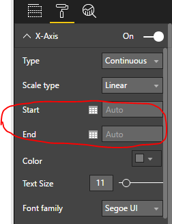
When you drag the date column to Axis of a line chart, it will automatically enable date hierarchy. You can check the column name instead of the Date Hierarchy. The date value in the X-axis will display based on the visual width and number of records in this date column. We are not able to set interval for date in the X-axis, we can just specify the start date and end date.


q2.PNGq3.PNG


To display all date values in x-axis, the best option is to set X-axis type as Categorical, it will generate a horizontal scroll bar for us to view all data if there are two many records.


Best Regards,
Qiuyun Yu

Community Support Team _ Qiuyun Yu
If this post helps, then please consider Accept it as the solution to help the other members find it more quickly.

View solution in original post

18 REPLIES 18
MustafaTorun
New Member

You can first shift to categorical view of X-axis and from visual sort the axis accordingly. This is the ultimate solution. 


MustafaTorun_0-1696848738058.png


Amazing, thanks.

nadeemabbasi
Frequent Visitor

All though the thread is very old but I have similar case case where I need to show all date type labels for x-axis. The provide solution was not fullfilling requriment. The best way to achive this job create a custom column using Format funtion where you can achive any type of Date format and it will show all labels on X-axis.


Format(MyTableName[Date],"mmm-yy")


frankvb
Helper II
Helper II

In the end I does anybody have a solution in the end for:

-line chart

-trend line

-display all values on x-axis

-missing values in the line chart not connected by line

?

I am also looking for the same , want date format as mm/dd/yyyy but it is displaying as mmm-yyyy,

- Line chart --> x axis --> continous 

- Trend Line is required so can't change to the Categorical


Anonymous
Not applicable

Added a date column using start of month and things worked out.


Date = STARTOFMONTH([YOURDATEFIELD])
Anonymous
Not applicable

I really don't think this is a solution....we need PowerBI to allow us to have a trend line using a categorical axis, or show all the months on a linear axis.  No matter how large I make the chart area it only shows every second month.

I know this is an old post but came across the same issue. Maybe it's been properly fixed by now but I wanted a trend line on a column chart with categorical axis to show labels for each column.
I did find a work around which gives me everything I wanted but it's FAR from ideal.
I set my chart to continuous to get the trend line and removed the x-axis labels and title. I then created a  duplicate of the chart all set to white other than the x-axis labels and title and changed this one to categorical - lined it up with my other chart and chucked it to the back so only the labels and title were visible on the x-axis. et voila - a continuous column chart with trend line and x-axis labels for each column


jjlogan007
Regular Visitor

I had same requirement: continuous dates on X-axis and event counts on Y-axis (0 to ....).  to solve this I created a simple Calendar table with Dates in one column continuous from my start date to last date in my period under review - did this in Excel but of course can use other data source (Access, etc). Save or close the Excel before import. I am using PowerBI Desktop. Then Get Data, ensure Date format. Then Load query. Then link Calendar table to fact table in Relationships. Then in visual use Date from fact table and format x-axis as Continuous / Linear. Hope this helps. JL

I'd also like to add 3 things that are pretty obvious (though I missed them).  These are small, but critical to ensure that this works:


1. Make sure your custom date table is set as the default date table.  PowerBI defaults to its own date table until you define your own date table.  Right click on your date table and choose "Mark As Date Table".  https://docs.microsoft.com/en-us/power-bi/desktop-date-tables   (Side note: you can also build your own Hierarchy from your date table Year > Quarter > Month > Week > Date)


2. Make sure the visual's X-axis is set to "Show Items With No Data" to make sure that days with no value are still included in the visual.  Right click on the Axis field in the Fields list to do this.


3.  Make sure your X-axis is set to Continuous.  Click on your visual, then go to Format and expand the X-axis options.

v-qiuyu-msft
Community Support
Community Support

Hi @kirill_vaynberg,


When you drag the date column to Axis of a line chart, it will automatically enable date hierarchy. You can check the column name instead of the Date Hierarchy. The date value in the X-axis will display based on the visual width and number of records in this date column. We are not able to set interval for date in the X-axis, we can just specify the start date and end date.


q2.PNGq3.PNG


To display all date values in x-axis, the best option is to set X-axis type as Categorical, it will generate a horizontal scroll bar for us to view all data if there are two many records.


Best Regards,
Qiuyun Yu

Community Support Team _ Qiuyun Yu
If this post helps, then please consider Accept it as the solution to help the other members find it more quickly.
Anonymous
Not applicable

I have the same need except I need date & time to be considered as one value.  For example the chart may extend from 8:00PM on 7/14/2019 until 8:00PM on 7/15/2019 and the tick marks will likely be every couple of hours.  If the user selects a wider range, the tick marks may become days.  The point being I need Power BI to treat date-time as one field.  How is this done in Power BI? @v-qiuyu-msft 

Hi @v-qiuyu-msft


If I use a Categorical for my X-axis, then I'm not able to display a trend line using the Analytics pane. Is there any other way to keep the Continuous type and to display all the months names ?


Thank you for your help.

Anonymous
Not applicable

This is my exact requirements any solution?

Anonymous
Not applicable

I had the exact same need today....I want to show a trend line but cannot if I use Categorical.  Please allow us to show a monthly interval with a trendline.

Does anybody have a solution for this problem?
If I want to see a trend or the whole year in a chart (without scrolling), there are gaps between the weeks (weekend  = gap).


Hi @v-qiuyu-msft

Thank you very much for the clarification. Are you able to share what criteria are uded to determine the number of labels shown? If I know the algorithm that uses visual width and number of records in this date column, I could try massaging my data and layout to match it in the future.

What pathways are there if i would like to propose setting interval for date in the X-axis as a future option?

Hi @kirill_vaynberg,


I'm not sure which criteria are used to determine the number of labels shown, but cased on my test, we can drag to increase chart width to make more date values display in X-axis.


You can submit an idea in Ideas forum.


Best Regards,
Qiuyun Yu

Community Support Team _ Qiuyun Yu
If this post helps, then please consider Accept it as the solution to help the other members find it more quickly.

Helpful resources

Announcements
Europe Fabric Conference

Europe’s largest Microsoft Fabric Community Conference

Join the community in Stockholm for expert Microsoft Fabric learning including a very exciting keynote from Arun Ulag, Corporate Vice President, Azure Data.

AugPowerBI_Carousel

Power BI Monthly Update - August 2024

Check out the August 2024 Power BI update to learn about new features.

September Hackathon Carousel

Microsoft Fabric & AI Learning Hackathon

Learn from experts, get hands-on experience, and win awesome prizes.

Sept NL Carousel

Fabric Community Update - September 2024

Find out what's new and trending in the Fabric Community.