FabCon is coming to Atlanta
Join us at FabCon Atlanta from March 16 - 20, 2026, for the ultimate Fabric, Power BI, AI and SQL community-led event. Save $200 with code FABCOMM.
Register now!- Power BI forums
- Get Help with Power BI
- Desktop
- Service
- Report Server
- Power Query
- Mobile Apps
- Developer
- DAX Commands and Tips
- Custom Visuals Development Discussion
- Health and Life Sciences
- Power BI Spanish forums
- Translated Spanish Desktop
- Training and Consulting
- Instructor Led Training
- Dashboard in a Day for Women, by Women
- Galleries
- Data Stories Gallery
- Themes Gallery
- Contests Gallery
- Quick Measures Gallery
- Notebook Gallery
- Translytical Task Flow Gallery
- TMDL Gallery
- R Script Showcase
- Webinars and Video Gallery
- Ideas
- Custom Visuals Ideas (read-only)
- Issues
- Issues
- Events
- Upcoming Events
Calling all Data Engineers! Fabric Data Engineer (Exam DP-700) live sessions are back! Starting October 16th. Sign up.
- Power BI forums
- Forums
- Get Help with Power BI
- Desktop
- Re: Shared X axis for multiple dates and Count of ...
- Subscribe to RSS Feed
- Mark Topic as New
- Mark Topic as Read
- Float this Topic for Current User
- Bookmark
- Subscribe
- Printer Friendly Page
- Mark as New
- Bookmark
- Subscribe
- Mute
- Subscribe to RSS Feed
- Permalink
- Report Inappropriate Content
Shared X axis for multiple dates and Count of occurrence on Y axis
Hi,
I have a table similar to below
| Case ID | Deadline 1 | Deadline 2 | Deadline 3 | Deadline 4 |
| A | Dec 2022 | Feb 2023 | May 2023 | Jun 2024 |
| B | Jul 2020 | May 2023 | Aug 2024 | |
| C | May 2019 | Jul 2020 | Dec 2021 | |
| D | Jul 2020 | Mar 2021 | Apr 2021 | Aug 2024 |
| E | May 2019 | May 2023 | Aug 2024 | |
| F | Dec 2022 | Feb 2023 | May 2023 | Aug 2024 |
| G | Dec 2022 | Feb 2023 | May 2023 | Aug 2024 |
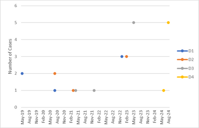
I would like to have a graph with single x axis as date (from min(date) of above table to max(date)) and then number of cases who have a deadline for a given date. So, I am expecting something similar to below:
Thanks
Solved! Go to Solution.
- Mark as New
- Bookmark
- Subscribe
- Mute
- Subscribe to RSS Feed
- Permalink
- Report Inappropriate Content
Hi @hamadani ,
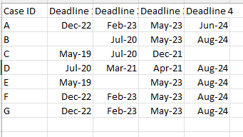
This is my test table:
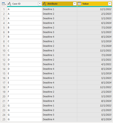
Select "Case ID" and Unpivot other columns:
You will get a table like this:
Close and apply to Power BI, create a measure:
Count of case =
CALCULATE (
    COUNT ( 'Table'[Case ID] ),
    FILTER ( 'Table', 'Table'[Value] = SELECTEDVALUE ( 'Table'[Value] ) )
)
Create a scatter visual:
I think this is the result you want.
Best regards,
Yadong Fang
If this post helps, then please consider Accept it as the solution to help the other members find it more quickly.
- Mark as New
- Bookmark
- Subscribe
- Mute
- Subscribe to RSS Feed
- Permalink
- Report Inappropriate Content
Thank you @amitchandak . However, could you please elaborate on what you mean by "joining all of them"? All data is stored in one table
- Mark as New
- Bookmark
- Subscribe
- Mute
- Subscribe to RSS Feed
- Permalink
- Report Inappropriate Content
@hamadani , Join all of them with a common date table and use date from date table on axis.
Other than one join all other joins will be inactive, use userelationship for that
Helpful resources

FabCon Global Hackathon
Join the Fabric FabCon Global Hackathon—running virtually through Nov 3. Open to all skill levels. $10,000 in prizes!

Power BI Monthly Update - September 2025
Check out the September 2025 Power BI update to learn about new features.


