FabCon is coming to Atlanta
Join us at FabCon Atlanta from March 16 - 20, 2026, for the ultimate Fabric, Power BI, AI and SQL community-led event. Save $200 with code FABCOMM.
Register now!- Power BI forums
- Get Help with Power BI
- Desktop
- Service
- Report Server
- Power Query
- Mobile Apps
- Developer
- DAX Commands and Tips
- Custom Visuals Development Discussion
- Health and Life Sciences
- Power BI Spanish forums
- Translated Spanish Desktop
- Training and Consulting
- Instructor Led Training
- Dashboard in a Day for Women, by Women
- Galleries
- Data Stories Gallery
- Themes Gallery
- Contests Gallery
- QuickViz Gallery
- Quick Measures Gallery
- Visual Calculations Gallery
- Notebook Gallery
- Translytical Task Flow Gallery
- TMDL Gallery
- R Script Showcase
- Webinars and Video Gallery
- Ideas
- Custom Visuals Ideas (read-only)
- Issues
- Issues
- Events
- Upcoming Events
The Power BI Data Visualization World Championships is back! Get ahead of the game and start preparing now! Learn more
- Power BI forums
- Forums
- Get Help with Power BI
- Desktop
- Re: Share your thoughts on the new On-Object Inter...
- Subscribe to RSS Feed
- Mark Topic as New
- Mark Topic as Read
- Float this Topic for Current User
- Bookmark
- Subscribe
- Printer Friendly Page
- Mark as New
- Bookmark
- Subscribe
- Mute
- Subscribe to RSS Feed
- Permalink
- Report Inappropriate Content
Share your thoughts on the new On-Object Interaction feature (preview)
Hit Reply to tell us what you think about the new On-Object Interaction feature so we can continue to improve.
For example:
- What changes would you like to see?
- If you turned off the preview switch, why?
- Any suggestions for addititional settings or capabilities?
Thanks,
-Power BI team
To read more about the feature, see the announcement in the Power BI Product Blog or our documentation on how to Use on-object interaction
FAQs:
- Q: How can I open multiple panes at once?
- A: You can CTRL + click or right click on the unselected pane you wish to open and choose "Open in new pane"
- Q: Where did aggregations move to?
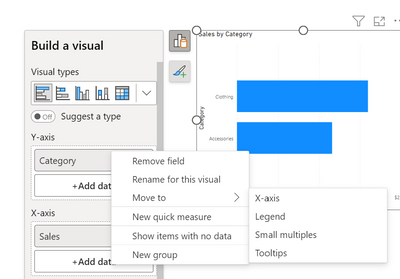
- A: It's still on right click of a field, or you can use the new flyout aggregations dropdown while choosing or swapping a field.
- Q: Where did drillthrough and tooltip page setup move to?
- A: Drillthrough is now in the page settings of the format pane under Page Information > Page type > Drillthrough or Tooltip.
- Mark as New
- Bookmark
- Subscribe
- Mute
- Subscribe to RSS Feed
- Permalink
- Report Inappropriate Content
Turned this preview feature off a few minutes after I turned it on. This has the feel of a feature that was designed by someone who does not use Power BI on the daily. It is counter-productive to 'nest' menus at this deep of level. This feature increased the number of clicks required to do some of the most common tasks. This feature could be okay if shortcut keys were more widely available. Please consider making this feature optional going forward and not a required default.
- Mark as New
- Bookmark
- Subscribe
- Mute
- Subscribe to RSS Feed
- Permalink
- Report Inappropriate Content
Hello RosieL,
I switched back to the clasical mode for these reason.
1) you have to search for the button for each object. it's easier to look at the same place to see what are the data in the visual, than searching for the button and clicking it.
2) I didn't find how to reorganaise fields. (move up and down) drag and drop don't work
3) neither copy paste
4) the suggest format switch cannot be turned off once of all. Sorry but this is useless.
overall, I think that the most ennoying part is the 1). when you are using any software you are used to have functionnalities organised in your "workspace". Moving stuff from one fixed place to a moving one slows down the working process.
that's my 0.02€
- Mark as New
- Bookmark
- Subscribe
- Mute
- Subscribe to RSS Feed
- Permalink
- Report Inappropriate Content
Thank you for this feedback. We are looking into giving users the ability to attach the build menu as a pane again if you prefer the more static nature as before.
We're adding a few improvements for #2 here to make drag/drop zones a bit wider so super precision during dragging should not be required, however it should not be completely broken, would love to learn more about the visual type and which field wells you ran into this broken state. You can also right click on a field and use "move to" to swap which field well the field shows up in.
#3, are you saying copy/paste for a visual also stopped working for you? Could you share more details?
#4 you can set the suggestions to be off by default from the options menu if you prefer:
- Mark as New
- Bookmark
- Subscribe
- Mute
- Subscribe to RSS Feed
- Permalink
- Report Inappropriate Content
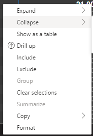
I agree that the copy/paste function doesn't work with this. Using a matrix visual I tried copying a value by right clicking on a cell and no options were given unlike the classic view which gives the expand/collapse etc.
Another EDIT: I re-opened Power BI after turning this function off and because I turned off the preview query function, can't remember now what it was called. Every time I add a measure/attribute it still prompts me to refresh the query before loading the new attribute. Hard to decipher how to turn this function off as well.
Edit: I got the functionality to work by turning off this functionality in preview without rebooting Power BI so I still have the new view with the classic functionality. Obviously this is tedious work just to get it working because I would have to load the preview and close PBI and open again to get the new preview then turn the functionality off again. Then repeat when i close the file as settings would reset.
- Mark as New
- Bookmark
- Subscribe
- Mute
- Subscribe to RSS Feed
- Permalink
- Report Inappropriate Content
Love the idea and in-pane editing of things like title. Turning preview pane off again for now. Some immediate things I don't like:
-No vertical/horizontal only resize options?
-Re-ordering data fields requires too much precision, have to get mouse within just a few pixels
-No inserting data fields other than at the end(?)
I would like to see BOTH the visualization pane (as-is) as well as the new one. Together they can be better than individually.
- Mark as New
- Bookmark
- Subscribe
- Mute
- Subscribe to RSS Feed
- Permalink
- Report Inappropriate Content
Its not hard to use but how do I create drill-throughs now? seriously where did the field well go to insert the drill-through field to enable it?
- Mark as New
- Bookmark
- Subscribe
- Mute
- Subscribe to RSS Feed
- Permalink
- Report Inappropriate Content
- Mark as New
- Bookmark
- Subscribe
- Mute
- Subscribe to RSS Feed
- Permalink
- Report Inappropriate Content
- What changes would you like to see?
- Losing the Visualization pane was a downfall to productivity. It is easier for newcomers, but it gets old too fast as it takes a lot more clicks to get to the same place as it was possible before
- If you turned off the preview switch, why?
- It harmed my productivity
- Any suggestions for addititional settings or capabilities?
- Keep the visualization pane, both working at the same would be incredibly good
- Mark as New
- Bookmark
- Subscribe
- Mute
- Subscribe to RSS Feed
- Permalink
- Report Inappropriate Content
turned it on, then off almost immedietly - I really hope this doesn't become a part of the actual UI and is forced on us. I thought the on-object would be a quick way to get at a simple fix or edit but that the visualizations pane would still be 100% as is, with the list of fields and related objects. As soon as I saw that was not true, I turned off the feature. I need to SEE all my fields, in my face, expecially when there's an error or I'm dealing with dozens of visuals and need to edit each one.
- Mark as New
- Bookmark
- Subscribe
- Mute
- Subscribe to RSS Feed
- Permalink
- Report Inappropriate Content
I tried the new UI, but didn't like it at all. It looks sleek, but is very counter-productive:
1) An extra click is required to add data to any visual
2) On laptop (small screens), you can't see all data fields at once, it requires scrolling up/down to add data, which is time-wasting and huge pain to work with any visuals, especially those have many data fields like tables
3) If a visual is on left side of screen, to drag/drop data fields from "data" pane on right side of screen, the travel distance is now MUCH longer, this alone makes the new UI almost useless. In the past user can drag/drop data fields between "Data/Visualization" next to each other much faster
Speaking as huge PBI fan - this new UI is NOT for serious business users. It turned simple, fast, straightfoward UI into a clustered menu taking a lot more clicks/time to achieve the same thing. It is the opposite of LEAN. Bugs like not showing error fields (exclaimnation marks) is also big turn-off.
I hope it does't get implemented, or at least give user an option to keep the old way.
- Mark as New
- Bookmark
- Subscribe
- Mute
- Subscribe to RSS Feed
- Permalink
- Report Inappropriate Content
I turned it off after a few hours. The UI is less intuitive the options are much more scattered and not all options like adding fields for your drill down filters are available. The visualizations pane is a lot easier and user friendly and a lot quicker (less clicks).
- Mark as New
- Bookmark
- Subscribe
- Mute
- Subscribe to RSS Feed
- Permalink
- Report Inappropriate Content
Hey, another question.
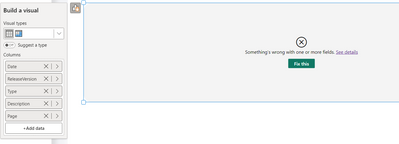
I would expect to see which column is giving me the error of the visual.
- Mark as New
- Bookmark
- Subscribe
- Mute
- Subscribe to RSS Feed
- Permalink
- Report Inappropriate Content
Hi,
Thanks for the update. Looks very intuitive but I need some time to get used to it!
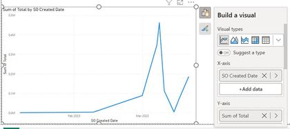
Question tho, I would like to make the size wider of the values popup screen. To know which measure it is, I need to hover on it now.
- Mark as New
- Bookmark
- Subscribe
- Mute
- Subscribe to RSS Feed
- Permalink
- Report Inappropriate Content

All grouped objects lose their properties. When we have an object that is grouped, the properties that appear are the properties of the page, and not of the object, when they do not belong to the previously selected object and not to the current object, it is a mix of properties, which in most cases do not belong to the selected object..
The size parameterizations are wrong, showing that an object cannot have an indicated size, if we add the number to the parameter box, but if we manually stretch the object it works without problem.
In the ntive Funnel visual, it is not possible to drag the items that we add to the values up or down, changing the position of the metrics. For it to work, I had to exit the page, re-enter and refresh the visual.
Microsoft is once again releasing tools without doing the most basic tests.
- Mark as New
- Bookmark
- Subscribe
- Mute
- Subscribe to RSS Feed
- Permalink
- Report Inappropriate Content
All my objects are in groups. I am experiencing the same issue, all my formatting options are completely gone. Despite clearly having a visual selected, the formatting page thinks its on the page level. I am now forced to use this preview feature despite it lacking key features. Also just super frustrated how the amount of clicks to accomplish things keeps increasing.
Please Microsoft invest in more QA resources. Minimal testing would have caught this major bug.
- Mark as New
- Bookmark
- Subscribe
- Mute
- Subscribe to RSS Feed
- Permalink
- Report Inappropriate Content
I did turn off the preview switch because I don't see the Visualization pane which contains my favorite tabs: Build, Format, Analytic. I don't think this is an authentic upgrade of PBI but more like catching the trends to be similarly compared to other BI tools. You normally see people are complaining about hard-to-use PBI but it's just because they're new to the tool or switch from other platforms.
However, if you have to introduce the On-object, please don't turn off the 3 tabs mentioned. It's best to keep it there at the same place. Very handy and useful!
- Mark as New
- Bookmark
- Subscribe
- Mute
- Subscribe to RSS Feed
- Permalink
- Report Inappropriate Content
Coudn't agree more! Same thoughts. The new UI is hugely counter-productive for any serious business user. One-click adding data in the past now becomes several clicks and sorting through clustered menu.
- Mark as New
- Bookmark
- Subscribe
- Mute
- Subscribe to RSS Feed
- Permalink
- Report Inappropriate Content
Do not like this. I turned it off. The visualization toolbar is too important to put it into a pop-up.
- Mark as New
- Bookmark
- Subscribe
- Mute
- Subscribe to RSS Feed
- Permalink
- Report Inappropriate Content
Adding a Date column to a table - don't see an option to add just the date value, it just does hierarchy. If I switch off On Object, there is an option to chose which format to add.
- Mark as New
- Bookmark
- Subscribe
- Mute
- Subscribe to RSS Feed
- Permalink
- Report Inappropriate Content
I've switched the preview feature back off as I find on-object difficult to work with as the width of the columns added to the visual does not well support longer column names. Off-object better uses the available screen real estate without obscuring other objects on the canvas and allows for adjusting the width of the fieldnames. Also, the on-object wastes a lot of space by making the objects taller and resulting in a lot more scrolling.
- Mark as New
- Bookmark
- Subscribe
- Mute
- Subscribe to RSS Feed
- Permalink
- Report Inappropriate Content
Worst addition to PBI so far! Give us the option to disable this or use the old method. Took me 15 minutes to figure out where my **bleep** visualisations went
Helpful resources

Power BI Dataviz World Championships
The Power BI Data Visualization World Championships is back! Get ahead of the game and start preparing now!

| User | Count |
|---|---|
| 39 | |
| 38 | |
| 38 | |
| 28 | |
| 27 |
| User | Count |
|---|---|
| 124 | |
| 88 | |
| 73 | |
| 66 | |
| 65 |


