Get Fabric certified for FREE!
Don't miss your chance to take the Fabric Data Engineer (DP-600) exam for FREE! Find out how by attending the DP-600 session on April 23rd (pacific time), live or on-demand.
Learn more- Power BI forums
- Get Help with Power BI
- Desktop
- Service
- Report Server
- Power Query
- Mobile Apps
- Developer
- DAX Commands and Tips
- Custom Visuals Development Discussion
- Health and Life Sciences
- Power BI Spanish forums
- Translated Spanish Desktop
- Training and Consulting
- Instructor Led Training
- Dashboard in a Day for Women, by Women
- Galleries
- Data Stories Gallery
- Themes Gallery
- Contests Gallery
- QuickViz Gallery
- Quick Measures Gallery
- Visual Calculations Gallery
- Notebook Gallery
- Translytical Task Flow Gallery
- TMDL Gallery
- R Script Showcase
- Webinars and Video Gallery
- Ideas
- Custom Visuals Ideas (read-only)
- Issues
- Issues
- Events
- Upcoming Events
Next up in the FabCon + SQLCon recap series: The roadmap for Microsoft SQL and Maximizing Developer experiences in Fabric. All sessions are available on-demand after the live show. Register now
- Power BI forums
- Forums
- Get Help with Power BI
- Desktop
- Re: Shape Map - Incorrectly Displaying
- Subscribe to RSS Feed
- Mark Topic as New
- Mark Topic as Read
- Float this Topic for Current User
- Bookmark
- Subscribe
- Printer Friendly Page
- Mark as New
- Bookmark
- Subscribe
- Mute
- Subscribe to RSS Feed
- Permalink
- Report Inappropriate Content
Shape Map - Incorrectly Displaying
Recently I downloaded the shapefile for FSA boundaries for Canada found on the Government of Canada's site (https://www12.statcan.gc.ca/census-recensement/2021/geo/sip-pis/boundary-limites/index2021-eng.cfm?y....
After I converted the shapefile to TopoJSON using MapShaper (https://mapshaper.org/) as recommended by the Microsoft's support page (https://learn.microsoft.com/en-us/power-bi/visuals/desktop-shape-map) regarding Shape Map utilization.
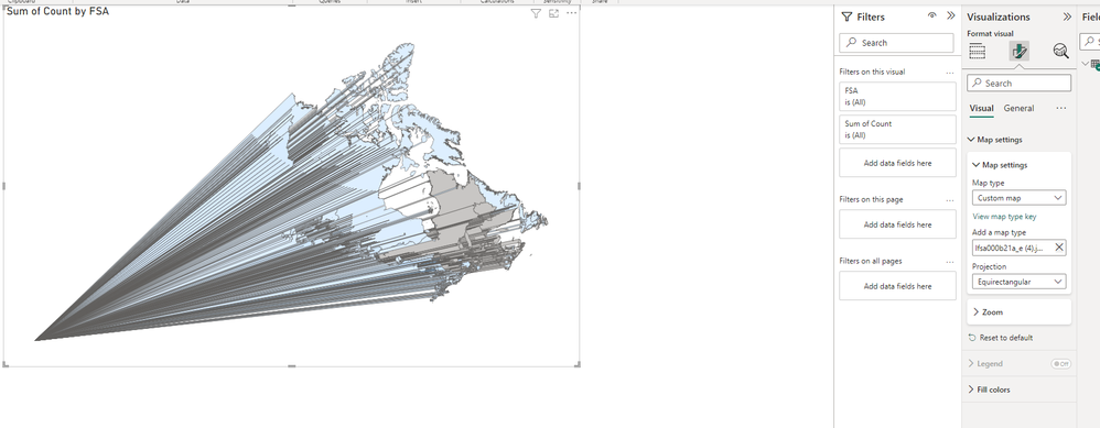
Initially I tried using the biggest file, it seemed too detailed to properly load on my Power BI Desktop (actually crashed my program), so I used a simplified file (using MapShaper's simplify tool) and added the file to Power BI again at a much smaller file size. It's now displaying however, the image is glitched/incorrect, with verticies converging to the bottom left corner of the box... anyone have recommendations on how I can properly get Canada's FSA boundaries to properly display?
Solved! Go to Solution.
- Mark as New
- Bookmark
- Subscribe
- Mute
- Subscribe to RSS Feed
- Permalink
- Report Inappropriate Content
I tried simplifying the shapefile and converting to WGS84 using this command in MapShaper console option.
-proj wgs84
You can get the topoJSon here.
- Mark as New
- Bookmark
- Subscribe
- Mute
- Subscribe to RSS Feed
- Permalink
- Report Inappropriate Content
I tried simplifying the shapefile and converting to WGS84 using this command in MapShaper console option.
-proj wgs84
You can get the topoJSon here.
- Mark as New
- Bookmark
- Subscribe
- Mute
- Subscribe to RSS Feed
- Permalink
- Report Inappropriate Content
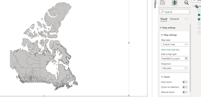
Thank you Danyel! I tried the file you provided and simplified it. Its displaying properly on Power BI now!
I do have a question regarding simplifying, I'm not too familiar with mapping tools like these, on MapShaper for simplifcation, which settings boxes did you tick off for 'Simplification' and 'Method' (Douglas-Peucker, Visvalin Effective Area, Visvalingam Weighted Area, etc) , also how much % did you lower it to for Power BI to process it properly?
- Mark as New
- Bookmark
- Subscribe
- Mute
- Subscribe to RSS Feed
- Permalink
- Report Inappropriate Content
I simplified to 20% and it's still quite big. You can probably find a map that's already simplified.
Some of this algorithms can be quite complex, you can read more on wikipedia for example.
https://en.wikipedia.org/wiki/Ramer%E2%80%93Douglas%E2%80%93Peucker_algorithm
https://en.wikipedia.org/wiki/Visvalingam%E2%80%93Whyatt_algorithm
- Mark as New
- Bookmark
- Subscribe
- Mute
- Subscribe to RSS Feed
- Permalink
- Report Inappropriate Content
I got it down to around 5% and it loaded. Appreciate your help!
- Mark as New
- Bookmark
- Subscribe
- Mute
- Subscribe to RSS Feed
- Permalink
- Report Inappropriate Content
Helpful resources

New to Fabric Survey
If you have recently started exploring Fabric, we'd love to hear how it's going. Your feedback can help with product improvements.

Power BI DataViz World Championships - June 2026
A new Power BI DataViz World Championship is coming this June! Don't miss out on submitting your entry.

Join our Fabric User Panel
Share feedback directly with Fabric product managers, participate in targeted research studies and influence the Fabric roadmap.

| User | Count |
|---|---|
| 48 | |
| 43 | |
| 39 | |
| 19 | |
| 17 |
| User | Count |
|---|---|
| 69 | |
| 63 | |
| 32 | |
| 30 | |
| 23 |


