- Subscribe to RSS Feed
- Mark Topic as New
- Mark Topic as Read
- Float this Topic for Current User
- Bookmark
- Subscribe
- Printer Friendly Page
- Mark as New
- Bookmark
- Subscribe
- Mute
- Subscribe to RSS Feed
- Permalink
- Report Inappropriate Content

Secondary Y-axis - Equal the properties of the first Y-axis
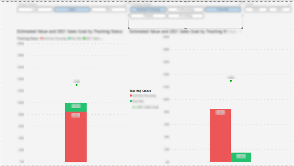
I am utilizing a Line and clustered column visualization and I am needing the secondary Y-axis to equal the properties of the first Y-axis, even as the data Auto-changes for the clustered columns. The reason is because the line data (the dot below) doesn't change. It is the goal we're trying to achieve. So any time the Y-axis auto changes for the clustered columns I need the secondary Y-axis to change with it. Otherwise, the dot keeps it's own properties and doesn't align with the clustered column properties and just doesn't work.
As a work around, I have manually changed the end data for both Y-axises from Auto to the same number on both so that they align, but then when data changes, I have to then go in and update this every time. So I am trying to get away from having to manually do that and just hope that I can somehow setup the Secondary Y-axis to take on the properties of the first axis.
Thank you in advance!
Solved! Go to Solution.
- Mark as New
- Bookmark
- Subscribe
- Mute
- Subscribe to RSS Feed
- Permalink
- Report Inappropriate Content

Hi @sbedford ,
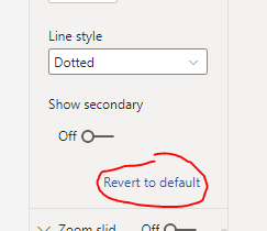
Would you please click Revert to default firstly and check the Show secondary and uncheck the Show secondary:
If this post helps, then please consider Accept it as the solution to help the other members find it more quickly.
Best Regards,
Dedmon Dai
- Mark as New
- Bookmark
- Subscribe
- Mute
- Subscribe to RSS Feed
- Permalink
- Report Inappropriate Content

Hi @sbedford
Click on your chart, and go to the chart's Format tab. Expand the Y Axis dropdown and scroll down. You will see "Show Secondary". Turn that off. If it is already off by default, turn it on and then turn it back off.
If my answer helped, please accept it as a solution!
- Mark as New
- Bookmark
- Subscribe
- Mute
- Subscribe to RSS Feed
- Permalink
- Report Inappropriate Content

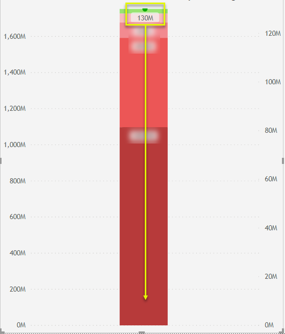
Thank you for the reply, however, that is already turned off. What I am meaning is that when they are set to Auto, I need the secondary axis data points to match the first axis.
See below. The 130M dot from the secondary axis needs to be way down low where the yellow arrow is pointing, but instead it's creating it's own axis parameters which do not align with the original axis. And it's making the chart not make sense.
- Mark as New
- Bookmark
- Subscribe
- Mute
- Subscribe to RSS Feed
- Permalink
- Report Inappropriate Content

I understand that when you look at it at first, it is set to "off". But I believe there is a small glitch in the chart that, although it is off, it is actually on unless you turn it on, then off. Please try toggling to to "On", then back to "Off".
As you can see in my example, my Show Secondary is turned off, but it is still showing
Once I turned it on, then turned it off again, it is now working.
- Mark as New
- Bookmark
- Subscribe
- Mute
- Subscribe to RSS Feed
- Permalink
- Report Inappropriate Content

Hmmm. Mine isn't doing that when I turn it off and back on. 🤔
- Mark as New
- Bookmark
- Subscribe
- Mute
- Subscribe to RSS Feed
- Permalink
- Report Inappropriate Content
- Mark as New
- Bookmark
- Subscribe
- Mute
- Subscribe to RSS Feed
- Permalink
- Report Inappropriate Content
- Mark as New
- Bookmark
- Subscribe
- Mute
- Subscribe to RSS Feed
- Permalink
- Report Inappropriate Content

Hi @sbedford ,
Would you please click Revert to default firstly and check the Show secondary and uncheck the Show secondary:
If this post helps, then please consider Accept it as the solution to help the other members find it more quickly.
Best Regards,
Dedmon Dai
- Mark as New
- Bookmark
- Subscribe
- Mute
- Subscribe to RSS Feed
- Permalink
- Report Inappropriate Content
Hi
It works perfectly on my side. The great thing is that it only shows 1 axis. When I make the secondary axis visible then it doesn't work.
Thank you
Cheers
- Mark as New
- Bookmark
- Subscribe
- Mute
- Subscribe to RSS Feed
- Permalink
- Report Inappropriate Content

That worked! Thank you so much!
Helpful resources
| Subject | Author | Posted | |
|---|---|---|---|
| 01-18-2024 08:48 PM | |||
| 04-01-2024 11:27 PM | |||
| 11-23-2022 02:52 AM | |||
| 01-15-2024 09:21 AM | |||
| 11-22-2024 03:35 PM |
| User | Count |
|---|---|
| 120 | |
| 105 | |
| 84 | |
| 52 | |
| 46 |


