Get Fabric certified for FREE!
Don't miss your chance to take the Fabric Data Engineer (DP-600) exam for FREE! Find out how by watching the DP-600 session on-demand now through April 28th.
Learn more- Power BI forums
- Get Help with Power BI
- Desktop
- Service
- Report Server
- Power Query
- Mobile Apps
- Developer
- DAX Commands and Tips
- Custom Visuals Development Discussion
- Health and Life Sciences
- Power BI Spanish forums
- Translated Spanish Desktop
- Training and Consulting
- Instructor Led Training
- Dashboard in a Day for Women, by Women
- Galleries
- Data Stories Gallery
- Themes Gallery
- Contests Gallery
- QuickViz Gallery
- Quick Measures Gallery
- Visual Calculations Gallery
- Notebook Gallery
- Translytical Task Flow Gallery
- TMDL Gallery
- R Script Showcase
- Webinars and Video Gallery
- Ideas
- Custom Visuals Ideas (read-only)
- Issues
- Issues
- Events
- Upcoming Events
Join the FabCon + SQLCon recap series. Up next: Power BI, Real-Time Intelligence, IQ and AI, and Data Factory take center stage. All sessions are available on-demand after the live show. Register now
- Power BI forums
- Forums
- Get Help with Power BI
- Desktop
- Re: Scatterplot trend line does not go through dat...
- Subscribe to RSS Feed
- Mark Topic as New
- Mark Topic as Read
- Float this Topic for Current User
- Bookmark
- Subscribe
- Printer Friendly Page
- Mark as New
- Bookmark
- Subscribe
- Mute
- Subscribe to RSS Feed
- Permalink
- Report Inappropriate Content
Scatterplot trend line does not go through data
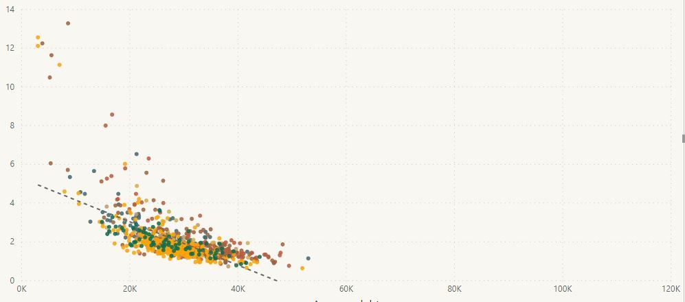
I am adding a trend line to a scatterplot. As you can see in the attached screen shot, the line does not go through the data. I cannot figure out what is going on here. In fact, two of my colleagues have looked at this and we're all stumped.
Things we've tried:
- Turning off all filters and slicers
- Filtering out blank values
- Filtering out values beyond the visible axes
- Turning off all axis limits (i.e., there is no data beyond the visible axes that could be pulling the line)
The line does respond to changes in filters: if we turn filters/slicers on and off, the line will shift, but it never actually goes through the displayed data.
Are there any other things that we should look at?
Edit/Update:
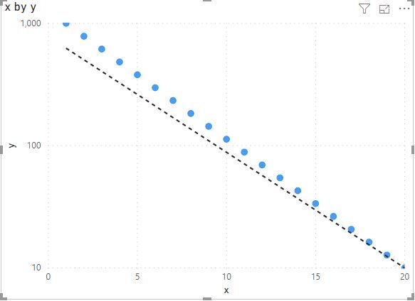
The y-axis is on a log scale. If I change the scale to linear, the line works properly. So, This appears to be a bug. When the y-axis is changed to log, the trend line continues to be on a linear scale. Is there any way to fix this?
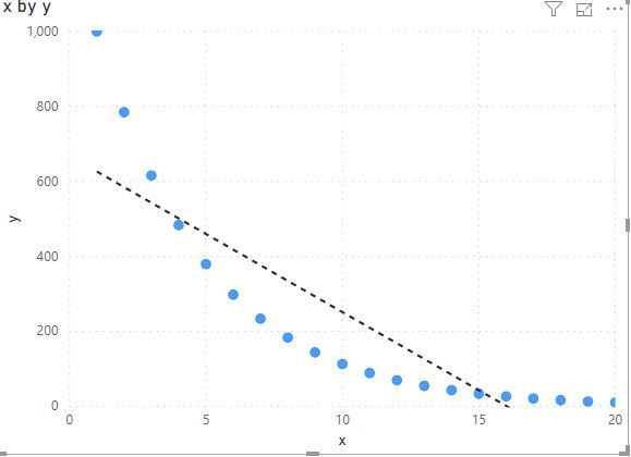
Screen shot of y-axis on a linear scale (same data) added for comparison.
Log scale:
Linear scale:
- Mark as New
- Bookmark
- Subscribe
- Mute
- Subscribe to RSS Feed
- Permalink
- Report Inappropriate Content
Hi! I'm facing the exactly same issue here. Is there any workaround except creating a custom visual by myself?
- Mark as New
- Bookmark
- Subscribe
- Mute
- Subscribe to RSS Feed
- Permalink
- Report Inappropriate Content
Hi @dtan ,
Can you please share some sample data for test? It is hard to test without any sample data.
How to Get Your Question Answered Quickly
Notice: please do mask on sensitive data before share
Regards,
Xiaoxin Sheng
- Mark as New
- Bookmark
- Subscribe
- Mute
- Subscribe to RSS Feed
- Permalink
- Report Inappropriate Content
Sure. Here is a table of log-linear data that I created with python:
| x | y |
| 1 | 1000 |
| 2 | 784.76 |
| 3 | 615.8482 |
| 4 | 483.293 |
| 5 | 379.269 |
| 6 | 297.6351 |
| 7 | 233.5721 |
| 8 | 183.2981 |
| 9 | 143.845 |
| 10 | 112.8838 |
| 11 | 88.58668 |
| 12 | 69.51928 |
| 13 | 54.55595 |
| 14 | 42.81332 |
| 15 | 33.59818 |
| 16 | 26.36651 |
| 17 | 20.69138 |
| 18 | 16.23777 |
| 19 | 12.74275 |
| 20 | 10 |
When I plot this in PowerBI with y on a linear scale, the trend line is correct. When I plot with y on a log scale, the trend line no longer goes through the data.
Linear scale:
Log scale:
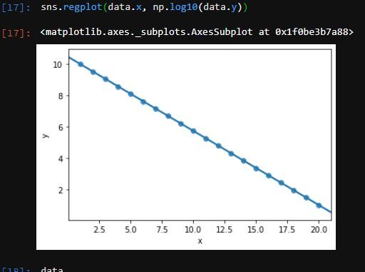
The data were created so that the relationship is perfectly log-linear, and the line should go exactly through the datapoints. Here is a plot I made with the data in python with the y data plotted as log10(y):
- Mark as New
- Bookmark
- Subscribe
- Mute
- Subscribe to RSS Feed
- Permalink
- Report Inappropriate Content
Hi @dtan ,
I can reproduce your scenario.
I build a table from your sample data and add a calculated column based y column, trend line works well as the result that your python code generated.
logY = LOG10([y])
Regards,
Xiaoxin Sheng
- Mark as New
- Bookmark
- Subscribe
- Mute
- Subscribe to RSS Feed
- Permalink
- Report Inappropriate Content
Thanks -- unfortunately with this fix (as in my Python demo) is that the y-axis is now in log-units.
The ideal scenario we're trying for is to have the y-axis in their original units (e.g., 1, 10, 100), but with their spacing on a log scale, and the trend line reflecting the linearized relationship *after* the log transform.
I can't find a clear way to plot the log-transformed datapoints with the values on the y-axis in the original scale, but with the trend line showing the now linearized relationship in PowerBI.
In scripting-based plotting tools you can generally apply values to the y-axis for display purposes (e.g., have 1, 10, and 100, equispaced along the y-axis), while plotting the log-transformed data with the appropriate trendline. Is this possible in PowerBI? Is there a hacky workaround that can be done to display the y-axis in the original units, while plotting the log transformed data with trend line?
More generally, it seems less than ideal to have a trendline *not* go through data after the axis is changed to a log scale (independent of my particular problem -- this is a platform-level issue).
Helpful resources

Power BI Monthly Update - April 2026
Check out the April 2026 Power BI update to learn about new features.

New to Fabric Survey
If you have recently started exploring Fabric, we'd love to hear how it's going. Your feedback can help with product improvements.

Power BI DataViz World Championships - June 2026
A new Power BI DataViz World Championship is coming this June! Don't miss out on submitting your entry.

| User | Count |
|---|---|
| 45 | |
| 38 | |
| 34 | |
| 21 | |
| 17 |
| User | Count |
|---|---|
| 66 | |
| 64 | |
| 31 | |
| 26 | |
| 26 |


