FabCon is coming to Atlanta
Join us at FabCon Atlanta from March 16 - 20, 2026, for the ultimate Fabric, Power BI, AI and SQL community-led event. Save $200 with code FABCOMM.
Register now!- Power BI forums
- Get Help with Power BI
- Desktop
- Service
- Report Server
- Power Query
- Mobile Apps
- Developer
- DAX Commands and Tips
- Custom Visuals Development Discussion
- Health and Life Sciences
- Power BI Spanish forums
- Translated Spanish Desktop
- Training and Consulting
- Instructor Led Training
- Dashboard in a Day for Women, by Women
- Galleries
- Data Stories Gallery
- Themes Gallery
- Contests Gallery
- QuickViz Gallery
- Quick Measures Gallery
- Visual Calculations Gallery
- Notebook Gallery
- Translytical Task Flow Gallery
- TMDL Gallery
- R Script Showcase
- Webinars and Video Gallery
- Ideas
- Custom Visuals Ideas (read-only)
- Issues
- Issues
- Events
- Upcoming Events
The Power BI Data Visualization World Championships is back! Get ahead of the game and start preparing now! Learn more
- Power BI forums
- Forums
- Get Help with Power BI
- Desktop
- Scatterplot line graph plotting issues
- Subscribe to RSS Feed
- Mark Topic as New
- Mark Topic as Read
- Float this Topic for Current User
- Bookmark
- Subscribe
- Printer Friendly Page
- Mark as New
- Bookmark
- Subscribe
- Mute
- Subscribe to RSS Feed
- Permalink
- Report Inappropriate Content
Scatterplot line graph plotting issues
Hi All,
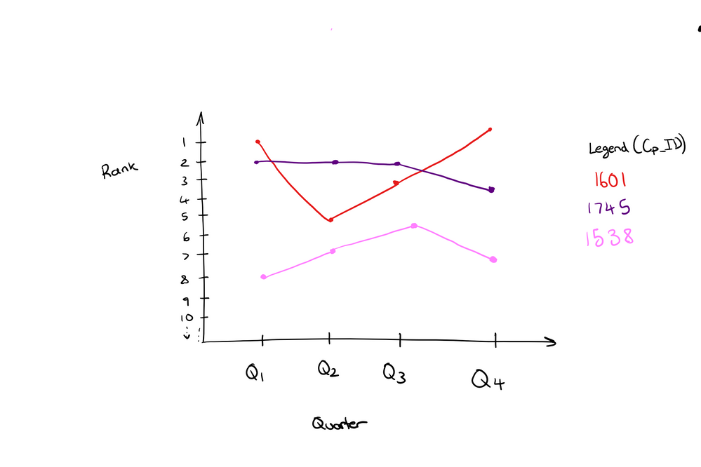
I am trying to plot the rank of a company over the past 4 quarters.
Y-axis: Ranking
X-axis: Quarters
Legend: Comapny (One line for each company)
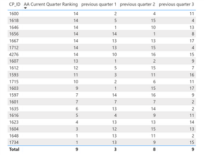
My data is shown below.
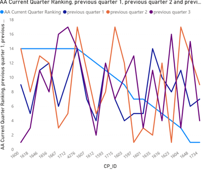
I tried using scatter charts and line charts but CP ID goes to the x-axis (see bwlow) and I cant move the values around in the fields page. Any ideas on how to solve this? Thqanks in advance for all the help!
Solved! Go to Solution.
- Mark as New
- Bookmark
- Subscribe
- Mute
- Subscribe to RSS Feed
- Permalink
- Report Inappropriate Content
Hi @Anonymous ,
It is hard to calculate across multiple columns, I'd like to suggest you to 'unpivot columns' on your quarter fields(at query editor side), then you can write a formula to rolling calculate over these quarter ranges. (id to axis, attribute as legend, measure as value)
Regards,
Xiaoxin Sheng
- Mark as New
- Bookmark
- Subscribe
- Mute
- Subscribe to RSS Feed
- Permalink
- Report Inappropriate Content
Hi @Anonymous ,
Thank you for your response. Just a quick follow up question, is it possible to unpivot tables while they are in a visual? My table is a visual on a page and I used measures to calculate the rankings.
Regards,
Nader
- Mark as New
- Bookmark
- Subscribe
- Mute
- Subscribe to RSS Feed
- Permalink
- Report Inappropriate Content
HI @Anonymous ,
You can use the matrix visual to expand unpivoted fields.(id to rows, attribute to columns, measure as value)
BTW, you can also use duplicate query feature to create a backup table to do calculation with the original table structure.
Regards,
Xiaoxin Sheng
- Mark as New
- Bookmark
- Subscribe
- Mute
- Subscribe to RSS Feed
- Permalink
- Report Inappropriate Content
- Mark as New
- Bookmark
- Subscribe
- Mute
- Subscribe to RSS Feed
- Permalink
- Report Inappropriate Content
Hi @Anonymous ,
not sure what you are looking for on this, however to better compare numbers by Quarters use Line chart and change formatting as per attached screenshot.
let me know if it helps.
Regards,
Washivale
- Mark as New
- Bookmark
- Subscribe
- Mute
- Subscribe to RSS Feed
- Permalink
- Report Inappropriate Content
Hi Washivale,
Thanks for your reply.
I sketched the graph I am trying to make below.
The graph in my original post is the outcome of using the line graph, and I am unable to make CP_ID the legend and plot how the rank of each ID changes over the 4 periods.
I hope this explains what I am trying to achieve.
Helpful resources

Power BI Dataviz World Championships
The Power BI Data Visualization World Championships is back! Get ahead of the game and start preparing now!

| User | Count |
|---|---|
| 40 | |
| 37 | |
| 33 | |
| 29 | |
| 27 |
| User | Count |
|---|---|
| 134 | |
| 104 | |
| 63 | |
| 60 | |
| 55 |


