Join us at FabCon Vienna from September 15-18, 2025
The ultimate Fabric, Power BI, SQL, and AI community-led learning event. Save €200 with code FABCOMM.
Get registered- Power BI forums
- Get Help with Power BI
- Desktop
- Service
- Report Server
- Power Query
- Mobile Apps
- Developer
- DAX Commands and Tips
- Custom Visuals Development Discussion
- Health and Life Sciences
- Power BI Spanish forums
- Translated Spanish Desktop
- Training and Consulting
- Instructor Led Training
- Dashboard in a Day for Women, by Women
- Galleries
- Data Stories Gallery
- Themes Gallery
- Contests Gallery
- Quick Measures Gallery
- Notebook Gallery
- Translytical Task Flow Gallery
- TMDL Gallery
- R Script Showcase
- Webinars and Video Gallery
- Ideas
- Custom Visuals Ideas (read-only)
- Issues
- Issues
- Events
- Upcoming Events
Compete to become Power BI Data Viz World Champion! First round ends August 18th. Get started.
- Power BI forums
- Forums
- Get Help with Power BI
- Desktop
- Re: Scaling Gantt and Line Chart after slicing
- Subscribe to RSS Feed
- Mark Topic as New
- Mark Topic as Read
- Float this Topic for Current User
- Bookmark
- Subscribe
- Printer Friendly Page
- Mark as New
- Bookmark
- Subscribe
- Mute
- Subscribe to RSS Feed
- Permalink
- Report Inappropriate Content
Scaling Gantt and Line Chart after slicing
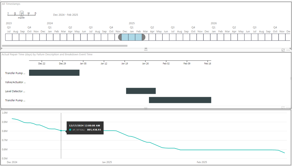
We would like to demonstrate equipment breakdowns against process tank volumes by displaying our volume in a line chart with a Gantt aligned above; the Gantt displays our breakdowns.
Consider the attached image; theTransfer Pump (failure) event should align with the indicated spot of the line graph. The end should very nearly coincide with the point at which the line graph descends again (they're a day apart).
The line chart always scales nicely to the width of the visual, is there a way to scale the Gantt to the width of the visual? Setting the "Gantt Date type" under Format options doesn't accomplish the desired result; it just extends the Gantt to as long as it needs to be, either short of the visual width or longer.
Solved! Go to Solution.
- Mark as New
- Bookmark
- Subscribe
- Mute
- Subscribe to RSS Feed
- Permalink
- Report Inappropriate Content
You are correct; to scale the Gantt chart I have to edit the visual. It's scaled based on ticks; each tick is based on the number of milliseconds in the display unit (day, week, month, etc.). The axis is then set to the margin + number of ticks (among other things).
So to scale my Gantt chart to my line chart (which does make sense in my use, because the failure correlates directly to the volume represented in the line chart) I have to make the ticks dynamic based on the visual display rather than time frame.
If anyone's interested, I'll post the modified Gantt when I'm done.
- Mark as New
- Bookmark
- Subscribe
- Mute
- Subscribe to RSS Feed
- Permalink
- Report Inappropriate Content
I don’t think you can scale the Gantt to the width of the visual, the width of failure description in the Gannt is determined by the Duration.
Gantt chart and Line chart are two different charts, they use different scale type(Line chart uses Linear scale type ) and display report from different dimensions. In my opinion, it doesn’t make sense to scale the width of failure description in Gantt to match the width of points in Line Chart.
Regards,
Lydia Zhang
- Mark as New
- Bookmark
- Subscribe
- Mute
- Subscribe to RSS Feed
- Permalink
- Report Inappropriate Content
You are correct; to scale the Gantt chart I have to edit the visual. It's scaled based on ticks; each tick is based on the number of milliseconds in the display unit (day, week, month, etc.). The axis is then set to the margin + number of ticks (among other things).
So to scale my Gantt chart to my line chart (which does make sense in my use, because the failure correlates directly to the volume represented in the line chart) I have to make the ticks dynamic based on the visual display rather than time frame.
If anyone's interested, I'll post the modified Gantt when I'm done.
- Mark as New
- Bookmark
- Subscribe
- Mute
- Subscribe to RSS Feed
- Permalink
- Report Inappropriate Content
Hello Ballard,
I'd really like to use this modified visual.
May you respond here when you have it finished?
Thanks, Wallace
- Mark as New
- Bookmark
- Subscribe
- Mute
- Subscribe to RSS Feed
- Permalink
- Report Inappropriate Content
I haven't had more opportunity to work on this, but as we get back towards an analysis phase of our project, I might be able to revisit. If I get it created, I will share here.
- Mark as New
- Bookmark
- Subscribe
- Mute
- Subscribe to RSS Feed
- Permalink
- Report Inappropriate Content
OK, thanks.
- Mark as New
- Bookmark
- Subscribe
- Mute
- Subscribe to RSS Feed
- Permalink
- Report Inappropriate Content
@Ballard-Atkins,
You can post the modified Gantt and accept appropriate replies as answer, that way, other community members would easily find the solution when they get same issues.
Regards,
Lydia


