FabCon is coming to Atlanta
Join us at FabCon Atlanta from March 16 - 20, 2026, for the ultimate Fabric, Power BI, AI and SQL community-led event. Save $200 with code FABCOMM.
Register now!- Power BI forums
- Get Help with Power BI
- Desktop
- Service
- Report Server
- Power Query
- Mobile Apps
- Developer
- DAX Commands and Tips
- Custom Visuals Development Discussion
- Health and Life Sciences
- Power BI Spanish forums
- Translated Spanish Desktop
- Training and Consulting
- Instructor Led Training
- Dashboard in a Day for Women, by Women
- Galleries
- Data Stories Gallery
- Themes Gallery
- Contests Gallery
- QuickViz Gallery
- Quick Measures Gallery
- Visual Calculations Gallery
- Notebook Gallery
- Translytical Task Flow Gallery
- TMDL Gallery
- R Script Showcase
- Webinars and Video Gallery
- Ideas
- Custom Visuals Ideas (read-only)
- Issues
- Issues
- Events
- Upcoming Events
The Power BI Data Visualization World Championships is back! Get ahead of the game and start preparing now! Learn more
- Power BI forums
- Forums
- Get Help with Power BI
- Desktop
- Re: Sankey visual - prepare data, best practice
- Subscribe to RSS Feed
- Mark Topic as New
- Mark Topic as Read
- Float this Topic for Current User
- Bookmark
- Subscribe
- Printer Friendly Page
- Mark as New
- Bookmark
- Subscribe
- Mute
- Subscribe to RSS Feed
- Permalink
- Report Inappropriate Content
Sankey visual - prepare data, best practice
As a newbie to powerBI I am looking into visualising bookkeeping data into a sankey diagram. mainly to visualize which accounts sum up to all revenue bookings. But I am stuck on how to proceed and would appreciate any hints/thoughts.
The data is basically structured as follows with simple data:
| Journal entry number | Date | Account number | Debet amount | Credit amount |
| 1 | 20180101 | 3000 | 10 000 | |
| 1 | 20180101 | 1500 | 10 000 | |
| 2 | 20180101 | 3010 | 16 000 | |
| 2 | 20180101 | 1500 | 20 000 | |
| 2 | 20180101 | 2600 | 4 000 | |
| 3 | 20180101 | 3020 | 30 000 | |
| 3 | 20180101 | 1500 | 30 000 | |
| 4 | 20180101 | 3000 | 40 000 | |
| 4 | 20180101 | 1500 | 40 000 |
3xxx-accounts are revenue accounts
2600 a VAT account
1500 an accounts receivable account
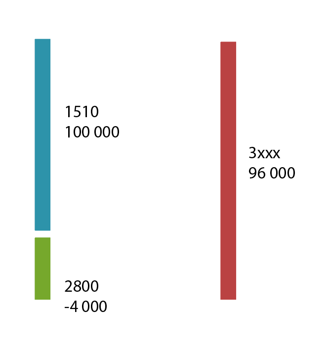
So my goal would be to acheive a diagram for the above showing that total revenue of 10 000 + 16 000 + 30 000 + 40 000 = 96 000 is posted in the bookkeeping with 100 000 against account 1500 and -4 000 against account 2600.
- Mark as New
- Bookmark
- Subscribe
- Mute
- Subscribe to RSS Feed
- Permalink
- Report Inappropriate Content
Hi @kevlin79
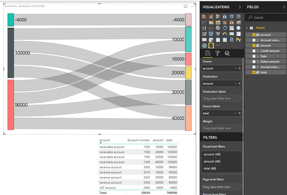
Based on your example dataset and article how to create sankey chart,
I create three calculated columns in your table
category of account number

account =
SWITCH (
    TRUE (),
    LEFT ( [Account number] ) = "3", "revenue account",
    [Account number] = 1500, "receivable account",
    [Account number] = 2600, "VAT account"
)


put amount of each account category from two columns into one column

amount =
SWITCH (
    TRUE (),
    LEFT ( [Account number] ) = "3", [Credit amount],
    [Account number] = 1500, [Debet amount],
    [Account number] = 2600, - [Credit amount]
)


calculate total per account category

total = CALCULATE(SUM(Sheet2[amount]),ALLEXCEPT(Sheet2,Sheet2[account]))
Finally add column to the visual
Best Regards
Maggie
- Mark as New
- Bookmark
- Subscribe
- Mute
- Subscribe to RSS Feed
- Permalink
- Report Inappropriate Content
Many thanks for your answer. Believe I need to do some reading. My goal was to achieve a chart like this (manual illustration). Perhaps I need to create an all new table based on the data in the other table (a consolidated table).
- Mark as New
- Bookmark
- Subscribe
- Mute
- Subscribe to RSS Feed
- Permalink
- Report Inappropriate Content
Hi @kevlin79
Is your problem sloved,
if so, could you share how you do at your convenience or mark my answer as a solution so that others can get help from this thread?
If bot, please don't hesiate to ask me.
Best Regards
Maggie
Helpful resources

Power BI Dataviz World Championships
The Power BI Data Visualization World Championships is back! Get ahead of the game and start preparing now!

| User | Count |
|---|---|
| 39 | |
| 36 | |
| 33 | |
| 31 | |
| 28 |
| User | Count |
|---|---|
| 128 | |
| 88 | |
| 79 | |
| 68 | |
| 63 |


