FabCon is coming to Atlanta
Join us at FabCon Atlanta from March 16 - 20, 2026, for the ultimate Fabric, Power BI, AI and SQL community-led event. Save $200 with code FABCOMM.
Register now!- Power BI forums
- Get Help with Power BI
- Desktop
- Service
- Report Server
- Power Query
- Mobile Apps
- Developer
- DAX Commands and Tips
- Custom Visuals Development Discussion
- Health and Life Sciences
- Power BI Spanish forums
- Translated Spanish Desktop
- Training and Consulting
- Instructor Led Training
- Dashboard in a Day for Women, by Women
- Galleries
- Data Stories Gallery
- Themes Gallery
- Contests Gallery
- Quick Measures Gallery
- Notebook Gallery
- Translytical Task Flow Gallery
- TMDL Gallery
- R Script Showcase
- Webinars and Video Gallery
- Ideas
- Custom Visuals Ideas (read-only)
- Issues
- Issues
- Events
- Upcoming Events
To celebrate FabCon Vienna, we are offering 50% off select exams. Ends October 3rd. Request your discount now.
- Power BI forums
- Forums
- Get Help with Power BI
- Desktop
- Same count for different percent values.
- Subscribe to RSS Feed
- Mark Topic as New
- Mark Topic as Read
- Float this Topic for Current User
- Bookmark
- Subscribe
- Printer Friendly Page
- Mark as New
- Bookmark
- Subscribe
- Mute
- Subscribe to RSS Feed
- Permalink
- Report Inappropriate Content
Same count for different percent values.
I have scutation where I created column chart with % on x axis and distinct values
on y axis based on the % and count column in data
So I have created measure to calculate values
Measure = SUMX(
SUMMARIZE(Sheet1,
Sheet1[%],
Sheet1[Count]),
CALCULATE(
MAX(Sheet1[Count])
Here is my data show in blow table
A | B | C | D | E | F | G | Count | % |
1 | 3655 | 3655 | 1154 | 1 | 145729 | 150048 | 1 | 40 |
1 | 3655 | 3655 | 1154 | 1 | 150755 | 152506 | 1 | 40 |
1 | 3659 | 3659 | 1164 | 2 | 184952 | 184954 | 8 | 60 |
1 | 3659 | 3659 | 1164 | 2 | 184956 | 184957 | 8 | 60 |
1 | 3659 | 3659 | 1164 | 2 | 184958 | 185048 | 8 | 60 |
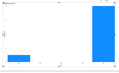
Here is my chart which I have created on dashboard
We have to show 40% of the values (1 to 40) on x axis with the same values which is reflected on 40% bar.
Solved! Go to Solution.
- Mark as New
- Bookmark
- Subscribe
- Mute
- Subscribe to RSS Feed
- Permalink
- Report Inappropriate Content
Hi @Anonymous ,
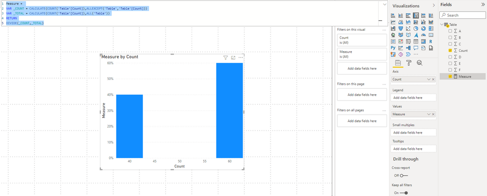
If you want to show 40% in 40 and show 60% in 60, please try this code.
Measure =
VAR _COUNT = CALCULATE(COUNT('Table'[Count]),ALLEXCEPT('Table','Table'[Count]))
VAR _TOTAL = CALCULATE(COUNT('Table'[Count]),ALL('Table'))
RETURN
DIVIDE(_COUNT,_TOTAL)
Result is as below.
If this reply still couldn't help you solve your problem, please tell us more details about your table. Will you use columns A,B,C,D...in your calculation? Please share a same file and show us a screenshot with the result you want.
Best Regards,
Rico Zhou
If this post helps, then please consider Accept it as the solution to help the other members find it more quickly.
- Mark as New
- Bookmark
- Subscribe
- Mute
- Subscribe to RSS Feed
- Permalink
- Report Inappropriate Content
Please provide a more detailed explanation of what you are aiming to achieve. It is not clear (to me) from your description. Your sample data doesn't seem to match the chart.


