FabCon is coming to Atlanta
Join us at FabCon Atlanta from March 16 - 20, 2026, for the ultimate Fabric, Power BI, AI and SQL community-led event. Save $200 with code FABCOMM.
Register now!- Power BI forums
- Get Help with Power BI
- Desktop
- Service
- Report Server
- Power Query
- Mobile Apps
- Developer
- DAX Commands and Tips
- Custom Visuals Development Discussion
- Health and Life Sciences
- Power BI Spanish forums
- Translated Spanish Desktop
- Training and Consulting
- Instructor Led Training
- Dashboard in a Day for Women, by Women
- Galleries
- Data Stories Gallery
- Themes Gallery
- Contests Gallery
- QuickViz Gallery
- Quick Measures Gallery
- Visual Calculations Gallery
- Notebook Gallery
- Translytical Task Flow Gallery
- TMDL Gallery
- R Script Showcase
- Webinars and Video Gallery
- Ideas
- Custom Visuals Ideas (read-only)
- Issues
- Issues
- Events
- Upcoming Events
The Power BI Data Visualization World Championships is back! Get ahead of the game and start preparing now! Learn more
- Power BI forums
- Forums
- Get Help with Power BI
- Desktop
- Re: SPC chart (I-MR) - Line chart, straight line u...
- Subscribe to RSS Feed
- Mark Topic as New
- Mark Topic as Read
- Float this Topic for Current User
- Bookmark
- Subscribe
- Printer Friendly Page
- Mark as New
- Bookmark
- Subscribe
- Mute
- Subscribe to RSS Feed
- Permalink
- Report Inappropriate Content
SPC chart (I-MR) - Line chart, straight line using Single Value
Hi,
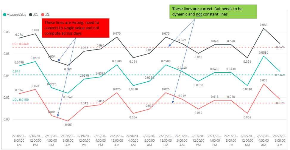
Objective is to create I-MR chart (simplest of SPC chart type). I'm almost complete with great help from forum. Final help needed.
Help needed: In Line Chart, need to add 2 straight lines (from measures). a) Upper Control Limit, UCL and b) Lower Control Limit, LCL. One Single value instead of computing across days.
Problem: Due to calculations, the UCL and LCL lines are computed across days. My goal is 2 straight lines with UCL= 0.066 and LCL=0.015. Actual data set is much larger, as such i cant use the analytics function to draw 2 constant lines.
LCL = [Mean]-2.66*[Sigma]

UCL = [Mean]+2.66*[Sigma]
sample pbix https://1drv.ms/u/s!ArjVwEnHONXNgh2-T7FtnCPcmkYg
Other DAX
UCL = [Mean]+2.66*[Sigma]

Sigma = [MRBar]/1.128

MRBar = AverageX(ALLSELECTED(data1[TimeSPC]);[MovingRange])

MovingRange =
IF(ISBLANK(data1[EarlierTime]);blank();(
VAR EarlierTime = CALCULATE ( MAX ( data1[TimeSPC] ); FILTER ( ALLSELECTED ( data1[TimeSPC] ); data1[TimeSPC] < SELECTEDVALUE ( data1[TimeSPC] ) ) )
VAR EarlierMeasureValue = CALCULATE ( SUM ( data1[MeasureValue] ); data1[TimeSPC] = EarlierTime )
RETURN ABS ( EarlierMeasureValue - SUM ( data1[MeasureValue] ) ) ))
- Mark as New
- Bookmark
- Subscribe
- Mute
- Subscribe to RSS Feed
- Permalink
- Report Inappropriate Content
UCLConstant = CALCULATE( [Mean]+2.66*[Sigma], ALLSELECTED( data1[TimeSPC] ))
- Mark as New
- Bookmark
- Subscribe
- Mute
- Subscribe to RSS Feed
- Permalink
- Report Inappropriate Content
Hi @vincentakatoh,
Actually, I am confused your sentence: "Actual data set is much larger, as such i cant use the analytics function to draw 2 constant lines." You can add two lines easily as follows.
Best Regards,
Angelia
- Mark as New
- Bookmark
- Subscribe
- Mute
- Subscribe to RSS Feed
- Permalink
- Report Inappropriate Content
When you calculate mean for the year, you will have 2 lines LCL and UCL on a constant value. The measure mean is as follows:
Mean =
CALCULATE (
AVERAGE ( [MeasureValue] );
FILTER ( ALL ( data1 ); data1[MeasureValue] )
)
- Mark as New
- Bookmark
- Subscribe
- Mute
- Subscribe to RSS Feed
- Permalink
- Report Inappropriate Content
I have an Excel SPC chart but need to add in data for different data sets and create an interactive Power BI chart is this possible?
Helpful resources

Power BI Dataviz World Championships
The Power BI Data Visualization World Championships is back! Get ahead of the game and start preparing now!

| User | Count |
|---|---|
| 38 | |
| 38 | |
| 36 | |
| 28 | |
| 28 |
| User | Count |
|---|---|
| 124 | |
| 88 | |
| 74 | |
| 66 | |
| 65 |


