FabCon is coming to Atlanta
Join us at FabCon Atlanta from March 16 - 20, 2026, for the ultimate Fabric, Power BI, AI and SQL community-led event. Save $200 with code FABCOMM.
Register now!- Power BI forums
- Get Help with Power BI
- Desktop
- Service
- Report Server
- Power Query
- Mobile Apps
- Developer
- DAX Commands and Tips
- Custom Visuals Development Discussion
- Health and Life Sciences
- Power BI Spanish forums
- Translated Spanish Desktop
- Training and Consulting
- Instructor Led Training
- Dashboard in a Day for Women, by Women
- Galleries
- Data Stories Gallery
- Themes Gallery
- Contests Gallery
- Quick Measures Gallery
- Notebook Gallery
- Translytical Task Flow Gallery
- TMDL Gallery
- R Script Showcase
- Webinars and Video Gallery
- Ideas
- Custom Visuals Ideas (read-only)
- Issues
- Issues
- Events
- Upcoming Events
To celebrate FabCon Vienna, we are offering 50% off select exams. Ends October 3rd. Request your discount now.
- Power BI forums
- Forums
- Get Help with Power BI
- Desktop
- SPC chart (I-MR) - Line chart, straight line using...
- Subscribe to RSS Feed
- Mark Topic as New
- Mark Topic as Read
- Float this Topic for Current User
- Bookmark
- Subscribe
- Printer Friendly Page
- Mark as New
- Bookmark
- Subscribe
- Mute
- Subscribe to RSS Feed
- Permalink
- Report Inappropriate Content
SPC chart (I-MR) - Line chart, straight line using Single Value
Hi,
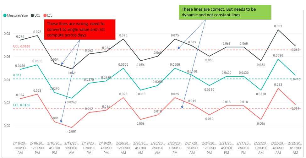
Objective is to create I-MR chart (simplest of SPC chart type). I'm almost complete with great help from forum. Final help needed.
Help needed: In Line Chart, need to add 2 straight lines (from measures). a) Upper Control Limit, UCL and b) Lower Control Limit, LCL. One Single value instead of computing across days.
Problem: Due to calculations, the UCL and LCL lines are computed across days. My goal is 2 straight lines with UCL= 0.066 and LCL=0.015. Actual data set is much larger, as such i cant use the analytics function to draw 2 constant lines.
LCL = [Mean]-2.66*[Sigma]

UCL = [Mean]+2.66*[Sigma]
sample pbix https://1drv.ms/u/s!ArjVwEnHONXNgh2-T7FtnCPcmkYg
Other DAX
UCL = [Mean]+2.66*[Sigma]

Sigma = [MRBar]/1.128

MRBar = AverageX(ALLSELECTED(data1[TimeSPC]);[MovingRange])

MovingRange =
IF(ISBLANK(data1[EarlierTime]);blank();(
VAR EarlierTime = CALCULATE ( MAX ( data1[TimeSPC] ); FILTER ( ALLSELECTED ( data1[TimeSPC] ); data1[TimeSPC] < SELECTEDVALUE ( data1[TimeSPC] ) ) )
VAR EarlierMeasureValue = CALCULATE ( SUM ( data1[MeasureValue] ); data1[TimeSPC] = EarlierTime )
RETURN ABS ( EarlierMeasureValue - SUM ( data1[MeasureValue] ) ) ))
- Mark as New
- Bookmark
- Subscribe
- Mute
- Subscribe to RSS Feed
- Permalink
- Report Inappropriate Content
UCLConstant = CALCULATE( [Mean]+2.66*[Sigma], ALLSELECTED( data1[TimeSPC] ))
- Mark as New
- Bookmark
- Subscribe
- Mute
- Subscribe to RSS Feed
- Permalink
- Report Inappropriate Content
Hi @vincentakatoh,
Actually, I am confused your sentence: "Actual data set is much larger, as such i cant use the analytics function to draw 2 constant lines." You can add two lines easily as follows.
Best Regards,
Angelia
- Mark as New
- Bookmark
- Subscribe
- Mute
- Subscribe to RSS Feed
- Permalink
- Report Inappropriate Content
When you calculate mean for the year, you will have 2 lines LCL and UCL on a constant value. The measure mean is as follows:
Mean =
CALCULATE (
AVERAGE ( [MeasureValue] );
FILTER ( ALL ( data1 ); data1[MeasureValue] )
)
- Mark as New
- Bookmark
- Subscribe
- Mute
- Subscribe to RSS Feed
- Permalink
- Report Inappropriate Content
I have an Excel SPC chart but need to add in data for different data sets and create an interactive Power BI chart is this possible?


