Fabric Data Days starts November 4th!
Advance your Data & AI career with 50 days of live learning, dataviz contests, hands-on challenges, study groups & certifications and more!
Get registered- Power BI forums
- Get Help with Power BI
- Desktop
- Service
- Report Server
- Power Query
- Mobile Apps
- Developer
- DAX Commands and Tips
- Custom Visuals Development Discussion
- Health and Life Sciences
- Power BI Spanish forums
- Translated Spanish Desktop
- Training and Consulting
- Instructor Led Training
- Dashboard in a Day for Women, by Women
- Galleries
- Data Stories Gallery
- Themes Gallery
- Contests Gallery
- QuickViz Gallery
- Quick Measures Gallery
- Visual Calculations Gallery
- Notebook Gallery
- Translytical Task Flow Gallery
- TMDL Gallery
- R Script Showcase
- Webinars and Video Gallery
- Ideas
- Custom Visuals Ideas (read-only)
- Issues
- Issues
- Events
- Upcoming Events
Get Fabric Certified for FREE during Fabric Data Days. Don't miss your chance! Request now
- Power BI forums
- Forums
- Get Help with Power BI
- Desktop
- Re: Reference Line on x-axis
- Subscribe to RSS Feed
- Mark Topic as New
- Mark Topic as Read
- Float this Topic for Current User
- Bookmark
- Subscribe
- Printer Friendly Page
- Mark as New
- Bookmark
- Subscribe
- Mute
- Subscribe to RSS Feed
- Permalink
- Report Inappropriate Content
Reference Line on x-axis
I have date on my x-axis of a Line chart.
I need a vertical reference line on a particular (dynamic) date to see if my trend line crossed that date or not.
Thanks.
Solved! Go to Solution.
- Mark as New
- Bookmark
- Subscribe
- Mute
- Subscribe to RSS Feed
- Permalink
- Report Inappropriate Content
Hi @naitiksoni
To draw the Vertical reference line is currently not possible. You can use bit of trick though. Use Shapes to create a static vertical line and it is not dynamic as explained. See the attached screenshot.
Bhavesh
Love the Self Service BI.
Please use the 'Mark as answer' link to mark a post that answers your question. If you find a reply helpful, please remember to give Kudos.
- Mark as New
- Bookmark
- Subscribe
- Mute
- Subscribe to RSS Feed
- Permalink
- Report Inappropriate Content
Hi @naitiksoni,
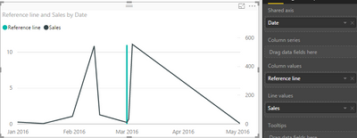
A vertical reference line is not available now. To work around this requirement, you can try to use a combination chart.
- Create a "line and stacked column chart"
- Put column [date] into shared axis and put [values] into line values.
- Create a measure that evaluates to the maximum value when Date=specific date(otherwise blank), put this measure into column values.
Measures can be:
Reference line =
    IF (
        HASONEVALUE ( Table1[Date] ),
        IF (
            VALUES ( Table1[Date] ) = DATE ( 2016, 3, 1 ),
            MAXX ( ALL ( Table1[Date] ), MAX ( Table1[Sales] ) )
        )
    )
Thanks,
Yuliana Gu
If this post helps, then please consider Accept it as the solution to help the other members find it more quickly.
- Mark as New
- Bookmark
- Subscribe
- Mute
- Subscribe to RSS Feed
- Permalink
- Report Inappropriate Content
As an FYI here is a related idea to vote for:https://ideas.powerbi.com/forums/265200-power-bi-ideas/suggestions/19550122-vertical-reference-lines...
- Mark as New
- Bookmark
- Subscribe
- Mute
- Subscribe to RSS Feed
- Permalink
- Report Inappropriate Content
Hi @naitiksoni,
A vertical reference line is not available now. To work around this requirement, you can try to use a combination chart.
- Create a "line and stacked column chart"
- Put column [date] into shared axis and put [values] into line values.
- Create a measure that evaluates to the maximum value when Date=specific date(otherwise blank), put this measure into column values.
Measures can be:
Reference line =
    IF (
        HASONEVALUE ( Table1[Date] ),
        IF (
            VALUES ( Table1[Date] ) = DATE ( 2016, 3, 1 ),
            MAXX ( ALL ( Table1[Date] ), MAX ( Table1[Sales] ) )
        )
    )
Thanks,
Yuliana Gu
If this post helps, then please consider Accept it as the solution to help the other members find it more quickly.
- Mark as New
- Bookmark
- Subscribe
- Mute
- Subscribe to RSS Feed
- Permalink
- Report Inappropriate Content
Is there a way to get multiple vertical reference lines?
I tried this,
Reference line =
IF (
HASONEVALUE( Query1[datetime] ),
IF (
VALUES ( Query1[datetime] ) = DATESBETWEEN(Query2[DATE], DATE(2018,1,1), DATE(2018,12,31)),
MAXX ( ALL ( Query1[datetime] ), MAX ( Query1[param1] ) )
)
)
I get further error,
Error Message:

MdxScript(Model) (7, 43) Calculation error in measure 'Query1'[Reference line]: A table of multiple values was supplied where a single value was expected.
- Mark as New
- Bookmark
- Subscribe
- Mute
- Subscribe to RSS Feed
- Permalink
- Report Inappropriate Content
curious to see if you ever got this working.
I have a list of events that I'd like to reference as points or bars in my graphs. Keep thinking that this original formula for static ref points
Reference line =
    IF (
        HASONEVALUE ( 'Date'[Date] ),
        IF (
            VALUES ( 'Date'[Date] ) = DATE ( 2019, 03, 03),
            MAXX ( ALL ( 'Date'[Date] ), MAX ( WeeklyAnalysis[Actuals_CY] ) )
        )
)- Mark as New
- Bookmark
- Subscribe
- Mute
- Subscribe to RSS Feed
- Permalink
- Report Inappropriate Content
Hi @Anonymous
No, Unfortunately I didnt manage to get it to work
Matt
- Mark as New
- Bookmark
- Subscribe
- Mute
- Subscribe to RSS Feed
- Permalink
- Report Inappropriate Content
I have a project with Production deployed to date, for this project, there are Incidents associated with it and for each incident, there is created date. My requirement is, I have to plot count of incidents based on their create date on X-Axis. But the challenge here is I have to include a vertical line on X-Axis based on Production deployed to date so that user will quickly identify when the project is deployed on production and he can quickly check how many incidents are raised before one month and after one month. Please help me know how can I achieve this.
- Mark as New
- Bookmark
- Subscribe
- Mute
- Subscribe to RSS Feed
- Permalink
- Report Inappropriate Content
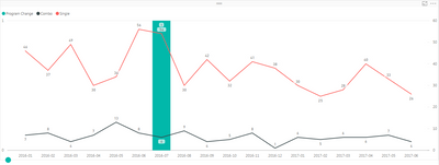
Not sure if the issue is still open or not, but I recently had to tackle a similar issue. I saw that there was a way to use a combo chart to create the reference line with a measure, but you can't split your line chart into multiple categories with the combo chart, so that didn't meet my needs.
The best way I found to have a dynamic reference line was to overlap multiple visuals on top of each other.
- Create your line chart like normal with no reference line
- Create a measure with the basic equation below (assuming you're plotting by date):
- if(datevalue(max(<date on your x-axis>)) = Date(<event date>),1,0)
- My report required the user to input a desired event date. So I used parameters for Day, Month, and Year:<event date> above = Date('Year'[Year Value],'Month'[Month Value],'Day'[Day Value])
- Copy and paste your line chart, convert it to a column chart, and put your new measure into the "column values" pill
- Move your column chart directly behind your line chart, and make everything on the chart except for your column color white (axis, title, etc.)
- Now you should have a dynamic reference line! The only problem is that the axes of the two charts are not aligned
- To get around the axes being unsynced, I turned off the y-axis completely of both charts, so that differences in their scale would no longer change the aspect ratio of the chart
- I then created a 3RD CHART that is yet another copy of the line chart. Here, I made everything white except for the y axis, including the data colors. That way we now have a y-axis that follows our filters, but does not affect the aspect ratio of the charts that is actually show our data and the reference line
The only downfall of this method is that, if you have new categories come into your data later, you will have to go back into your 3rd chart and make those new categories white.
Hope this helps!
- Mark as New
- Bookmark
- Subscribe
- Mute
- Subscribe to RSS Feed
- Permalink
- Report Inappropriate Content
Thank you for providing this helpful solution to a similar problem I've had!
I implelemented it and it works as expected. Your screen shot, however, shows a very thin line (which I like) while mine is quite thick. I can't seem to find any formatting option that controls the width of the column(s).
Am I missing something? Can you please point me to this option?
- Mark as New
- Bookmark
- Subscribe
- Mute
- Subscribe to RSS Feed
- Permalink
- Report Inappropriate Content
How did you get the vertical line to show on a multi-line chart?
I've seen this example on a combination chart but it only appears to work for multi-bar, single line combination and not the multi-line chart.
- Mark as New
- Bookmark
- Subscribe
- Mute
- Subscribe to RSS Feed
- Permalink
- Report Inappropriate Content
Hi
I know this is an old but did you manage to fiure our how to make the column thinner? Ive tried the padding but it doesnt change it enough for what I would like
Thanks
Matt
- Mark as New
- Bookmark
- Subscribe
- Mute
- Subscribe to RSS Feed
- Permalink
- Report Inappropriate Content
- Mark as New
- Bookmark
- Subscribe
- Mute
- Subscribe to RSS Feed
- Permalink
- Report Inappropriate Content
@Sha_Kri if you change your X-Axis - Type to "Categorical" you can set the Inner padding to the maximum, which makes the columns thinner.
Only option I have found to far.
- Mark as New
- Bookmark
- Subscribe
- Mute
- Subscribe to RSS Feed
- Permalink
- Report Inappropriate Content
My company has moved on from Power BI to Tableau. I don't recall if I figured out how to make the line thinner. It is of little concern to me right now. Best of luck to you.
- Mark as New
- Bookmark
- Subscribe
- Mute
- Subscribe to RSS Feed
- Permalink
- Report Inappropriate Content
- Mark as New
- Bookmark
- Subscribe
- Mute
- Subscribe to RSS Feed
- Permalink
- Report Inappropriate Content
Bhavesh
Love the Self Service BI.
Please use the 'Mark as answer' link to mark a post that answers your question. If you find a reply helpful, please remember to give Kudos.
- Mark as New
- Bookmark
- Subscribe
- Mute
- Subscribe to RSS Feed
- Permalink
- Report Inappropriate Content
Hi @naitiksoni
To draw the Vertical reference line is currently not possible. You can use bit of trick though. Use Shapes to create a static vertical line and it is not dynamic as explained. See the attached screenshot.
Bhavesh
Love the Self Service BI.
Please use the 'Mark as answer' link to mark a post that answers your question. If you find a reply helpful, please remember to give Kudos.
Helpful resources

Fabric Data Days
Advance your Data & AI career with 50 days of live learning, contests, hands-on challenges, study groups & certifications and more!

Power BI Monthly Update - October 2025
Check out the October 2025 Power BI update to learn about new features.


