Get certified for free when you join Fabric Data Days 2026 and dive into Fabric, Power BI, SQL, AI, and other essential data skills.
Join nowJuly 28 - August 9 | Final Round of the Power BI Dataviz World Championships. This is your chance. Learn more
Hi guys,
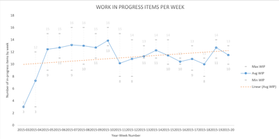
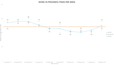
Really enjoying the capabilities I'm getting from Power BI. Struggling with one chart I'm trying to recreate. Essentially I'm trying to show the average number of items in progress (WIP) in a week, as well as the max, min and linear WIP.
Using Excel I get this chart:
However best I can do in Power BI is this:
Any ideas around how I could get a version better aligned with what I had in Excel?
@Anonymous,
You may directly try Power BI publisher for Excel.
Thanks for the reply, and yes fully aware of that, however using the OData connector I don't really want to add Excel into the mix as well...the intention is for these charts to be live 🙂
If you love stickers, then you will definitely want to check out our community sticker challenge, Barcelona edition!
Check out the July 2026 Power BI update to learn about new features.
| User | Count |
|---|---|
| 26 | |
| 22 | |
| 22 | |
| 20 | |
| 17 |
| User | Count |
|---|---|
| 35 | |
| 29 | |
| 21 | |
| 19 | |
| 17 |