Get Fabric certified for FREE!
Don't miss your chance to take the Fabric Data Engineer (DP-600) exam for FREE! Find out how by watching the DP-600 session on-demand now through April 28th.
Learn more- Power BI forums
- Get Help with Power BI
- Desktop
- Service
- Report Server
- Power Query
- Mobile Apps
- Developer
- DAX Commands and Tips
- Custom Visuals Development Discussion
- Health and Life Sciences
- Power BI Spanish forums
- Translated Spanish Desktop
- Training and Consulting
- Instructor Led Training
- Dashboard in a Day for Women, by Women
- Galleries
- Data Stories Gallery
- Themes Gallery
- Contests Gallery
- QuickViz Gallery
- Quick Measures Gallery
- Visual Calculations Gallery
- Notebook Gallery
- Translytical Task Flow Gallery
- TMDL Gallery
- R Script Showcase
- Webinars and Video Gallery
- Ideas
- Custom Visuals Ideas (read-only)
- Issues
- Issues
- Events
- Upcoming Events
Join the FabCon + SQLCon recap series. Up next: Power BI, Real-Time Intelligence, IQ and AI, and Data Factory take center stage. All sessions are available on-demand after the live show. Register now
- Power BI forums
- Forums
- Get Help with Power BI
- Desktop
- Re: Radar chart
- Subscribe to RSS Feed
- Mark Topic as New
- Mark Topic as Read
- Float this Topic for Current User
- Bookmark
- Subscribe
- Printer Friendly Page
- Mark as New
- Bookmark
- Subscribe
- Mute
- Subscribe to RSS Feed
- Permalink
- Report Inappropriate Content
Radar chart
Hi,
I'm trying to add a radar chart in my Power BI report but I think it isn't working well... I'd like to change de order of the "Category" field.
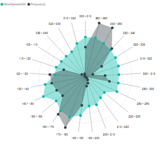
I'd like to show the radar chart like this one:
Thanks!
Solved! Go to Solution.
- Mark as New
- Bookmark
- Subscribe
- Mute
- Subscribe to RSS Feed
- Permalink
- Report Inappropriate Content
Hi @aitor,
Based on my test in the Radar chart, there is no OOTB feature available for us to specify direction of display category field. Currently, the radar chart displays category field in anticlockwise direction from A-Z automatically.
For your requirement, I would suggest you send a feedback to Power BI Custom Visuals Support alias: pbicvsupport@microsoft.com.
If you have any question, please feel free to ask.
Best Regards,
Qiuyun Yu
If this post helps, then please consider Accept it as the solution to help the other members find it more quickly.
- Mark as New
- Bookmark
- Subscribe
- Mute
- Subscribe to RSS Feed
- Permalink
- Report Inappropriate Content
- Mark as New
- Bookmark
- Subscribe
- Mute
- Subscribe to RSS Feed
- Permalink
- Report Inappropriate Content
Hi, did you ever get a response back from this?
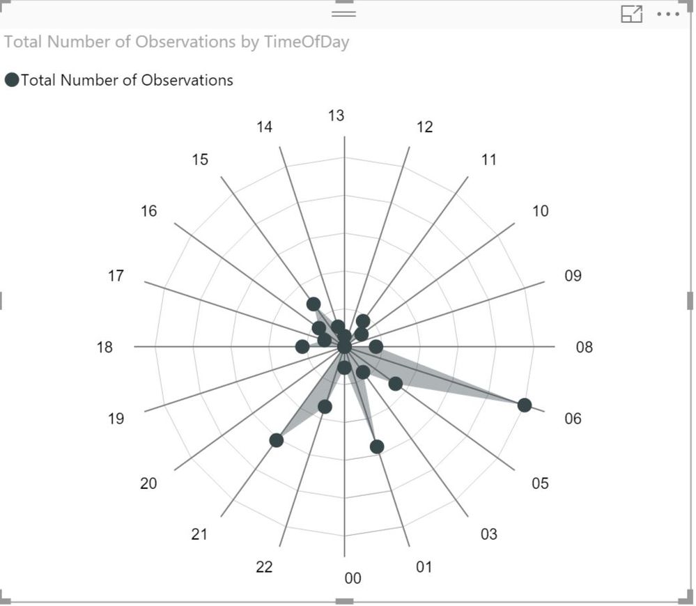
I have a similar question, except my 'category' variable is hour of day (as a calculated column that extracts 'hour' from a SQL datetime stamp using the FORMAT() dax function). Currently the radar chart displays hours in 24hr format, with the 00hrs at the bottom, and goes anticlockwise.
What I really want is the 00 to start at the top and go to 01, 02 etc. in a clockwise direction. I can't see a way to do this in the custom radar chart - perhaps there's another custom visual that does what I want?
In Tableau, there was a similar chart referred to as a 'Coxcomb' chart, but it was pretty complex to construct.
- Mark as New
- Bookmark
- Subscribe
- Mute
- Subscribe to RSS Feed
- Permalink
- Report Inappropriate Content
In terms or ordering your categories, you don't do this in the visual itself. You do this to the table that stores your category data.
For example, let's say you have a table for days of the week. It has an Id column and a Name column (Monday, Tuesday, etc.). Go to Data, select your table, select the Name column, then go to the Modeling tab and select Sort. Choose to sort the Name column by the Id.
This should then reflect in your visual.
Hope that helps,
C
Helpful resources

Power BI Monthly Update - April 2026
Check out the April 2026 Power BI update to learn about new features.

New to Fabric Survey
If you have recently started exploring Fabric, we'd love to hear how it's going. Your feedback can help with product improvements.

Power BI DataViz World Championships - June 2026
A new Power BI DataViz World Championship is coming this June! Don't miss out on submitting your entry.

| User | Count |
|---|---|
| 48 | |
| 40 | |
| 38 | |
| 20 | |
| 17 |
| User | Count |
|---|---|
| 68 | |
| 65 | |
| 30 | |
| 26 | |
| 25 |


