Get Fabric certified for FREE!
Don't miss your chance to take the Fabric Data Engineer (DP-700) exam on us!
Learn more- Power BI forums
- Get Help with Power BI
- Desktop
- Service
- Report Server
- Power Query
- Mobile Apps
- Developer
- DAX Commands and Tips
- Custom Visuals Development Discussion
- Health and Life Sciences
- Power BI Spanish forums
- Translated Spanish Desktop
- Training and Consulting
- Instructor Led Training
- Dashboard in a Day for Women, by Women
- Galleries
- Data Stories Gallery
- Themes Gallery
- Contests Gallery
- QuickViz Gallery
- Quick Measures Gallery
- Visual Calculations Gallery
- Notebook Gallery
- Translytical Task Flow Gallery
- TMDL Gallery
- R Script Showcase
- Webinars and Video Gallery
- Ideas
- Custom Visuals Ideas (read-only)
- Issues
- Issues
- Events
- Upcoming Events
The FabCon + SQLCon recap series starts April 14th at 8am Pacific. If you’re tracking where AI is going inside Fabric, this first session is a can't miss. Register now
- Power BI forums
- Forums
- Get Help with Power BI
- Desktop
- Pie Chart and Calculation Help
- Subscribe to RSS Feed
- Mark Topic as New
- Mark Topic as Read
- Float this Topic for Current User
- Bookmark
- Subscribe
- Printer Friendly Page
- Mark as New
- Bookmark
- Subscribe
- Mute
- Subscribe to RSS Feed
- Permalink
- Report Inappropriate Content
Pie Chart and Calculation Help
My dataset is has a Start Date and a Finish Date, and from this information I am currently calculating Day Count, Days Remaining and Days Complete.
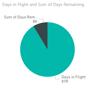
I am trying to represent within a pie chart, how many days have been completed, and how many days are remaining, however Power BI is summing the rows because the dataset itself is aggregated daily. Unlike the "table visualization", there is not an option for "Don't Summarize". The pictures below show the pie chart with the "Days in Flight" and "Days Remaining" summed, and the table view with the correct information.
I am looking for two answers/suggestions:
1. How can I have the pie chart not sum the Days Remaining or Days in Flight?
(I believe this is a product of the dataset which has a daily aggregation.)
2. How can I show only percentages in the pie chart?
- Mark as New
- Bookmark
- Subscribe
- Mute
- Subscribe to RSS Feed
- Permalink
- Report Inappropriate Content
You could create a specific % measure and use that on your access instead.
So rather than Sum of XYZ, create a measure which is the Sum of XYZ divided by the Total of XYZ, then format that as a percent and drag it to your axis.
Then of course you'll want to see the sum as well.
Have you explored the tooltips as an option as well?
- Mark as New
- Bookmark
- Subscribe
- Mute
- Subscribe to RSS Feed
- Permalink
- Report Inappropriate Content
I'm not following you here. Do you have multiple different flights/planes for which there are days flown and days remaining?
Helpful resources

New to Fabric Survey
If you have recently started exploring Fabric, we'd love to hear how it's going. Your feedback can help with product improvements.

Power BI DataViz World Championships - June 2026
A new Power BI DataViz World Championship is coming this June! Don't miss out on submitting your entry.

Join our Fabric User Panel
Share feedback directly with Fabric product managers, participate in targeted research studies and influence the Fabric roadmap.

| User | Count |
|---|---|
| 53 | |
| 40 | |
| 38 | |
| 19 | |
| 18 |
| User | Count |
|---|---|
| 69 | |
| 68 | |
| 34 | |
| 33 | |
| 30 |


