Join us in Barcelona for FabCon and SQLCon, September 28 - October 1, 2026.
This is best Fabric, Power BI, SQL and AI community event. How do we know? The last event sold out! Save €200 with code FABCMTY200.
Register now- Power BI forums
- Get Help with Power BI
- Desktop
- Service
- Report Server
- Power Query
- Mobile Apps
- Developer
- DAX Commands and Tips
- Custom Visuals Development Discussion
- Health and Life Sciences
- Power BI Spanish forums
- Translated Spanish Desktop
- Training and Consulting
- Instructor Led Training
- Dashboard in a Day for Women, by Women
- Galleries
- Data Stories Gallery
- Themes Gallery
- Contests Gallery
- QuickViz Gallery
- Quick Measures Gallery
- Visual Calculations Gallery
- Fabric Apps Gallery
- Notebook Gallery
- Translytical Task Flow Gallery
- TMDL Gallery
- R Script Showcase
- Webinars and Video Gallery
- Ideas
- Custom Visuals Ideas (read-only)
- Issues
- Issues
- Events
- Upcoming Events
July 28 - August 9 | Final Round of the Power BI Dataviz World Championships. This is your chance. Learn more
- Power BI forums
- Forums
- Get Help with Power BI
- Desktop
- Re: R Script - Overlay Normal Distribution Curve
- Subscribe to RSS Feed
- Mark Topic as New
- Mark Topic as Read
- Float this Topic for Current User
- Bookmark
- Subscribe
- Printer Friendly Page

- Mark as New
- Bookmark
- Subscribe
- Mute
- Subscribe to RSS Feed
- Permalink
- Report Inappropriate Content
R Script - Overlay Normal Distribution Curve
Hi everyone,
Having a bit of an issue overlaying a normal distribution curve on a histogram visual, using R scripts.
# The following code to create a dataframe and remove duplicated rows is always executed and acts as a preamble for your script:

# dataset <- data.frame(Ratings)
# dataset <- unique(dataset)

# Paste or type your script code here:
library(ggplot2)
ggplot(data=dataset,aes(x=dataset$Ratings)) +
    geom_histogram(aes(y=..density..),col="#ffffff",fill="#bfd730") +
    labs(title="Employee 2019 Performance Rating", x="Performance Ratings", y="Frequency") +
    geom_density(col=2)

#Adding Normal Curve
ratings_norm_curve=rnorm(length(Ratings),mean(Ratings),sd(Ratings))

#Adding it to Histogram
lines(density(ratings_norm_curve, adjust = 2), col="blue", lwd=2)
What might I be doing wrong here?
Solved! Go to Solution.


- Mark as New
- Bookmark
- Subscribe
- Mute
- Subscribe to RSS Feed
- Permalink
- Report Inappropriate Content
Hi @Anonymous ,
Sorry to reply late. Please check whether this could meet your requirements:
library(ggplot2)
ggplot(data=dataset,aes(x=dataset$Ratings)) +
    geom_histogram(aes(y=..density..),col="#ffffff",fill="#bfd730") +
    labs(title="Employee 2019 Performance Rating", x="Performance Ratings", y="Frequency") +
    geom_density(col=2) +
    stat_function(fun = dnorm,
        args = list(mean = mean(dataset$Ratings, na.rm = TRUE),
                    sd = sd(dataset$Ratings, na.rm = TRUE)),
colour = 'blue') 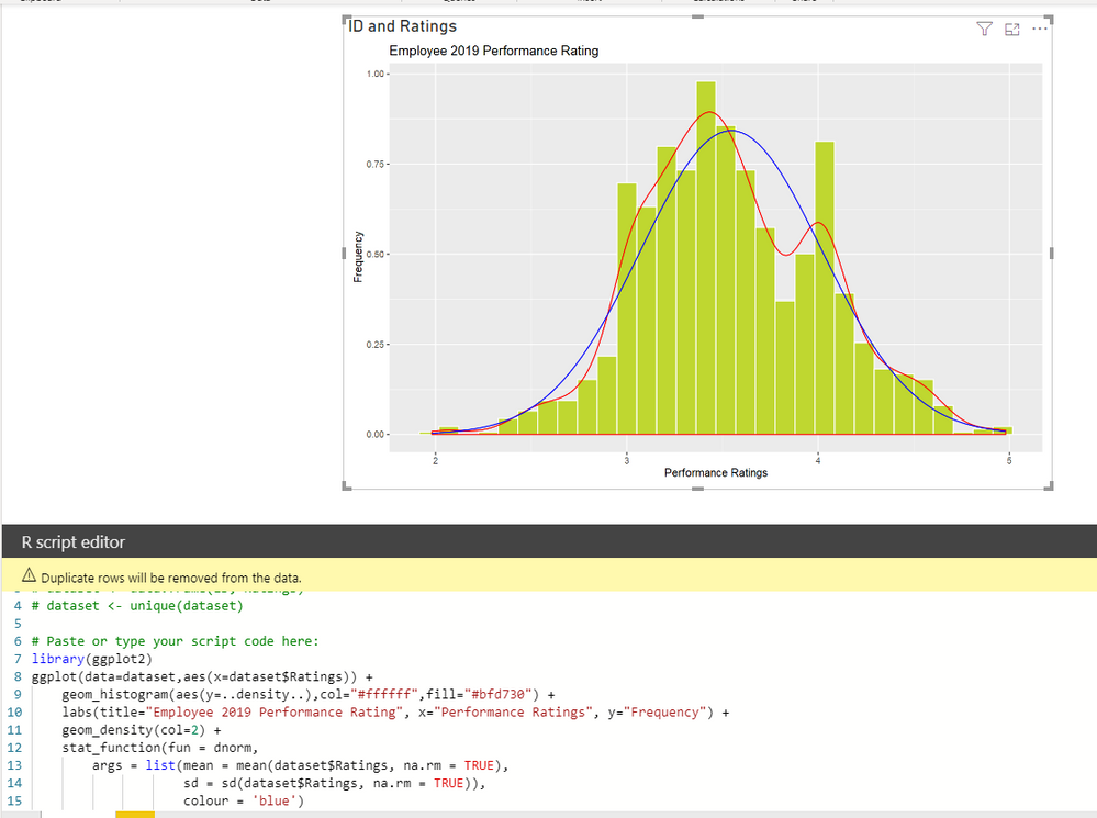
Best Regards,
Icey
If this post helps, then please consider Accept it as the solution to help the other members find it more quickly.
- Mark as New
- Bookmark
- Subscribe
- Mute
- Subscribe to RSS Feed
- Permalink
- Report Inappropriate Content
Hi @Anonymous ,
Sorry to reply late. Please check whether this could meet your requirements:
library(ggplot2)
ggplot(data=dataset,aes(x=dataset$Ratings)) +
    geom_histogram(aes(y=..density..),col="#ffffff",fill="#bfd730") +
    labs(title="Employee 2019 Performance Rating", x="Performance Ratings", y="Frequency") +
    geom_density(col=2) +
    stat_function(fun = dnorm,
        args = list(mean = mean(dataset$Ratings, na.rm = TRUE),
                    sd = sd(dataset$Ratings, na.rm = TRUE)),
                    colour = 'blue')
Best Regards,
Icey
If this post helps, then please consider Accept it as the solution to help the other members find it more quickly.

- Mark as New
- Bookmark
- Subscribe
- Mute
- Subscribe to RSS Feed
- Permalink
- Report Inappropriate Content
Why the frequency shown in decimals (x axis)?
- Mark as New
- Bookmark
- Subscribe
- Mute
- Subscribe to RSS Feed
- Permalink
- Report Inappropriate Content
@Icey is it possible to show the count of frequency on the x-axis of this code?
- Mark as New
- Bookmark
- Subscribe
- Mute
- Subscribe to RSS Feed
- Permalink
- Report Inappropriate Content
Yes thank you so much!!! 🙂
- Mark as New
- Bookmark
- Subscribe
- Mute
- Subscribe to RSS Feed
- Permalink
- Report Inappropriate Content
Hi @Anonymous ,
Please share me some dummy sample data, not real data, for test.
Best Regards,
Icey
If this post helps, then please consider Accept it as the solution to help the other members find it more quickly.
- Mark as New
- Bookmark
- Subscribe
- Mute
- Subscribe to RSS Feed
- Permalink
- Report Inappropriate Content
Helpful resources

FabCon & SQLCon – Barcelona 2026
Join us in Barcelona for FabCon and SQLCon, the Fabric, Power BI, SQL, and AI community event. Save €200 with code FABCMTY200.

Power BI DataViz World Championships - June 2026
A new Power BI DataViz World Championship is coming this June! Don't miss out on submitting your entry.

| User | Count |
|---|---|
| 27 | |
| 22 | |
| 20 | |
| 18 | |
| 14 |


| User | Count |
|---|---|
| 25 | |
| 20 | |
| 20 | |
| 20 | |
| 20 |


