Join us at FabCon Vienna from September 15-18, 2025
The ultimate Fabric, Power BI, SQL, and AI community-led learning event. Save €200 with code FABCOMM.
Get registered- Power BI forums
- Get Help with Power BI
- Desktop
- Service
- Report Server
- Power Query
- Mobile Apps
- Developer
- DAX Commands and Tips
- Custom Visuals Development Discussion
- Health and Life Sciences
- Power BI Spanish forums
- Translated Spanish Desktop
- Training and Consulting
- Instructor Led Training
- Dashboard in a Day for Women, by Women
- Galleries
- Data Stories Gallery
- Themes Gallery
- Contests Gallery
- Quick Measures Gallery
- Notebook Gallery
- Translytical Task Flow Gallery
- TMDL Gallery
- R Script Showcase
- Webinars and Video Gallery
- Ideas
- Custom Visuals Ideas (read-only)
- Issues
- Issues
- Events
- Upcoming Events
Compete to become Power BI Data Viz World Champion! First round ends August 18th. Get started.
- Power BI forums
- Forums
- Get Help with Power BI
- Desktop
- Quick Measure-Difference from filtered value shows...
- Subscribe to RSS Feed
- Mark Topic as New
- Mark Topic as Read
- Float this Topic for Current User
- Bookmark
- Subscribe
- Printer Friendly Page
- Mark as New
- Bookmark
- Subscribe
- Mute
- Subscribe to RSS Feed
- Permalink
- Report Inappropriate Content
Quick Measure-Difference from filtered value shows different totals depending on where placed
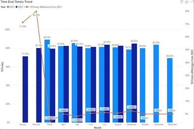
Hey guys, this is my first post here. This forum has helped me a lot though. I will start by saying I'm not a pro at this. I like designing dashboards, and try to use only quick measures if I can get away with it. Anyway, I have a dashboard that brings in multiple tables using star schema. My dashboard uses measures to compare the two main tables (time eval and late time). The visualization I'm focusing on here is a combo clustered column chart.
The image doesn't seem to want to post clearly. Anyway it shows two colums in most months. The first is the 2021 %timely column and the second is the 2022 % timely column.
There is a secondary line that is supposed to show the percentage difference between 2022 and 2021.
So here is the wierd thing. I used a few measures to get to the % timely.
The first is:

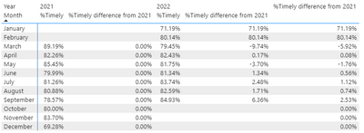
So the wierd thing is that if I put the measure into any other field (like the column field, or if I change to a line graph and place in the main line field, or the tooltips) it shows me the correct answer which is the first %timely difference from 2021. If, however, I place that measure in the secondary line field in the combo clustured column chart it shows the second %timely difference from 2021 (which is the wrong answer).
Is there any way to somehow take that second %Timely difference from 2021 out so the line shows the correct number?
Solved! Go to Solution.
- Mark as New
- Bookmark
- Subscribe
- Mute
- Subscribe to RSS Feed
- Permalink
- Report Inappropriate Content
YES!!!!!!@!! I FIGURED IT OUT!!!!!
So I took the original algorithm here:
And added an additional calculation to the VAR_MEASURE_VALUE field here:
This now shows the correct information! Thanks!
- Mark as New
- Bookmark
- Subscribe
- Mute
- Subscribe to RSS Feed
- Permalink
- Report Inappropriate Content
Hi @Majeebus
Thanks for reaching out to us.
>> So the wierd thing is that if I put the measure into any other field (like the column field, or if I change to a line graph and place in the main line field, or the tooltips) it shows me the correct answer which is the first %timely difference from 2021.
I suspect this phenomenon is context related, please refer How To Apply Context Concept in DAX — DAX in Power BI — Chapter 3 | by Arpita Ghosh | Analytics Vidh...
Best Regards,
Community Support Team _Tang
If this post helps, please consider Accept it as the solution to help the other members find it more quickly.
- Mark as New
- Bookmark
- Subscribe
- Mute
- Subscribe to RSS Feed
- Permalink
- Report Inappropriate Content
You have me pretty confused. The article you listed shows context by adding a filter. I already have the filter in the measure, and I would think it's an explicit filter.
Can you explain where you think the explicit context of the measure is incorrect? The only place I would think I could add an additional explicit filter would be on the VAR_MEASURE_VALUE+[%Timely] line, but when I try that it breaks the algorithm.
- Mark as New
- Bookmark
- Subscribe
- Mute
- Subscribe to RSS Feed
- Permalink
- Report Inappropriate Content
Sorry just reread my original post. I know why the table has the extra %timely difference from 2021 lines. The first column after the 2022 column is the tooltips and the last column is from the secondary line. Sorry for the confusion.
I still don't know why placing that measure in the secondary line gives me the wrong percentages. Is this an actual coding error with power BI maybe?


