Get Fabric certified for FREE!
Don't miss your chance to take the Fabric Data Engineer (DP-600) exam for FREE! Find out how by watching the DP-600 session on-demand now through April 28th.
Learn more- Power BI forums
- Get Help with Power BI
- Desktop
- Service
- Report Server
- Power Query
- Mobile Apps
- Developer
- DAX Commands and Tips
- Custom Visuals Development Discussion
- Health and Life Sciences
- Power BI Spanish forums
- Translated Spanish Desktop
- Training and Consulting
- Instructor Led Training
- Dashboard in a Day for Women, by Women
- Galleries
- Data Stories Gallery
- Themes Gallery
- Contests Gallery
- QuickViz Gallery
- Quick Measures Gallery
- Visual Calculations Gallery
- Notebook Gallery
- Translytical Task Flow Gallery
- TMDL Gallery
- R Script Showcase
- Webinars and Video Gallery
- Ideas
- Custom Visuals Ideas (read-only)
- Issues
- Issues
- Events
- Upcoming Events
Join the FabCon + SQLCon recap series. Up next: Power BI, Real-Time Intelligence, IQ and AI, and Data Factory take center stage. All sessions are available on-demand after the live show. Register now
- Power BI forums
- Forums
- Get Help with Power BI
- Desktop
- Questions on Visualizations
- Subscribe to RSS Feed
- Mark Topic as New
- Mark Topic as Read
- Float this Topic for Current User
- Bookmark
- Subscribe
- Printer Friendly Page
- Mark as New
- Bookmark
- Subscribe
- Mute
- Subscribe to RSS Feed
- Permalink
- Report Inappropriate Content
Questions on Visualizations
Hi
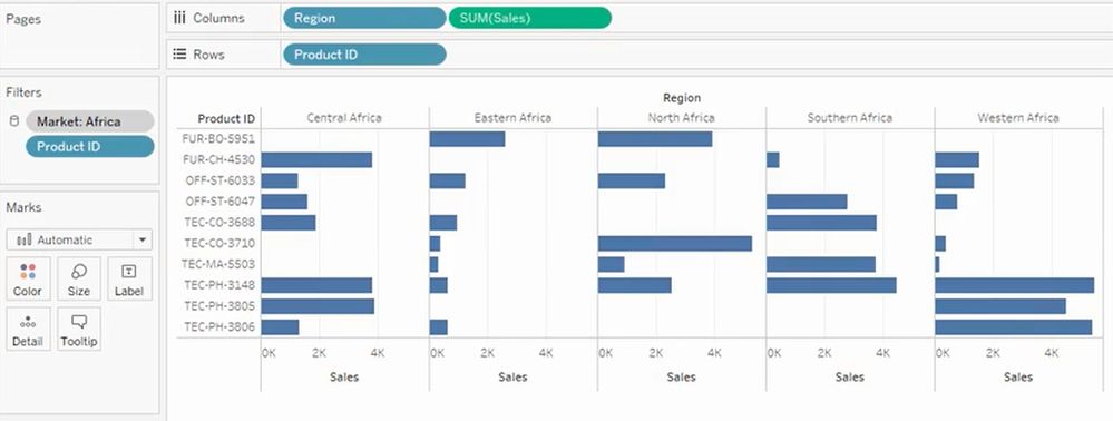
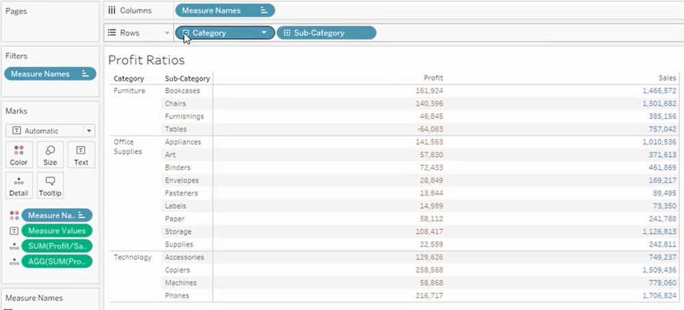
Recently I have checked Tableau for a new request. I could see some of the visuals created as below by just drag and drop the field to the Row & Column shelves.
Please let me know if the same can be achieved through Power BI. If so which visuals should I use to get the same appearance.
Do I need to use any Group By for the second image in Power BI but tableau automatically maintains the hierarchy without any manual grouping by the user.
Solved! Go to Solution.
- Mark as New
- Bookmark
- Subscribe
- Mute
- Subscribe to RSS Feed
- Permalink
- Report Inappropriate Content
Unfortunatly small multiples is currently an ommisiton in powerbi (with the exception of some custom visuals e.g. dot plot)
So your options are create several bar charts side by side (tricky to keep the axis the same) or use r visuals.
r visuals can do pretty much anything however you'll need r installing and a bit of r knowledge.
http://www.sthda.com/english/wiki/ggplot2-barplot-easy-bar-graphs-in-r-software-using-ggplot2
Hierarchies are easy in powerbi for matrix or some charts. You can drop in fields in the correct order and it will create the hierachy for you.
https://docs.microsoft.com/en-us/power-bi/desktop-matrix-visual
You can also create a hierachy in the fields lists by dropping a field onto another. This can then be dropped in to the visuals.
https://www.youtube.com/watch?v=q8WDUAiTGeU
Phil
Helpful resources

Power BI Monthly Update - April 2026
Check out the April 2026 Power BI update to learn about new features.

New to Fabric Survey
If you have recently started exploring Fabric, we'd love to hear how it's going. Your feedback can help with product improvements.

Power BI DataViz World Championships - June 2026
A new Power BI DataViz World Championship is coming this June! Don't miss out on submitting your entry.

| User | Count |
|---|---|
| 41 | |
| 37 | |
| 34 | |
| 21 | |
| 16 |
| User | Count |
|---|---|
| 65 | |
| 62 | |
| 31 | |
| 26 | |
| 25 |


