- Power BI forums
- Get Help with Power BI
- Desktop
- Service
- Report Server
- Power Query
- Mobile Apps
- Developer
- DAX Commands and Tips
- Custom Visuals Development Discussion
- Health and Life Sciences
- Power BI Spanish forums
- Translated Spanish Desktop
- Training and Consulting
- Instructor Led Training
- Dashboard in a Day for Women, by Women
- Galleries
- Data Stories Gallery
- Themes Gallery
- Contests Gallery
- QuickViz Gallery
- Quick Measures Gallery
- Visual Calculations Gallery
- Notebook Gallery
- Translytical Task Flow Gallery
- TMDL Gallery
- R Script Showcase
- Webinars and Video Gallery
- Ideas
- Custom Visuals Ideas (read-only)
- Issues
- Issues
- Events
- Upcoming Events
Learn from the best! Meet the four finalists headed to the FINALS of the Power BI Dataviz World Championships! Register now
- Power BI forums
- Forums
- Get Help with Power BI
- Desktop
- Question about the Ribbon Chart
- Subscribe to RSS Feed
- Mark Topic as New
- Mark Topic as Read
- Float this Topic for Current User
- Bookmark
- Subscribe
- Printer Friendly Page
- Mark as New
- Bookmark
- Subscribe
- Mute
- Subscribe to RSS Feed
- Permalink
- Report Inappropriate Content
Question about the Ribbon Chart
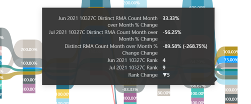
Hello Community - Does anyone know what the 89.58% number represents? I see that it appears to be adding the two percentages together, but what is it actually a measure of?
Solved! Go to Solution.
- Mark as New
- Bookmark
- Subscribe
- Mute
- Subscribe to RSS Feed
- Permalink
- Report Inappropriate Content
@Anonymous
You are hovering between June and July, so it shows the % change between the months.
-56.25 minus 33.33 = -89.58 This is the negative growth %
⭕ Subscribe and learn Power BI from these videos
⚪ Website ⚪ LinkedIn ⚪ PBI User Group
- Mark as New
- Bookmark
- Subscribe
- Mute
- Subscribe to RSS Feed
- Permalink
- Report Inappropriate Content
HI @Anonymous ,
As you haven't provided complete information around what metrics you have moved to this chart, I tried the ribbon chart at my end with a simple metric overtime:
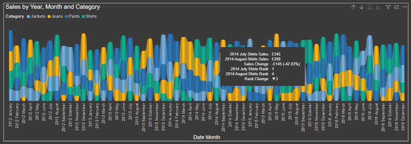
In the above chart I have shown Sales overtime split by different clothing categories.
When I hover over the ribbon portion of August 2014, I see a tooltip which ives me following information:
- Sales for Shirts for July 2014
- Sales for Shirts August 2014
- Difference in sales for above 2 months (negative as it is gone down in August as compared to July)
- In the month of July, a ranking is created for sales against all the different clothing categories; out of which Shirts generated the most sales and is ranked 1 as compared to other categories on the chart.
- Similarly a ranking for the Shirts category for the month of August.
- Last but not tht least, a chnage in the ranks for the Shirts category on sales.
I suspect in your case you are moving a proportion metric or a distinct count metric as a percentage. (not clear to me with your screenshot).
You can relate the description from my chart to your's and hopefully the tooltip information is clear to you.
Thanks,
Pragati
- Mark as New
- Bookmark
- Subscribe
- Mute
- Subscribe to RSS Feed
- Permalink
- Report Inappropriate Content
@Anonymous
You are hovering between June and July, so it shows the % change between the months.
-56.25 minus 33.33 = -89.58 This is the negative growth %
⭕ Subscribe and learn Power BI from these videos
⚪ Website ⚪ LinkedIn ⚪ PBI User Group
Helpful resources
| User | Count |
|---|---|
| 51 | |
| 35 | |
| 23 | |
| 17 | |
| 17 |
| User | Count |
|---|---|
| 70 | |
| 57 | |
| 40 | |
| 22 | |
| 22 |


