A new Data Days event is coming soon!
This time we’re going bigger than ever. Fabric, Power BI, SQL, AI and more. We're covering it all. You won't want to miss it.
Learn more- Power BI forums
- Get Help with Power BI
- Desktop
- Service
- Report Server
- Power Query
- Mobile Apps
- Developer
- DAX Commands and Tips
- Custom Visuals Development Discussion
- Health and Life Sciences
- Power BI Spanish forums
- Translated Spanish Desktop
- Training and Consulting
- Instructor Led Training
- Dashboard in a Day for Women, by Women
- Galleries
- Data Stories Gallery
- Themes Gallery
- Contests Gallery
- QuickViz Gallery
- Quick Measures Gallery
- Visual Calculations Gallery
- Notebook Gallery
- Translytical Task Flow Gallery
- TMDL Gallery
- R Script Showcase
- Webinars and Video Gallery
- Ideas
- Custom Visuals Ideas (read-only)
- Issues
- Issues
- Events
- Upcoming Events
Level up your Power BI skills this month - build one visual each week and tell better stories with data! Get started
- Power BI forums
- Forums
- Get Help with Power BI
- Desktop
- Re: Project Tracking
- Subscribe to RSS Feed
- Mark Topic as New
- Mark Topic as Read
- Float this Topic for Current User
- Bookmark
- Subscribe
- Printer Friendly Page
- Mark as New
- Bookmark
- Subscribe
- Mute
- Subscribe to RSS Feed
- Permalink
- Report Inappropriate Content
Project Tracking
Hi there,
I'm trying to create a project tracking chart, whihc is basically a project managemnet S curve.
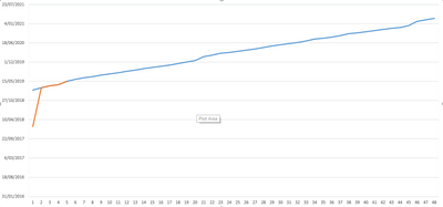
The only difference is my X axis is date (so continuous variable) and my Y axis are the different projects - 48 different sprints - (so a categorical variable).
I was able to do it in excel (picture below), and I'm trying ot accomnplish this in power BI.
Please help.
Cheers
Solved! Go to Solution.
- Mark as New
- Bookmark
- Subscribe
- Mute
- Subscribe to RSS Feed
- Permalink
- Report Inappropriate Content
Hi @Anonymous
Line chart doesn't support to use "date" in the y-axis.
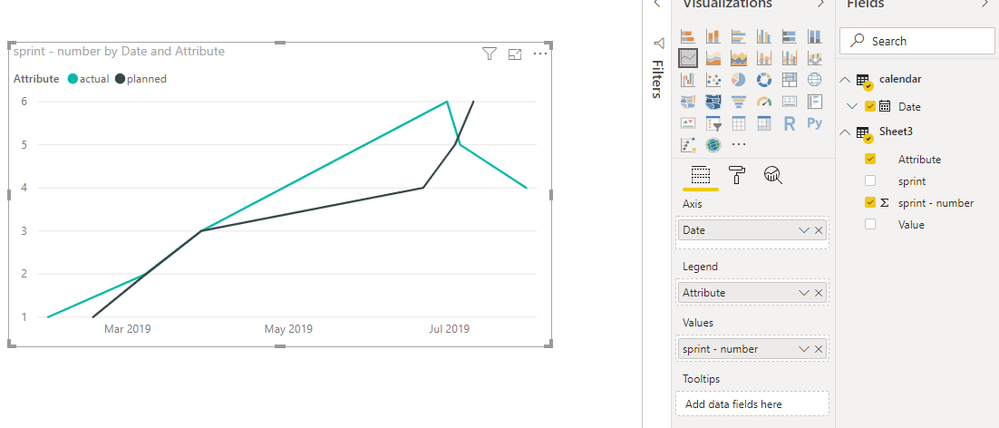
One workaround is as below:
Open Edit queries,
Click on "sprint" column, then select add column- duplicates column,
Click on the duplicated column, then select transform->split column,
Select "planned" and "actual" columns, then select transform->unpivot columns,
Close && apply,
Create another table and connnect it with original table
calendar = CALENDARAUTO()
Best Regards
Maggie
Community Support Team _ Maggie Li
If this post helps, then please consider Accept it as the solution to help the other members find it more quickly.
- Mark as New
- Bookmark
- Subscribe
- Mute
- Subscribe to RSS Feed
- Permalink
- Report Inappropriate Content
Hi @Anonymous
Another workaround is to create a R visual so that the date field can be used in Y axis.
After transformation as my previous post, create a r visual as below:
https://community.powerbi.com/t5/Desktop/dates-on-Y-axis/td-p/339940
Best Regards
Maggie
Community Support Team _ Maggie Li
If this post helps, then please consider Accept it as the solution to help the other members find it more quickly.
- Mark as New
- Bookmark
- Subscribe
- Mute
- Subscribe to RSS Feed
- Permalink
- Report Inappropriate Content
Hi @Anonymous
Line chart doesn't support to use "date" in the y-axis.
One workaround is as below:
Open Edit queries,
Click on "sprint" column, then select add column- duplicates column,
Click on the duplicated column, then select transform->split column,
Select "planned" and "actual" columns, then select transform->unpivot columns,
Close && apply,
Create another table and connnect it with original table
calendar = CALENDARAUTO()
Best Regards
Maggie
Community Support Team _ Maggie Li
If this post helps, then please consider Accept it as the solution to help the other members find it more quickly.
- Mark as New
- Bookmark
- Subscribe
- Mute
- Subscribe to RSS Feed
- Permalink
- Report Inappropriate Content
Hi @Anonymous ,
Sounds pretty straight forward, where did you get stuck?
Reg,
Robin
- Mark as New
- Bookmark
- Subscribe
- Mute
- Subscribe to RSS Feed
- Permalink
- Report Inappropriate Content
Hi Robin,
I've added a screenshot of the data I'm trying to visualise in power BI.
As you can see, the sprint data is on the x axis and is categorical and the y axis is the date the sprint is completed (there will be 2 trendlines, planned finish vs actual finish).
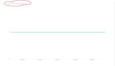
This is what I'm getting in Power BI.
As you can see, it's trying to count the sprints, but I need the sprints to be discrete.
Hope this provides more clarification.
Cheers.
Helpful resources

Power BI Monthly Update - April 2026
Check out the April 2026 Power BI update to learn about new features.

Data Days 2026 coming soon!
Sign up to receive a private message when registration opens and key events begin.

New to Fabric Survey
If you have recently started exploring Fabric, we'd love to hear how it's going. Your feedback can help with product improvements.

| User | Count |
|---|---|
| 35 | |
| 32 | |
| 26 | |
| 21 | |
| 18 |
| User | Count |
|---|---|
| 68 | |
| 36 | |
| 32 | |
| 25 | |
| 23 |


