Fabric Data Days starts November 4th!
Advance your Data & AI career with 50 days of live learning, dataviz contests, hands-on challenges, study groups & certifications and more!
Get registered- Power BI forums
- Get Help with Power BI
- Desktop
- Service
- Report Server
- Power Query
- Mobile Apps
- Developer
- DAX Commands and Tips
- Custom Visuals Development Discussion
- Health and Life Sciences
- Power BI Spanish forums
- Translated Spanish Desktop
- Training and Consulting
- Instructor Led Training
- Dashboard in a Day for Women, by Women
- Galleries
- Data Stories Gallery
- Themes Gallery
- Contests Gallery
- Quick Measures Gallery
- Visual Calculations Gallery
- Notebook Gallery
- Translytical Task Flow Gallery
- TMDL Gallery
- R Script Showcase
- Webinars and Video Gallery
- Ideas
- Custom Visuals Ideas (read-only)
- Issues
- Issues
- Events
- Upcoming Events
Join us at FabCon Atlanta from March 16 - 20, 2026, for the ultimate Fabric, Power BI, AI and SQL community-led event. Save $200 with code FABCOMM. Register now.
- Power BI forums
- Forums
- Get Help with Power BI
- Desktop
- Re: Problems creating calculated table from a slic...
- Subscribe to RSS Feed
- Mark Topic as New
- Mark Topic as Read
- Float this Topic for Current User
- Bookmark
- Subscribe
- Printer Friendly Page
- Mark as New
- Bookmark
- Subscribe
- Mute
- Subscribe to RSS Feed
- Permalink
- Report Inappropriate Content
Problems creating calculated table from a slicer
Hello,
I've been stuck with this issue for hours and I need help understanding why this solution isn't working.
What I want to solve is this:
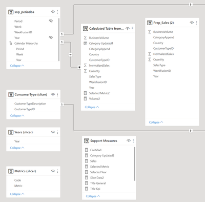
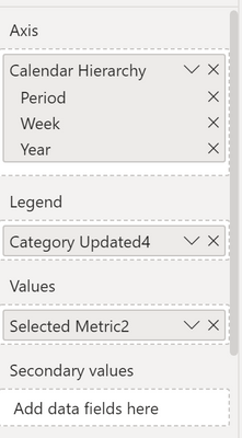
I have a large table and based on a dropdown isolated slicer select a single year to filter the Prep_Sales (2) table to deliver only the valid rows for the present year and the past year. Also, I want to display the filtered data in a line chart so I need some calculated columns and a relationship to my hierarchy table.
But for some reason, the slicer didn't get the year (on CurrentYear VAR) even the filter works if you put it manually. I made sure that Year is an integer value.
My script is the following


- Mark as New
- Bookmark
- Subscribe
- Mute
- Subscribe to RSS Feed
- Permalink
- Report Inappropriate Content
Hi @Anonymous ,
You could create a measure like below.
measure =
var sales_year = selectedvalue('Prep_Sales (2)'[Year])
var CurrentYear = SELECTEDVALUE('Years (slicer)'[Year])
return
IF( sales_year = CurrentYear || sales_year = CurrentYear-1,1,0)
Add this measure to visual filter set value = 1.
Best Regards,
Jay
- Mark as New
- Bookmark
- Subscribe
- Mute
- Subscribe to RSS Feed
- Permalink
- Report Inappropriate Content
I took it. But I can't maintain the colors because the category is on the legend.
So I have to get deep into this because I need some time calculations and Dax patterns to improve the design, and I think it is the right way to do this.
Thank you
- Mark as New
- Bookmark
- Subscribe
- Mute
- Subscribe to RSS Feed
- Permalink
- Report Inappropriate Content
Hi @Anonymous ,
"But I can't maintain the colors because the category is on the legend."
You can set data color manually.
Best Regards,
Jay
- Mark as New
- Bookmark
- Subscribe
- Mute
- Subscribe to RSS Feed
- Permalink
- Report Inappropriate Content
Sharing the pbix file.
I want the things :
- Select a Year and a Metric
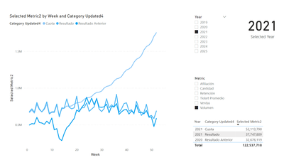
- The Line Chart will display the metric and year selected with 3 curves: Present Year, Quota, and Last Year.
- Keep the Line colors when you change the metric or year slicers, for example, red for Quota, blue for Present Year, and gray for Last Year.
https://drive.google.com/drive/folders/1NyodJ-pBQL2DQXk8XzChm4e0mimO4Nca?usp=sharing
Thanks for your time and patience,
Carlos
- Mark as New
- Bookmark
- Subscribe
- Mute
- Subscribe to RSS Feed
- Permalink
- Report Inappropriate Content
@Anonymous are you saying that the calculated table doesn't recalculate based on slicer selection?
- Mark as New
- Bookmark
- Subscribe
- Mute
- Subscribe to RSS Feed
- Permalink
- Report Inappropriate Content
Yes. I've tried with SELECTEDVALUE('Years (slicer)'[Year]), INT(SELECTEDVALUE('Years (slicer)'[Year])) and CONVERT(SELECTEDVALUE('Years (slicer)'[Year]), INTEGER) but didn't work. Any light with this BI variable?
- Mark as New
- Bookmark
- Subscribe
- Mute
- Subscribe to RSS Feed
- Permalink
- Report Inappropriate Content
@Anonymous calculated tables and columns only recalculate when data is refreshed, not when slicers change. What you're trying to do is not possible. Sorry to be the bearer of bad news 😕
- Mark as New
- Bookmark
- Subscribe
- Mute
- Subscribe to RSS Feed
- Permalink
- Report Inappropriate Content
Thanks for your time. It seems that I will change something of this model. How can I handle this solution?
- Mark as New
- Bookmark
- Subscribe
- Mute
- Subscribe to RSS Feed
- Permalink
- Report Inappropriate Content
@Anonymous no worries...I'm just trying to run out the clock at work. What are you trying to do?
- Mark as New
- Bookmark
- Subscribe
- Mute
- Subscribe to RSS Feed
- Permalink
- Report Inappropriate Content
I want to do these things:
- Select a Year and a Metric
- In a Line Chart display the metric selected with 3 curves: Present Year, Quota, and Last Year (see the image above).
- Keep the Line colors when you change the metric or year, for example, red for Quota, blue for Present Year, and gray for Last Year.
Thanks
- Mark as New
- Bookmark
- Subscribe
- Mute
- Subscribe to RSS Feed
- Permalink
- Report Inappropriate Content
@Anonymous can you provide sample data in a pbix file to work with?
Helpful resources

Fabric Data Days
Advance your Data & AI career with 50 days of live learning, contests, hands-on challenges, study groups & certifications and more!

Power BI Monthly Update - October 2025
Check out the October 2025 Power BI update to learn about new features.

| User | Count |
|---|---|
| 75 | |
| 36 | |
| 31 | |
| 29 | |
| 26 |

