Join the Fabric User Panel to shape the future of Fabric.
Share feedback directly with Fabric product managers, participate in targeted research studies and influence the Fabric roadmap.
Sign up now- Power BI forums
- Get Help with Power BI
- Desktop
- Service
- Report Server
- Power Query
- Mobile Apps
- Developer
- DAX Commands and Tips
- Custom Visuals Development Discussion
- Health and Life Sciences
- Power BI Spanish forums
- Translated Spanish Desktop
- Training and Consulting
- Instructor Led Training
- Dashboard in a Day for Women, by Women
- Galleries
- Data Stories Gallery
- Themes Gallery
- Contests Gallery
- QuickViz Gallery
- Quick Measures Gallery
- Visual Calculations Gallery
- Notebook Gallery
- Translytical Task Flow Gallery
- TMDL Gallery
- R Script Showcase
- Webinars and Video Gallery
- Ideas
- Custom Visuals Ideas (read-only)
- Issues
- Issues
- Events
- Upcoming Events
Get Fabric certified for FREE! Don't miss your chance! Learn more
- Power BI forums
- Forums
- Get Help with Power BI
- Desktop
- Re: Problem with Treemap
- Subscribe to RSS Feed
- Mark Topic as New
- Mark Topic as Read
- Float this Topic for Current User
- Bookmark
- Subscribe
- Printer Friendly Page
- Mark as New
- Bookmark
- Subscribe
- Mute
- Subscribe to RSS Feed
- Permalink
- Report Inappropriate Content
Problem with Treemap
Hello Power Communauty,
I have a little problem with the Treepmap visualisation.
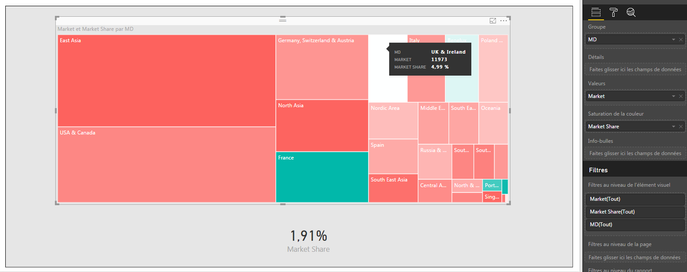
I have 2 measures, one representing the Market size (Box size) and the second representing the Market Share (Color).
I would like see where I can have opportunity on a big Market with a bad Market Share.
My objective is to have in red, every areas below the Market Share Average, and in green, every areas upper than the Market Share Average.
I think I did the right configuration, but I have some problem with the middle of the color settings :
As you can see, my average is at 1,91%, for every countries, and I have the "UK and Ireland" at 4,99% in white... With 4,99%, should be in green... It's the same with Spain at 2,29%, it's in Red but it's more than the 1,91% of the average...it's really weird !
Seems that the middle of the color saturation is near 5% (white color) and not at 1,9%...
Do someone already had this problem ? Do you have a solution?
Regards,
Solved! Go to Solution.
- Mark as New
- Bookmark
- Subscribe
- Mute
- Subscribe to RSS Feed
- Permalink
- Report Inappropriate Content
By default, the lowest value in your data is mapped to the least saturated color, and the highest value to the most saturated color. Center value is just the arithmetic mean of Minimum and Maximum, not all values. You may set them manually through Data colors section in Format pane.
As an alternative, use SIGN Function to create a calculated column.
Color Saturation Flag =
SIGN ( Table1[Column3] - AVERAGE ( Table1[Column3] ) )
If this post helps, then please consider Accept it as the solution to help the other members find it more quickly.
- Mark as New
- Bookmark
- Subscribe
- Mute
- Subscribe to RSS Feed
- Permalink
- Report Inappropriate Content
Think I understood the problem.
The color saturation don't take the VALUE as center, but that take the Center between the Higest and the Smallest Value.
For example, If I have Value A = 10 and B = 1000, the color saturation will take (1000-10)/2=495 and not (1000+10)/2=505...
That's why ! Do someone have an idea to correct that ?
Regards,
- Mark as New
- Bookmark
- Subscribe
- Mute
- Subscribe to RSS Feed
- Permalink
- Report Inappropriate Content
By default, the lowest value in your data is mapped to the least saturated color, and the highest value to the most saturated color. Center value is just the arithmetic mean of Minimum and Maximum, not all values. You may set them manually through Data colors section in Format pane.
As an alternative, use SIGN Function to create a calculated column.
Color Saturation Flag =
SIGN ( Table1[Column3] - AVERAGE ( Table1[Column3] ) )
If this post helps, then please consider Accept it as the solution to help the other members find it more quickly.
- Mark as New
- Bookmark
- Subscribe
- Mute
- Subscribe to RSS Feed
- Permalink
- Report Inappropriate Content
The SIGN function is perfect !
Here is my calculated measure:
Flag_Market_Share_Saturation = SIGN([Market Share] - (DIVIDE(CALCULATE(SUM(Database_Fusion[Group - Excel]);ALLEXCEPT(Database_Fusion;Database_Fusion[Addressable market]);Database_Fusion[Flag_ThisYear] = 1);CALCULATE(SUM(Database_Fusion[Market - Excel]);ALLEXCEPT(Database_Fusion;Database_Fusion[Addressable market]);Database_Fusion[Flag_ThisYear] = 1))))
Thanks a lot for your help !
Helpful resources

Join our Community Sticker Challenge 2026
If you love stickers, then you will definitely want to check out our Community Sticker Challenge!

Power BI Monthly Update - January 2026
Check out the January 2026 Power BI update to learn about new features.

| User | Count |
|---|---|
| 65 | |
| 64 | |
| 49 | |
| 21 | |
| 18 |
| User | Count |
|---|---|
| 119 | |
| 117 | |
| 38 | |
| 36 | |
| 29 |

