- Power BI forums
- Get Help with Power BI
- Desktop
- Service
- Report Server
- Power Query
- Mobile Apps
- Developer
- DAX Commands and Tips
- Custom Visuals Development Discussion
- Health and Life Sciences
- Power BI Spanish forums
- Translated Spanish Desktop
- Training and Consulting
- Instructor Led Training
- Dashboard in a Day for Women, by Women
- Galleries
- Data Stories Gallery
- Themes Gallery
- Contests Gallery
- QuickViz Gallery
- Quick Measures Gallery
- Visual Calculations Gallery
- Notebook Gallery
- Translytical Task Flow Gallery
- TMDL Gallery
- R Script Showcase
- Webinars and Video Gallery
- Ideas
- Custom Visuals Ideas (read-only)
- Issues
- Issues
- Events
- Upcoming Events
Learn from the best! Meet the four finalists headed to the FINALS of the Power BI Dataviz World Championships! Register now
- Power BI forums
- Forums
- Get Help with Power BI
- Desktop
- PowerBI Aggregates Inaccurate Data
- Subscribe to RSS Feed
- Mark Topic as New
- Mark Topic as Read
- Float this Topic for Current User
- Bookmark
- Subscribe
- Printer Friendly Page
- Mark as New
- Bookmark
- Subscribe
- Mute
- Subscribe to RSS Feed
- Permalink
- Report Inappropriate Content
PowerBI Aggregates Inaccurate Data
Hello,
I have the data I want to use that includes the percenatges for department scores for each department. I want to use those exact numbers in PowerBI, but instead it sums all the percentages and now it is inaccurate. I took off "Do not summarize" I still can't select it to show me only the numbers I already have. Makes sense? I hope I explained this well.
Solved! Go to Solution.
- Mark as New
- Bookmark
- Subscribe
- Mute
- Subscribe to RSS Feed
- Permalink
- Report Inappropriate Content
Hi @Anonymous ,
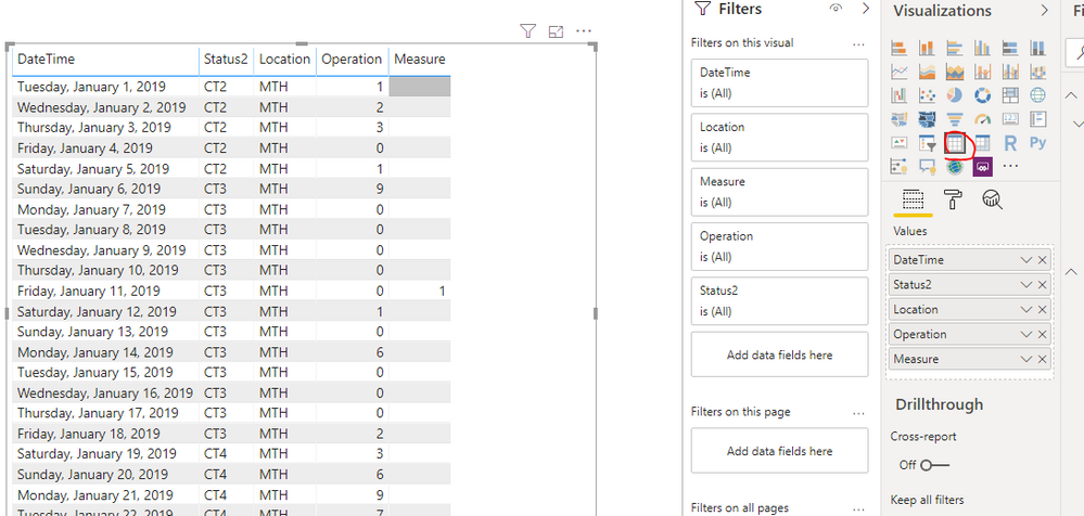
Choose the visual, then change the visual to table directly in the Visualizations Pane.
After that, set all the values don't summarize.
If this post helps, then please consider Accept it as the solution to help the others find it more quickly.
- Mark as New
- Bookmark
- Subscribe
- Mute
- Subscribe to RSS Feed
- Permalink
- Report Inappropriate Content
Oh yes. I did that and when I switched it back to the line chart it just turned into count. But when I selected min that seemed to work and get me the correct numbers.
Thank you for your help!!
- Mark as New
- Bookmark
- Subscribe
- Mute
- Subscribe to RSS Feed
- Permalink
- Report Inappropriate Content
@Anonymous first not sure why you are using matrix visual, use table visual and then select don't aggregate.
Subscribe to the @PowerBIHowTo YT channel for an upcoming video on List and Record functions in Power Query!!
Learn Power BI and Fabric - subscribe to our YT channel - Click here: @PowerBIHowTo
If my solution proved useful, I'd be delighted to receive Kudos. When you put effort into asking a question, it's equally thoughtful to acknowledge and give Kudos to the individual who helped you solve the problem. It's a small gesture that shows appreciation and encouragement! ❤
Did I answer your question? Mark my post as a solution. Proud to be a Super User! Appreciate your Kudos 🙂
Feel free to email me with any of your BI needs.
- Mark as New
- Bookmark
- Subscribe
- Mute
- Subscribe to RSS Feed
- Permalink
- Report Inappropriate Content
Hi,
I had no idea I was using a different visual. How do I change this? I do not see those options.
- Mark as New
- Bookmark
- Subscribe
- Mute
- Subscribe to RSS Feed
- Permalink
- Report Inappropriate Content
Hi @Anonymous ,
Choose the visual, then change the visual to table directly in the Visualizations Pane.
After that, set all the values don't summarize.
If this post helps, then please consider Accept it as the solution to help the others find it more quickly.
- Mark as New
- Bookmark
- Subscribe
- Mute
- Subscribe to RSS Feed
- Permalink
- Report Inappropriate Content
Oh yes. I did that and when I switched it back to the line chart it just turned into count. But when I selected min that seemed to work and get me the correct numbers.
Thank you for your help!!
Helpful resources
| User | Count |
|---|---|
| 50 | |
| 36 | |
| 29 | |
| 18 | |
| 17 |
| User | Count |
|---|---|
| 66 | |
| 58 | |
| 40 | |
| 21 | |
| 20 |


