A new Data Days event is coming soon!
This time we’re going bigger than ever. Fabric, Power BI, SQL, AI and more. We're covering it all. You won't want to miss it.
Learn more- Power BI forums
- Get Help with Power BI
- Desktop
- Service
- Report Server
- Power Query
- Mobile Apps
- Developer
- DAX Commands and Tips
- Custom Visuals Development Discussion
- Health and Life Sciences
- Power BI Spanish forums
- Translated Spanish Desktop
- Training and Consulting
- Instructor Led Training
- Dashboard in a Day for Women, by Women
- Galleries
- Data Stories Gallery
- Themes Gallery
- Contests Gallery
- QuickViz Gallery
- Quick Measures Gallery
- Visual Calculations Gallery
- Notebook Gallery
- Translytical Task Flow Gallery
- TMDL Gallery
- R Script Showcase
- Webinars and Video Gallery
- Ideas
- Custom Visuals Ideas (read-only)
- Issues
- Issues
- Events
- Upcoming Events
Join the FabCon + SQLCon recap series. Up next: Power BI, Real-Time Intelligence, IQ and AI, and Data Factory take center stage. All sessions are available on-demand after the live show. Register now
- Power BI forums
- Forums
- Get Help with Power BI
- Desktop
- Re: Power Query
- Subscribe to RSS Feed
- Mark Topic as New
- Mark Topic as Read
- Float this Topic for Current User
- Bookmark
- Subscribe
- Printer Friendly Page
- Mark as New
- Bookmark
- Subscribe
- Mute
- Subscribe to RSS Feed
- Permalink
- Report Inappropriate Content
Power Query
Below is the Input
Below is the Output
Would this even be possible using Power Query?
Solved! Go to Solution.
- Mark as New
- Bookmark
- Subscribe
- Mute
- Subscribe to RSS Feed
- Permalink
- Report Inappropriate Content
Hi, @Anonymous
In the matrix view of Desktop, you can output the results you expect.
Column:
End Date = [Start Date]+[Days Booked]Create a new date table.
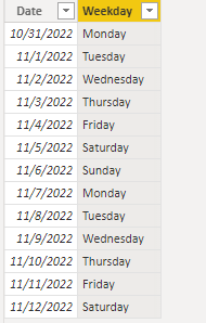
Date = CALENDAR(MIN('Table'[Start Date]),MAX('Table'[End Date]))Column:
Weekday = FORMAT([Date],"dddd")Measure =
IF (
SELECTEDVALUE ( 'Date'[Weekday] ) = "Saturday",
BLANK(),
IF (
SELECTEDVALUE ( 'Date'[Weekday] ) = "Sunday",
BLANK(),
CALCULATE (
MAX ( 'Table'[Project Name] ),
FILTER (
ALL ( 'Table' ),
[Start Date] <= SELECTEDVALUE ( 'Date'[Date] )
&& [End Date] >= SELECTEDVALUE ( 'Date'[Date] )
&& [Staff Name] = SELECTEDVALUE ( 'Table'[Staff Name] )
)
)
)
)Measure:
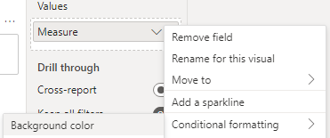
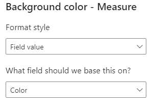
Color = SWITCH(TRUE(),
SELECTEDVALUE('Table'[Project Name])="ABC Pte Ltd","Yellow",
SELECTEDVALUE('Table'[Project Name])="DEF Pte Ltd","light gray",
SELECTEDVALUE('Table'[Project Name])="GHI Pte Ltd","blue",
SELECTEDVALUE('Table'[Project Name])="JKL Pte Ltd","gray")
Is this the result you expect?
Best Regards,
Community Support Team _Charlotte
If this post helps, then please consider Accept it as the solution to help the other members find it more quickly.
- Mark as New
- Bookmark
- Subscribe
- Mute
- Subscribe to RSS Feed
- Permalink
- Report Inappropriate Content
Thanks so much!
- Mark as New
- Bookmark
- Subscribe
- Mute
- Subscribe to RSS Feed
- Permalink
- Report Inappropriate Content
@Anonymous
You should try Gantt Chart, which you will get in Power BI in Get more visuals Section.
Helpful resources

Power BI Monthly Update - April 2026
Check out the April 2026 Power BI update to learn about new features.

New to Fabric Survey
If you have recently started exploring Fabric, we'd love to hear how it's going. Your feedback can help with product improvements.

Power BI DataViz World Championships - June 2026
A new Power BI DataViz World Championship is coming this June! Don't miss out on submitting your entry.

| User | Count |
|---|---|
| 40 | |
| 37 | |
| 31 | |
| 23 | |
| 15 |
| User | Count |
|---|---|
| 76 | |
| 59 | |
| 31 | |
| 31 | |
| 25 |


