FabCon is coming to Atlanta
Join us at FabCon Atlanta from March 16 - 20, 2026, for the ultimate Fabric, Power BI, AI and SQL community-led event. Save $200 with code FABCOMM.
Register now!- Power BI forums
- Get Help with Power BI
- Desktop
- Service
- Report Server
- Power Query
- Mobile Apps
- Developer
- DAX Commands and Tips
- Custom Visuals Development Discussion
- Health and Life Sciences
- Power BI Spanish forums
- Translated Spanish Desktop
- Training and Consulting
- Instructor Led Training
- Dashboard in a Day for Women, by Women
- Galleries
- Data Stories Gallery
- Themes Gallery
- Contests Gallery
- QuickViz Gallery
- Quick Measures Gallery
- Visual Calculations Gallery
- Notebook Gallery
- Translytical Task Flow Gallery
- TMDL Gallery
- R Script Showcase
- Webinars and Video Gallery
- Ideas
- Custom Visuals Ideas (read-only)
- Issues
- Issues
- Events
- Upcoming Events
The Power BI Data Visualization World Championships is back! Get ahead of the game and start preparing now! Learn more
- Power BI forums
- Forums
- Get Help with Power BI
- Desktop
- Power Bi - If condition - Returns multiple rows
- Subscribe to RSS Feed
- Mark Topic as New
- Mark Topic as Read
- Float this Topic for Current User
- Bookmark
- Subscribe
- Printer Friendly Page
- Mark as New
- Bookmark
- Subscribe
- Mute
- Subscribe to RSS Feed
- Permalink
- Report Inappropriate Content
Power Bi - If condition - Returns multiple rows
Due to some privacy issues, I cannot share the exact file I am working on. But the problem is here, I am trying to assign a rank to the customer (id) based on their revenue. The revenue is calculated based on some other information. However, the problem is
So, the function I put for Tranche is
if(Revenue<=0,1,if(Revenue<=100,2,if(Revenue<=300,3,if(Revenue<=400,4,if(Revenue<=500,5,if(Revenue<=600,6,7))))))
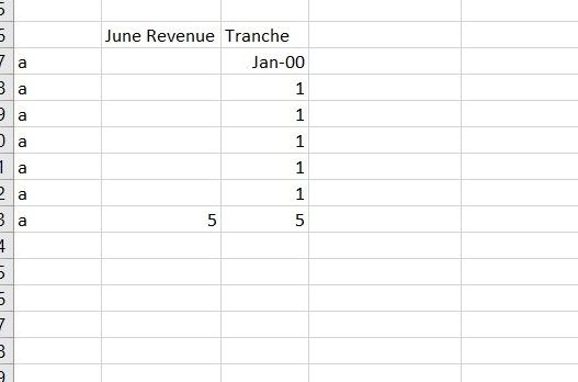
And the screenshot is what I got, I don't understand why I have 7 rows for each id.
If I dont put the function, Power BI has 2 rows. So my question is why when I put in the function, it has 7 rows.
| id | Revenue |
| a | 100 |
| b | 10000 |
Thanks
- Mark as New
- Bookmark
- Subscribe
- Mute
- Subscribe to RSS Feed
- Permalink
- Report Inappropriate Content
Usually these results are due to a relationship issue or (more likely) adding Tranche to the visualisation changes the context and it 'blows up' as some people call it.
Revenue is a measure? We would have to see it please and a data model with sample data would be great (fake data is fine as long as it illustrates the issue)
Also is Tranche a column or measure?
- Mark as New
- Bookmark
- Subscribe
- Mute
- Subscribe to RSS Feed
- Permalink
- Report Inappropriate Content
Thanks for the reply. This is what I am tring to do. Here I have three customers a,b and c. Column B is the flag of whether it is headquarter or not and C and D are month and daily revenue
First thing I do is I pushed all the revenue to the "Yes" in column B. So for instance, row 2 and row 3 have the same id and the same month, so the revnenue is pushed up to the "yes" level. Yes has a value of 5 and No has 0. For those that flag is unknown, nothing needs to be pushed up.

Instead, for id a, it has 7 rows
Thanks
Helpful resources

Power BI Dataviz World Championships
The Power BI Data Visualization World Championships is back! Get ahead of the game and start preparing now!

| User | Count |
|---|---|
| 40 | |
| 35 | |
| 34 | |
| 31 | |
| 28 |
| User | Count |
|---|---|
| 136 | |
| 102 | |
| 68 | |
| 66 | |
| 58 |


