FabCon is coming to Atlanta
Join us at FabCon Atlanta from March 16 - 20, 2026, for the ultimate Fabric, Power BI, AI and SQL community-led event. Save $200 with code FABCOMM.
Register now!- Power BI forums
- Get Help with Power BI
- Desktop
- Service
- Report Server
- Power Query
- Mobile Apps
- Developer
- DAX Commands and Tips
- Custom Visuals Development Discussion
- Health and Life Sciences
- Power BI Spanish forums
- Translated Spanish Desktop
- Training and Consulting
- Instructor Led Training
- Dashboard in a Day for Women, by Women
- Galleries
- Data Stories Gallery
- Themes Gallery
- Contests Gallery
- Quick Measures Gallery
- Notebook Gallery
- Translytical Task Flow Gallery
- TMDL Gallery
- R Script Showcase
- Webinars and Video Gallery
- Ideas
- Custom Visuals Ideas (read-only)
- Issues
- Issues
- Events
- Upcoming Events
Calling all Data Engineers! Fabric Data Engineer (Exam DP-700) live sessions are back! Starting October 16th. Sign up.
- Power BI forums
- Forums
- Get Help with Power BI
- Desktop
- Re: Power BI Visualisation - stacked bar chart wit...
- Subscribe to RSS Feed
- Mark Topic as New
- Mark Topic as Read
- Float this Topic for Current User
- Bookmark
- Subscribe
- Printer Friendly Page
- Mark as New
- Bookmark
- Subscribe
- Mute
- Subscribe to RSS Feed
- Permalink
- Report Inappropriate Content
Power BI Visualisation - stacked bar chart with 2 values
Hi
I have a column graph which is currently split into 4 columns by hierarchy. What I would like to have is each of these columns to show the proportion of yes or no within that. Example of data typed below:
Hierarchy | Yes/No |
Admin | Yes |
Engineering | No |
Elimination | Yes |
Admin | Yes |
Engineering | No |
Elimination | No |
Admin | Yes |
Admin | No |
Any help appreciated.
Thank you,
Solved! Go to Solution.
- Mark as New
- Bookmark
- Subscribe
- Mute
- Subscribe to RSS Feed
- Permalink
- Report Inappropriate Content
Hi,
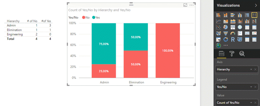
I think you may look for something like this:

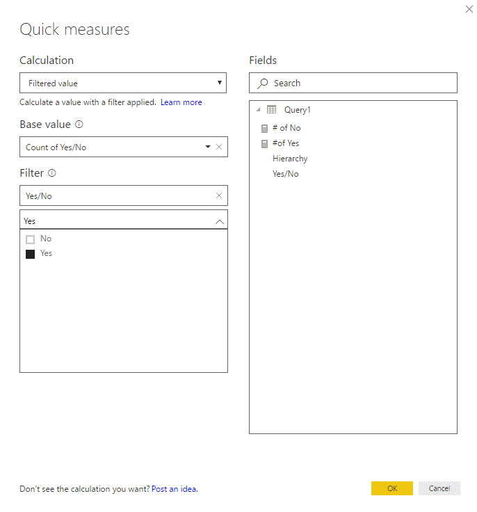
If you need it in a table visual, use Quick Measures - Filtered value. Example (to count the number of Yes):

If your goal is just to visualize the ratio, use 100% Stacked bar chart as I did in the first screenshot above.
Hope that helps.
Cheers,
Pawel
- Mark as New
- Bookmark
- Subscribe
- Mute
- Subscribe to RSS Feed
- Permalink
- Report Inappropriate Content
You can find more on Quick Measures in Power BI documentation: https://powerbi.microsoft.com/en-us/documentation/powerbi-desktop-quick-measures/.
- Mark as New
- Bookmark
- Subscribe
- Mute
- Subscribe to RSS Feed
- Permalink
- Report Inappropriate Content
Thanks for your help @Anonymous 🙂
- Mark as New
- Bookmark
- Subscribe
- Mute
- Subscribe to RSS Feed
- Permalink
- Report Inappropriate Content
Hi,
I think you may look for something like this:

If you need it in a table visual, use Quick Measures - Filtered value. Example (to count the number of Yes):

If your goal is just to visualize the ratio, use 100% Stacked bar chart as I did in the first screenshot above.
Hope that helps.
Cheers,
Pawel
Helpful resources

FabCon Global Hackathon
Join the Fabric FabCon Global Hackathon—running virtually through Nov 3. Open to all skill levels. $10,000 in prizes!

Power BI Monthly Update - September 2025
Check out the September 2025 Power BI update to learn about new features.

