Fabric Data Days starts November 4th!
Advance your Data & AI career with 50 days of live learning, dataviz contests, hands-on challenges, study groups & certifications and more!
Get registered- Power BI forums
- Get Help with Power BI
- Desktop
- Service
- Report Server
- Power Query
- Mobile Apps
- Developer
- DAX Commands and Tips
- Custom Visuals Development Discussion
- Health and Life Sciences
- Power BI Spanish forums
- Translated Spanish Desktop
- Training and Consulting
- Instructor Led Training
- Dashboard in a Day for Women, by Women
- Galleries
- Data Stories Gallery
- Themes Gallery
- Contests Gallery
- QuickViz Gallery
- Quick Measures Gallery
- Visual Calculations Gallery
- Notebook Gallery
- Translytical Task Flow Gallery
- TMDL Gallery
- R Script Showcase
- Webinars and Video Gallery
- Ideas
- Custom Visuals Ideas (read-only)
- Issues
- Issues
- Events
- Upcoming Events
Get Fabric Certified for FREE during Fabric Data Days. Don't miss your chance! Request now
- Power BI forums
- Forums
- Get Help with Power BI
- Desktop
- Power BI Visualisation - stacked bar chart with 2 ...
- Subscribe to RSS Feed
- Mark Topic as New
- Mark Topic as Read
- Float this Topic for Current User
- Bookmark
- Subscribe
- Printer Friendly Page
- Mark as New
- Bookmark
- Subscribe
- Mute
- Subscribe to RSS Feed
- Permalink
- Report Inappropriate Content
Power BI Visualisation - stacked bar chart with 2 values
Hi
I have a column graph which is currently split into 4 columns by hierarchy. What I would like to have is each of these columns to show the proportion of yes or no within that. Example of data typed below:
Hierarchy | Yes/No |
Admin | Yes |
Engineering | No |
Elimination | Yes |
Admin | Yes |
Engineering | No |
Elimination | No |
Admin | Yes |
Admin | No |
Any help appreciated.
Thank you,
Solved! Go to Solution.
- Mark as New
- Bookmark
- Subscribe
- Mute
- Subscribe to RSS Feed
- Permalink
- Report Inappropriate Content
Hi,
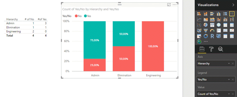
I think you may look for something like this:

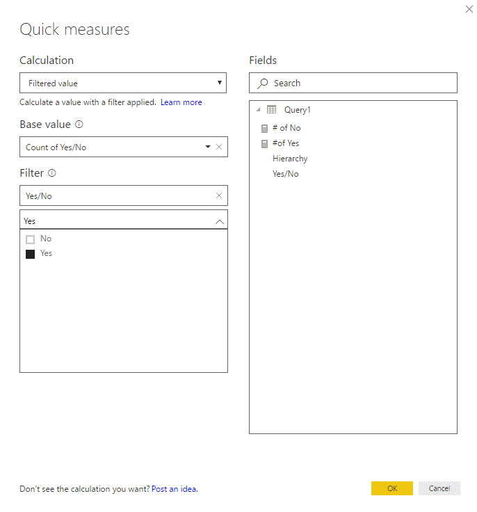
If you need it in a table visual, use Quick Measures - Filtered value. Example (to count the number of Yes):

If your goal is just to visualize the ratio, use 100% Stacked bar chart as I did in the first screenshot above.
Hope that helps.
Cheers,
Pawel
- Mark as New
- Bookmark
- Subscribe
- Mute
- Subscribe to RSS Feed
- Permalink
- Report Inappropriate Content
You can find more on Quick Measures in Power BI documentation: https://powerbi.microsoft.com/en-us/documentation/powerbi-desktop-quick-measures/.
- Mark as New
- Bookmark
- Subscribe
- Mute
- Subscribe to RSS Feed
- Permalink
- Report Inappropriate Content
Thanks for your help @Anonymous 🙂
- Mark as New
- Bookmark
- Subscribe
- Mute
- Subscribe to RSS Feed
- Permalink
- Report Inappropriate Content
Hi,
I think you may look for something like this:

If you need it in a table visual, use Quick Measures - Filtered value. Example (to count the number of Yes):

If your goal is just to visualize the ratio, use 100% Stacked bar chart as I did in the first screenshot above.
Hope that helps.
Cheers,
Pawel
Helpful resources

Fabric Data Days
Advance your Data & AI career with 50 days of live learning, contests, hands-on challenges, study groups & certifications and more!

Power BI Monthly Update - October 2025
Check out the October 2025 Power BI update to learn about new features.

