FabCon is coming to Atlanta
Join us at FabCon Atlanta from March 16 - 20, 2026, for the ultimate Fabric, Power BI, AI and SQL community-led event. Save $200 with code FABCOMM.
Register now!- Power BI forums
- Get Help with Power BI
- Desktop
- Service
- Report Server
- Power Query
- Mobile Apps
- Developer
- DAX Commands and Tips
- Custom Visuals Development Discussion
- Health and Life Sciences
- Power BI Spanish forums
- Translated Spanish Desktop
- Training and Consulting
- Instructor Led Training
- Dashboard in a Day for Women, by Women
- Galleries
- Data Stories Gallery
- Themes Gallery
- Contests Gallery
- QuickViz Gallery
- Quick Measures Gallery
- Visual Calculations Gallery
- Notebook Gallery
- Translytical Task Flow Gallery
- TMDL Gallery
- R Script Showcase
- Webinars and Video Gallery
- Ideas
- Custom Visuals Ideas (read-only)
- Issues
- Issues
- Events
- Upcoming Events
The Power BI Data Visualization World Championships is back! Get ahead of the game and start preparing now! Learn more
- Power BI forums
- Forums
- Get Help with Power BI
- Desktop
- Plotting workforce numbers over time
- Subscribe to RSS Feed
- Mark Topic as New
- Mark Topic as Read
- Float this Topic for Current User
- Bookmark
- Subscribe
- Printer Friendly Page
- Mark as New
- Bookmark
- Subscribe
- Mute
- Subscribe to RSS Feed
- Permalink
- Report Inappropriate Content
Plotting workforce numbers over time
Hi All,
I need help plotting the total number of personnel working on my project over time (total personnel by month) over the year.
I have a table called "PEOPLE" which contains all my project's personnel data:
- ID
- Name
- role
- start date
- end date
- isActive = Y/N
- etc etc
I have a date table containing date, month, quarter, year, monthsort from 2018-2025.
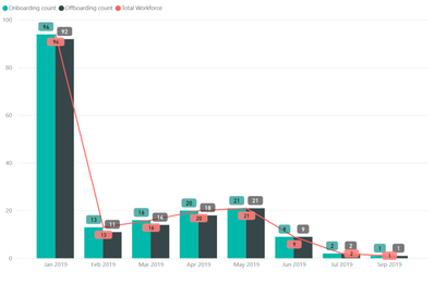
I want to visualize a stacked bar/line graph showing the following:
- Line - Total number of active personnel per month for 2018/2019
- I'm thinking that I have to calculate the total number of [isActive] per month into a new column and then plot that as a line in the visual?
- Bar - Total number of new starters per month (using start date)
- Would I create a relationship between People and Date tables by start date and then plot as a bar?
- bar - Total number of off-boarding per month (using end date)
- Would I create another relationship between People and Date tables by end date? Or can I leverage the start date relationship above somehow?
See below mock up (the red line is obviously not accurate, I just put it in there for illustration purposes)
Thanks in advance
Solved! Go to Solution.
- Mark as New
- Bookmark
- Subscribe
- Mute
- Subscribe to RSS Feed
- Permalink
- Report Inappropriate Content
Hi @tstraker ,
Current power bi not support direct analysis multiple date fields, you can consider to create a bridge table to expand all date ranges and link to variable table.
Spread revenue across period based on start and end date, slice and dase this using different dates
Regards,
Xiaoxin Sheng
Helpful resources

Power BI Dataviz World Championships
The Power BI Data Visualization World Championships is back! Get ahead of the game and start preparing now!

| User | Count |
|---|---|
| 37 | |
| 37 | |
| 33 | |
| 32 | |
| 29 |
| User | Count |
|---|---|
| 130 | |
| 88 | |
| 82 | |
| 68 | |
| 64 |


