FabCon is coming to Atlanta
Join us at FabCon Atlanta from March 16 - 20, 2026, for the ultimate Fabric, Power BI, AI and SQL community-led event. Save $200 with code FABCOMM.
Register now!- Power BI forums
- Get Help with Power BI
- Desktop
- Service
- Report Server
- Power Query
- Mobile Apps
- Developer
- DAX Commands and Tips
- Custom Visuals Development Discussion
- Health and Life Sciences
- Power BI Spanish forums
- Translated Spanish Desktop
- Training and Consulting
- Instructor Led Training
- Dashboard in a Day for Women, by Women
- Galleries
- Data Stories Gallery
- Themes Gallery
- Contests Gallery
- Quick Measures Gallery
- Notebook Gallery
- Translytical Task Flow Gallery
- TMDL Gallery
- R Script Showcase
- Webinars and Video Gallery
- Ideas
- Custom Visuals Ideas (read-only)
- Issues
- Issues
- Events
- Upcoming Events
To celebrate FabCon Vienna, we are offering 50% off select exams. Ends October 3rd. Request your discount now.
- Power BI forums
- Forums
- Get Help with Power BI
- Desktop
- Re: Plotting multiple series in a line chart
- Subscribe to RSS Feed
- Mark Topic as New
- Mark Topic as Read
- Float this Topic for Current User
- Bookmark
- Subscribe
- Printer Friendly Page
- Mark as New
- Bookmark
- Subscribe
- Mute
- Subscribe to RSS Feed
- Permalink
- Report Inappropriate Content
Plotting multiple series in a line chart
Hey guys
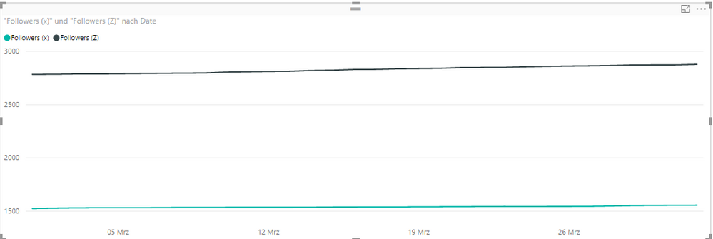
I'm trying to visualize two lines in a chart.
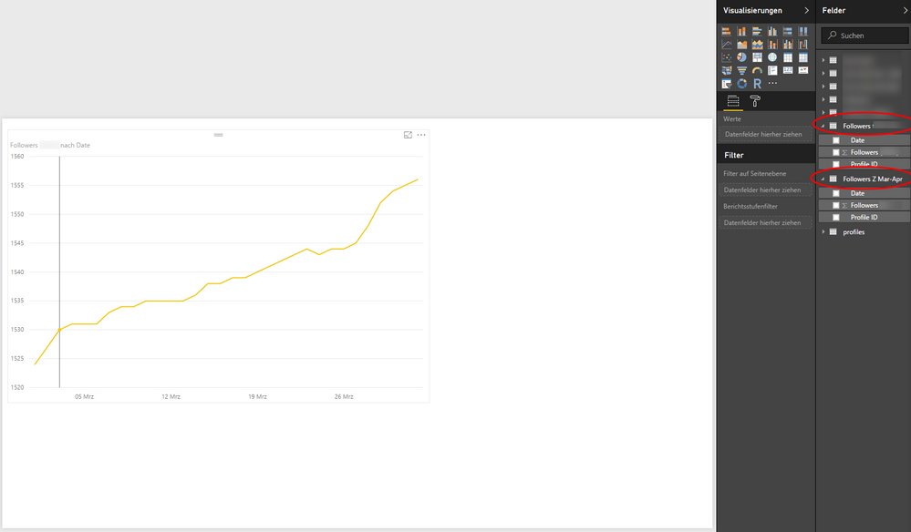
Line 1 is followers of our first social media account, while line 2 should represent our other account. You see both variables under Fields.
I have daily values for each variable, starting March 1 2017 to April 1 2017.
I know how I can display one line (drag Followers to Values, Date to Axis and Profiles to Legend) but I can't figure out how to add in the second line in the same chart.
How do I go about that?
Cheers
Solved! Go to Solution.
- Mark as New
- Bookmark
- Subscribe
- Mute
- Subscribe to RSS Feed
- Permalink
- Report Inappropriate Content
Actually I misspoke you will want "Append Queries". Go to the query editor and you will find the "Append Queries" on the Home tab on the far right:
You will be asked which tables you want to append (one to the other, assuming they have the same columns).
- Mark as New
- Bookmark
- Subscribe
- Mute
- Subscribe to RSS Feed
- Permalink
- Report Inappropriate Content
Add a column to each of the tables indicating while "follow" set it comes from, then merge the tables. Using the merged tables "Legend" would be the follow identifier (possible that this is already in the Profile ID column? - if so then you can merge the tables as is).
Hope this helps
David
- Mark as New
- Bookmark
- Subscribe
- Mute
- Subscribe to RSS Feed
- Permalink
- Report Inappropriate Content
Thanks for your reply, David.
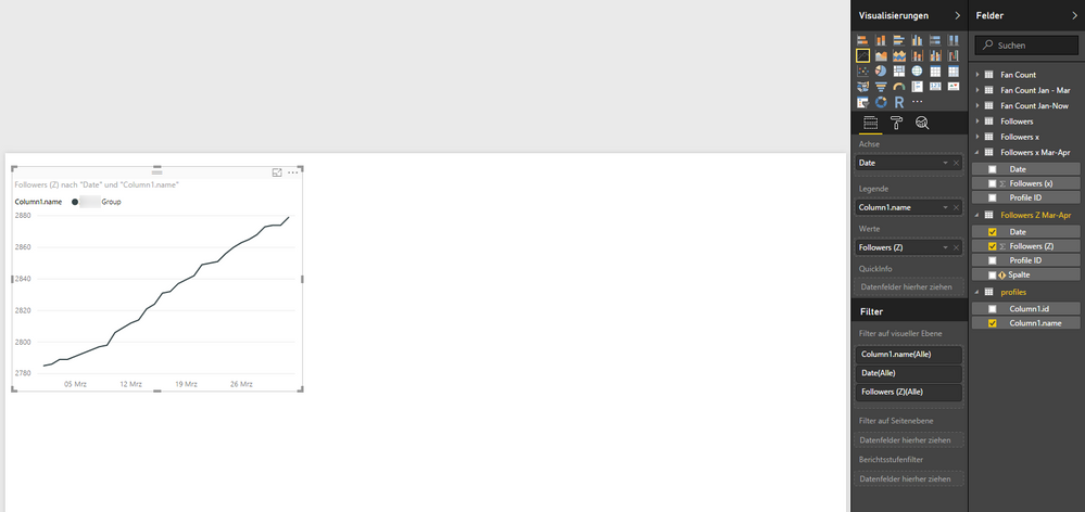
I masked the confidential parts of the data so here we go with what I have right now:
Followers (Z) is my value, Date is my axis and profiles is my legend.
Both Z and X are linked to profiles which is the legend, so this could serve as the identifier.
How can I now merge the tables and display Followers x?
I'm sorry, I have never merged tables in Power BI before.
Best,
Kevin
- Mark as New
- Bookmark
- Subscribe
- Mute
- Subscribe to RSS Feed
- Permalink
- Report Inappropriate Content
Actually I misspoke you will want "Append Queries". Go to the query editor and you will find the "Append Queries" on the Home tab on the far right:
You will be asked which tables you want to append (one to the other, assuming they have the same columns).
- Mark as New
- Bookmark
- Subscribe
- Mute
- Subscribe to RSS Feed
- Permalink
- Report Inappropriate Content
You are my personal hero, Sir.


