Get Fabric certified for FREE!
Don't miss your chance to take the Fabric Data Engineer (DP-600) exam for FREE! Find out how by attending the DP-600 session on April 23rd (pacific time), live or on-demand.
Learn more- Power BI forums
- Get Help with Power BI
- Desktop
- Service
- Report Server
- Power Query
- Mobile Apps
- Developer
- DAX Commands and Tips
- Custom Visuals Development Discussion
- Health and Life Sciences
- Power BI Spanish forums
- Translated Spanish Desktop
- Training and Consulting
- Instructor Led Training
- Dashboard in a Day for Women, by Women
- Galleries
- Data Stories Gallery
- Themes Gallery
- Contests Gallery
- QuickViz Gallery
- Quick Measures Gallery
- Visual Calculations Gallery
- Notebook Gallery
- Translytical Task Flow Gallery
- TMDL Gallery
- R Script Showcase
- Webinars and Video Gallery
- Ideas
- Custom Visuals Ideas (read-only)
- Issues
- Issues
- Events
- Upcoming Events
Next up in the FabCon + SQLCon recap series: The roadmap for Microsoft SQL and Maximizing Developer experiences in Fabric. All sessions are available on-demand after the live show. Register now
- Power BI forums
- Forums
- Get Help with Power BI
- Desktop
- Plotting Data Weekly
- Subscribe to RSS Feed
- Mark Topic as New
- Mark Topic as Read
- Float this Topic for Current User
- Bookmark
- Subscribe
- Printer Friendly Page
- Mark as New
- Bookmark
- Subscribe
- Mute
- Subscribe to RSS Feed
- Permalink
- Report Inappropriate Content
Plotting Data Weekly
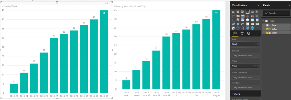
I have this data below which is collected once a week. I've tried a few differnt ways of plotting this and Power BI doesn't seem to like it. What am I missing and how can I work with this data?
| 1-Jun | 5 |
| 8-Jun | 11 |
| 15-Jun | 16 |
| 22-Jun | 22 |
| 29-Jun | 30 |
| 6-Jul | 32 |
| 13-Jul | 34 |
| 20-Jul | 37 |
| 27-Jul | 40 |
| 3-Aug | 45 |
Solved! Go to Solution.
- Mark as New
- Bookmark
- Subscribe
- Mute
- Subscribe to RSS Feed
- Permalink
- Report Inappropriate Content
Week = YEAR(Table[Date])&"-"&WEEKNUM(Table[Date])
- Mark as New
- Bookmark
- Subscribe
- Mute
- Subscribe to RSS Feed
- Permalink
- Report Inappropriate Content
That is a lot more elegant than the solution I was attempting to work towards. Thanks!
- Mark as New
- Bookmark
- Subscribe
- Mute
- Subscribe to RSS Feed
- Permalink
- Report Inappropriate Content
what exactly doesn't PBI like?
- Mark as New
- Bookmark
- Subscribe
- Mute
- Subscribe to RSS Feed
- Permalink
- Report Inappropriate Content
I am new to Power BI and have tried to plot similar weekly data. I tried using the formula given in the post but I couldn't get it to work. Please could somebody show me how to do this so that I can show data collected on a weekly basis on a graph, and show the date rather than week number on the axis (just as in the example above)
- Mark as New
- Bookmark
- Subscribe
- Mute
- Subscribe to RSS Feed
- Permalink
- Report Inappropriate Content
- Mark as New
- Bookmark
- Subscribe
- Mute
- Subscribe to RSS Feed
- Permalink
- Report Inappropriate Content
Week = YEAR(Table[Date])&"-"&WEEKNUM(Table[Date])
- Mark as New
- Bookmark
- Subscribe
- Mute
- Subscribe to RSS Feed
- Permalink
- Report Inappropriate Content
- Mark as New
- Bookmark
- Subscribe
- Mute
- Subscribe to RSS Feed
- Permalink
- Report Inappropriate Content
@travbum Well since you said "elegant" now I feel compelled to give you the solution that will sort weeks 1 thru 9 properly
Year-Week =
    YEAR ( 'Calendar'[Date] ) & "-"
        & CONCATENATE (
            IF ( WEEKNUM ( 'Calendar'[Date] ) < 10, "0", "" ),
            WEEKNUM ( 'Calendar'[Date] )
        )
Helpful resources

New to Fabric Survey
If you have recently started exploring Fabric, we'd love to hear how it's going. Your feedback can help with product improvements.

Power BI DataViz World Championships - June 2026
A new Power BI DataViz World Championship is coming this June! Don't miss out on submitting your entry.

Join our Fabric User Panel
Share feedback directly with Fabric product managers, participate in targeted research studies and influence the Fabric roadmap.

| User | Count |
|---|---|
| 48 | |
| 43 | |
| 39 | |
| 19 | |
| 17 |
| User | Count |
|---|---|
| 69 | |
| 63 | |
| 32 | |
| 30 | |
| 23 |

