FabCon is coming to Atlanta
Join us at FabCon Atlanta from March 16 - 20, 2026, for the ultimate Fabric, Power BI, AI and SQL community-led event. Save $200 with code FABCOMM.
Register now!- Power BI forums
- Get Help with Power BI
- Desktop
- Service
- Report Server
- Power Query
- Mobile Apps
- Developer
- DAX Commands and Tips
- Custom Visuals Development Discussion
- Health and Life Sciences
- Power BI Spanish forums
- Translated Spanish Desktop
- Training and Consulting
- Instructor Led Training
- Dashboard in a Day for Women, by Women
- Galleries
- Data Stories Gallery
- Themes Gallery
- Contests Gallery
- QuickViz Gallery
- Quick Measures Gallery
- Visual Calculations Gallery
- Notebook Gallery
- Translytical Task Flow Gallery
- TMDL Gallery
- R Script Showcase
- Webinars and Video Gallery
- Ideas
- Custom Visuals Ideas (read-only)
- Issues
- Issues
- Events
- Upcoming Events
Get Fabric Certified for FREE during Fabric Data Days. Don't miss your chance! Request now
- Power BI forums
- Forums
- Get Help with Power BI
- Desktop
- Re: Pivot data
- Subscribe to RSS Feed
- Mark Topic as New
- Mark Topic as Read
- Float this Topic for Current User
- Bookmark
- Subscribe
- Printer Friendly Page
- Mark as New
- Bookmark
- Subscribe
- Mute
- Subscribe to RSS Feed
- Permalink
- Report Inappropriate Content
Pivot data
Below is my data:
| MemberID | Cancer Column | Hypertension Column | Diabetes Column |
| 1 | n | n | diabetes |
| 2 | cancer | n | n |
| 2 | cancer | n | n |
| 3 | n | n | diabetes |
| 4 | n | hypertension | diabetes |
| 1 | n | n | diabetes |
| 6 | cancer | hypertension | n |
| 2 | cancer | n | n |
| 5 | n | hypertension | n |
| 3 | n | n | diabetes |
I would like to draw a graph as below:
cancer column, hypertension column, diabetes column correspond to chronic conditions.
y-axis should be the distinct count of members having that chronic condition.
How can i acheive this? do i need to create another table?
Solved! Go to Solution.
- Mark as New
- Bookmark
- Subscribe
- Mute
- Subscribe to RSS Feed
- Permalink
- Report Inappropriate Content
Hi @bsushy,
As the Cancer Column, Diabetes and Hypertension Columns are calculated columns, they won't appear in Query Editor. So the Pivot option is not available here.
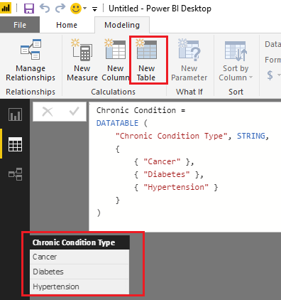
Based on my test, you can firstly use the formula below to create a new table which has a column of Chronic Condition Types.
Chronic Condition =
DATATABLE (
    "Chronic Condition Type", STRING,
    {
        { "Cancer" },
        { "Diabetes" },
        { "Hypertension" }
    }
)
Then you should be able to use the formula below to create a new measure to calculate distinct count of MemberID for each Chronic Condition Type from your original table('Table1').
Measure =
IF (
    HASONEVALUE ( 'Chronic Condition'[Chronic Condition Type] ),
    SWITCH (
        VALUES ( 'Chronic Condition'[Chronic Condition Type] ),
        "Cancer", CALCULATE (
            DISTINCTCOUNT ( Table1[MemberID] ),
            Table1[Cancer Column] = "cancer"
        ),
        "Hypertension", CALCULATE (
            DISTINCTCOUNT ( Table1[MemberID] ),
            Table1[Hypertension Column] = "hypertension"
        ),
        "Diabetes", CALCULATE (
            DISTINCTCOUNT ( Table1[MemberID] ),
            Table1[Diabetes Column] = "diabetes"
        )
    )
)
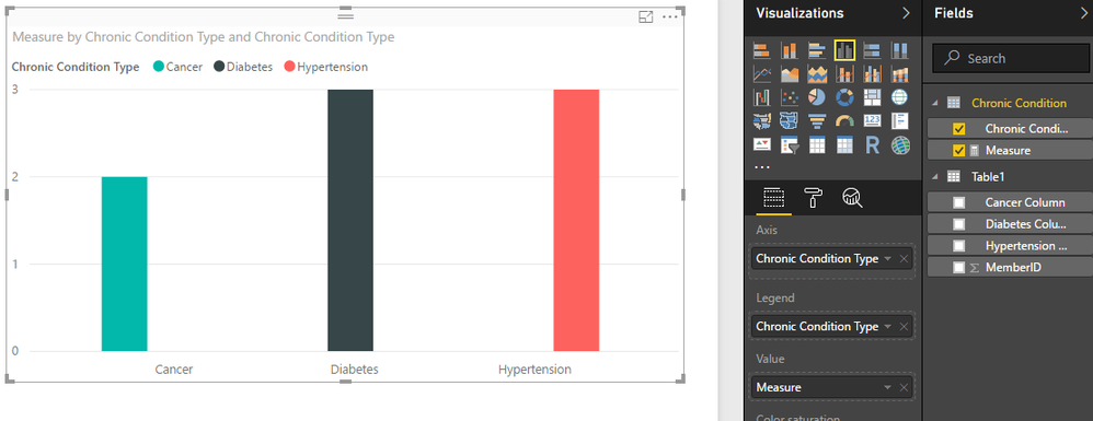
And then you can show the 'Chronic Condition'[Chronic Condition Type] as Axis, and the measure as Value to get your expected result. ![]()
Regards
- Mark as New
- Bookmark
- Subscribe
- Mute
- Subscribe to RSS Feed
- Permalink
- Report Inappropriate Content
If I understand correctly, I suggest removing duplicate records during your data processing. That way you will have a unique record for each member. Then it should be a simple matter of graphing the table. You may need to take the extra step of converting all of the "n" values to 0 and the non-"n" to 1. Then you can simply sum the columns.
- Mark as New
- Bookmark
- Subscribe
- Mute
- Subscribe to RSS Feed
- Permalink
- Report Inappropriate Content
@orourkebp thank you for responding.
How do i pivot calculated coulmns? Cancer Column, Diabetes and Hypertension Columns are calculated columns...I would like to pivot because it is easy to get those columns on a single axis.
- Mark as New
- Bookmark
- Subscribe
- Mute
- Subscribe to RSS Feed
- Permalink
- Report Inappropriate Content
Hi @bsushy,
As the Cancer Column, Diabetes and Hypertension Columns are calculated columns, they won't appear in Query Editor. So the Pivot option is not available here.
Based on my test, you can firstly use the formula below to create a new table which has a column of Chronic Condition Types.
Chronic Condition =
DATATABLE (
    "Chronic Condition Type", STRING,
    {
        { "Cancer" },
        { "Diabetes" },
        { "Hypertension" }
    }
)
Then you should be able to use the formula below to create a new measure to calculate distinct count of MemberID for each Chronic Condition Type from your original table('Table1').
Measure =
IF (
    HASONEVALUE ( 'Chronic Condition'[Chronic Condition Type] ),
    SWITCH (
        VALUES ( 'Chronic Condition'[Chronic Condition Type] ),
        "Cancer", CALCULATE (
            DISTINCTCOUNT ( Table1[MemberID] ),
            Table1[Cancer Column] = "cancer"
        ),
        "Hypertension", CALCULATE (
            DISTINCTCOUNT ( Table1[MemberID] ),
            Table1[Hypertension Column] = "hypertension"
        ),
        "Diabetes", CALCULATE (
            DISTINCTCOUNT ( Table1[MemberID] ),
            Table1[Diabetes Column] = "diabetes"
        )
    )
)
And then you can show the 'Chronic Condition'[Chronic Condition Type] as Axis, and the measure as Value to get your expected result. ![]()
Regards
- Mark as New
- Bookmark
- Subscribe
- Mute
- Subscribe to RSS Feed
- Permalink
- Report Inappropriate Content
Thank you:)
Helpful resources

Power BI Monthly Update - November 2025
Check out the November 2025 Power BI update to learn about new features.

Fabric Data Days
Advance your Data & AI career with 50 days of live learning, contests, hands-on challenges, study groups & certifications and more!


