FabCon is coming to Atlanta
Join us at FabCon Atlanta from March 16 - 20, 2026, for the ultimate Fabric, Power BI, AI and SQL community-led event. Save $200 with code FABCOMM.
Register now!- Power BI forums
- Get Help with Power BI
- Desktop
- Service
- Report Server
- Power Query
- Mobile Apps
- Developer
- DAX Commands and Tips
- Custom Visuals Development Discussion
- Health and Life Sciences
- Power BI Spanish forums
- Translated Spanish Desktop
- Training and Consulting
- Instructor Led Training
- Dashboard in a Day for Women, by Women
- Galleries
- Data Stories Gallery
- Themes Gallery
- Contests Gallery
- QuickViz Gallery
- Quick Measures Gallery
- Visual Calculations Gallery
- Notebook Gallery
- Translytical Task Flow Gallery
- TMDL Gallery
- R Script Showcase
- Webinars and Video Gallery
- Ideas
- Custom Visuals Ideas (read-only)
- Issues
- Issues
- Events
- Upcoming Events
The Power BI Data Visualization World Championships is back! Get ahead of the game and start preparing now! Learn more
- Power BI forums
- Forums
- Get Help with Power BI
- Desktop
- Re: Pie-charts in power-BI no longer working in MS...
- Subscribe to RSS Feed
- Mark Topic as New
- Mark Topic as Read
- Float this Topic for Current User
- Bookmark
- Subscribe
- Printer Friendly Page
- Mark as New
- Bookmark
- Subscribe
- Mute
- Subscribe to RSS Feed
- Permalink
- Report Inappropriate Content
Pie-charts in power-BI no longer working in MS Map visuals when using latitude/longitude
Hi,
This appears to be a bug?!
Pie-charts are no longer working in PowerBI Desktop maps, if you are using "longitude/latitude" as locators.
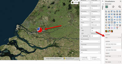
Before the latest update, PowerBI Azure map would refuse to make pie-charts of my geo-data, unless I used "City" as the locator.
Currently I use latitude/longitude for exact positions, and that worked well for the older version "MS Map" in PowerBI Desktop.
However. Now with the latest update of PowerBI desktop Version: 2.118.828.0 64-bit (june 2023),
Not only for the newer "Azure map" visuals, but neither will Pie-charts work anymore in the older visual "MS Map".
When changing to "city":
How can I resolve this issue. It is very frustrating having spent considerable amount of time to structure data and group assets to latitude/longitude.
Any suggestions? Or is this a known bug?
Best regards
Peter
- Mark as New
- Bookmark
- Subscribe
- Mute
- Subscribe to RSS Feed
- Permalink
- Report Inappropriate Content
Same issue...luckliy I hadn't hit the save button
- Mark as New
- Bookmark
- Subscribe
- Mute
- Subscribe to RSS Feed
- Permalink
- Report Inappropriate Content
Hi Twoods, I reported this issue through our main support channel that connected to MS developers. They recognize this bug and will work a on releasing a fix. Hopefully by the end of this year. (Hopefully earlier, because this bug prohibits me from using any Azure map visual and migrate from the older "Map" visual).
- Mark as New
- Bookmark
- Subscribe
- Mute
- Subscribe to RSS Feed
- Permalink
- Report Inappropriate Content
Nobody experiencing this issue?
- Mark as New
- Bookmark
- Subscribe
- Mute
- Subscribe to RSS Feed
- Permalink
- Report Inappropriate Content
Do anyone have an idea about how to resolve this issue with Azure map?
- Mark as New
- Bookmark
- Subscribe
- Mute
- Subscribe to RSS Feed
- Permalink
- Report Inappropriate Content
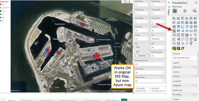
Actually, I have found out that the original visual "MS Map" DO WORK with pie charts.
I had mixed up my visuals.
I use the exact same data, and with original "MS Map" visual, using longitude/latitude works well to make pie charts. See print screen:
But when attempting to use the exact same data with Azure map, pie charts won't work.
Azure map supports pie charts only if you use "City" as locator.
Is this not a bug in Azure map?
Preferably, I'd like to use Azure map. Even though the satellite images are the same from Bing, Azure maps offers more extensive settings and looks nicer, since pies are not left with 'transparency'. In MS Map, there is no way to adjust transparency level with the pies, which is frustrating.
Do anyone expeirence the same issue?
Helpful resources

Power BI Dataviz World Championships
The Power BI Data Visualization World Championships is back! Get ahead of the game and start preparing now!

| User | Count |
|---|---|
| 41 | |
| 38 | |
| 36 | |
| 30 | |
| 28 |
| User | Count |
|---|---|
| 128 | |
| 88 | |
| 79 | |
| 67 | |
| 62 |


