FabCon is coming to Atlanta
Join us at FabCon Atlanta from March 16 - 20, 2026, for the ultimate Fabric, Power BI, AI and SQL community-led event. Save $200 with code FABCOMM.
Register now!- Power BI forums
- Get Help with Power BI
- Desktop
- Service
- Report Server
- Power Query
- Mobile Apps
- Developer
- DAX Commands and Tips
- Custom Visuals Development Discussion
- Health and Life Sciences
- Power BI Spanish forums
- Translated Spanish Desktop
- Training and Consulting
- Instructor Led Training
- Dashboard in a Day for Women, by Women
- Galleries
- Data Stories Gallery
- Themes Gallery
- Contests Gallery
- QuickViz Gallery
- Quick Measures Gallery
- Visual Calculations Gallery
- Notebook Gallery
- Translytical Task Flow Gallery
- TMDL Gallery
- R Script Showcase
- Webinars and Video Gallery
- Ideas
- Custom Visuals Ideas (read-only)
- Issues
- Issues
- Events
- Upcoming Events
Learn from the best! Meet the four finalists headed to the FINALS of the Power BI Dataviz World Championships! Register now
- Power BI forums
- Forums
- Get Help with Power BI
- Desktop
- Pie Chart split slice colours
- Subscribe to RSS Feed
- Mark Topic as New
- Mark Topic as Read
- Float this Topic for Current User
- Bookmark
- Subscribe
- Printer Friendly Page
- Mark as New
- Bookmark
- Subscribe
- Mute
- Subscribe to RSS Feed
- Permalink
- Report Inappropriate Content
Pie Chart split slice colours
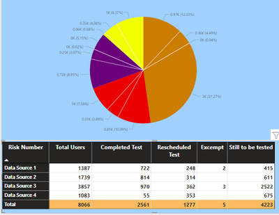
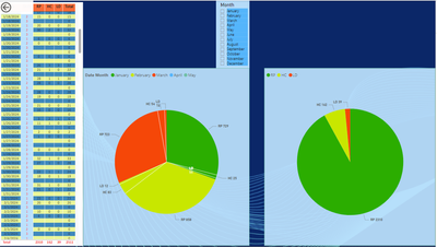
I have a piechart created from a matrix table whuich has 4 data sources. Each source is broken down into Total users. completed test, rescheduled, excempt and Still to be tested.
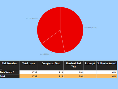
What Im trying to do is for each datasource pie slice, have each segment of that slice a different colour, so that if I used a slicer and chose a specific data source, each part of that pie would be a different colour. At the moment, I can see each data source and the splits per matrix column but they are the same base colour
Is this possible out of the box?
Solved! Go to Solution.
- Mark as New
- Bookmark
- Subscribe
- Mute
- Subscribe to RSS Feed
- Permalink
- Report Inappropriate Content
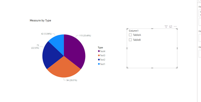
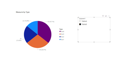
you can refer to the following example:
e.g
Measure = IF(ISFILTERED('Table (4)'[Column1]),IF(MAX('Table (4)'[Column1])="TableA",SUM(TableA[Column2]),SUM(TableB[Column2])),SUM(TableA[Column2])+SUM(TableB[Column2]))Output:
Best Regards!
Yolo Zhu
If this post helps, then please consider Accept it as the solution to help the other members find it more quickly.
- Mark as New
- Bookmark
- Subscribe
- Mute
- Subscribe to RSS Feed
- Permalink
- Report Inappropriate Content
Hello, I tried to recreate your suggestion in my project because I have the same situation, but in my case I want to divide by months, and I have multiple columns, I spent a lot of time but I didn't get the result. My only option is to duplicate the main PIE and change the parameters. Do you have another option using Months as a divisor?
I appreciate anye help.
dangcab
- Mark as New
- Bookmark
- Subscribe
- Mute
- Subscribe to RSS Feed
- Permalink
- Report Inappropriate Content
Hi!
Not out of the box, as far as I know. You can split colors either by category or source, but there will be shared colors.
What you probably could to is to create a new table where all data sources are combined using UNION(). In that table create a new column using CONCATENATE() with Category and Data Source as input and then using that column along with the values in your pie chart. That should give you the opportunity to set distinct colors for all combinations of data source and category.
Good luck!
Helpful resources

Join our Fabric User Panel
Share feedback directly with Fabric product managers, participate in targeted research studies and influence the Fabric roadmap.

Power BI Monthly Update - February 2026
Check out the February 2026 Power BI update to learn about new features.

| User | Count |
|---|---|
| 63 | |
| 55 | |
| 41 | |
| 16 | |
| 14 |
| User | Count |
|---|---|
| 98 | |
| 80 | |
| 35 | |
| 29 | |
| 25 |
