cancel
Showing results for 
Search instead for 
Did you mean: 

July 7 - July 17 | Round 2 of the Power BI Dataviz World Championships. Don't miss your chance! Learn more

Reply
highlander25361
Regular Visitor

Pie Chart split slice colours

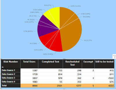
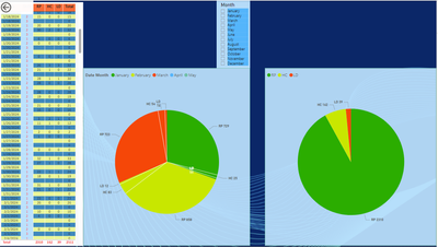
I have a piechart created from a matrix table whuich has 4 data sources. Each source is broken down into Total users. completed test, rescheduled, excempt and Still to be tested.


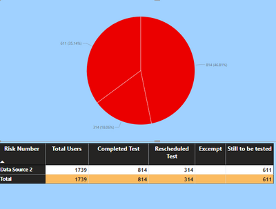
What Im trying to do is for each datasource pie slice, have each segment of that slice a different colour, so that if I used a slicer and chose a specific data source, each part of that pie would be a different colour. At the moment, I can see each data source and the splits per matrix column but they are the same base colour

highlander25361_0-1673969371497.png

highlander25361_1-1673969585827.png


Is this possible out of the box?

1 ACCEPTED SOLUTION
Anonymous
Not applicable

Hi @highlander25361 

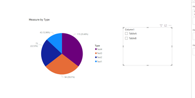
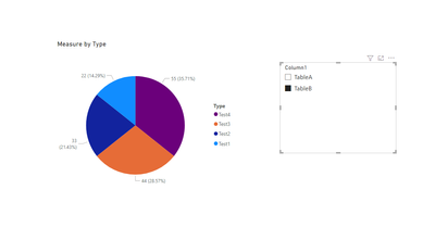
you can refer to the following example:

e.g

Measure = IF(ISFILTERED('Table (4)'[Column1]),IF(MAX('Table (4)'[Column1])="TableA",SUM(TableA[Column2]),SUM(TableB[Column2])),SUM(TableA[Column2])+SUM(TableB[Column2]))

Output:

vxinruzhumsft_0-1674010268481.png


vxinruzhumsft_1-1674010276158.png

Best Regards!

Yolo Zhu

If this post helps, then please consider Accept it as the solution to help the other members find it more quickly.

View solution in original post

3 REPLIES 3
Anonymous
Not applicable

Hi @highlander25361 

you can refer to the following example:

e.g

Measure = IF(ISFILTERED('Table (4)'[Column1]),IF(MAX('Table (4)'[Column1])="TableA",SUM(TableA[Column2]),SUM(TableB[Column2])),SUM(TableA[Column2])+SUM(TableB[Column2]))

Output:

vxinruzhumsft_0-1674010268481.png


vxinruzhumsft_1-1674010276158.png

Best Regards!

Yolo Zhu

If this post helps, then please consider Accept it as the solution to help the other members find it more quickly.

Hello, I tried to recreate your suggestion in my project because I have the same situation, but in my case I want to divide by months, and I have multiple columns, I spent a lot of time but I didn't get the result. My only option is to duplicate the main PIE and change the parameters. Do you have another option using Months as a divisor?


I appreciate anye help.


dangcab

dangcab_0-1711642776123.png


TomasAndersson
Solution Sage
Solution Sage

Hi!
Not out of the box, as far as I know. You can split colors either by category or source, but there will be shared colors.


What you probably could to is to create a new table where all data sources are combined using UNION(). In that table create a new column using CONCATENATE() with Category and Data Source as input and then using that column along with the values in your pie chart. That should give you the opportunity to set distinct colors for all combinations of data source and category.

Good luck!

Helpful resources

Announcements
FabCon and SQLCon Barcelona 2026

FabCon & SQLCon – Barcelona 2026

Join us in Barcelona for FabCon and SQLCon, the Fabric, Power BI, SQL, and AI community event. Save €200 with code FABCMTY200.

60 days of Data Days Carousel

Data Days 2026

Join Data Days 2026: 60 days of free live/on-demand sessions, challenges, study groups, and certification opportunities.

Power BI DataViz World Championships carousel

Power BI DataViz World Championships - June 2026

A new Power BI DataViz World Championship is coming this June! Don't miss out on submitting your entry.

Top Solution Authors