- Power BI forums
- Get Help with Power BI
- Desktop
- Service
- Report Server
- Power Query
- Mobile Apps
- Developer
- DAX Commands and Tips
- Custom Visuals Development Discussion
- Health and Life Sciences
- Power BI Spanish forums
- Translated Spanish Desktop
- Training and Consulting
- Instructor Led Training
- Dashboard in a Day for Women, by Women
- Galleries
- Data Stories Gallery
- Themes Gallery
- Contests Gallery
- QuickViz Gallery
- Quick Measures Gallery
- Visual Calculations Gallery
- Notebook Gallery
- Translytical Task Flow Gallery
- TMDL Gallery
- R Script Showcase
- Webinars and Video Gallery
- Ideas
- Custom Visuals Ideas (read-only)
- Issues
- Issues
- Events
- Upcoming Events
Learn from the best! Meet the four finalists headed to the FINALS of the Power BI Dataviz World Championships! Register now
- Power BI forums
- Forums
- Get Help with Power BI
- Desktop
- Personalized histogram
- Subscribe to RSS Feed
- Mark Topic as New
- Mark Topic as Read
- Float this Topic for Current User
- Bookmark
- Subscribe
- Printer Friendly Page
- Mark as New
- Bookmark
- Subscribe
- Mute
- Subscribe to RSS Feed
- Permalink
- Report Inappropriate Content
Personalized histogram
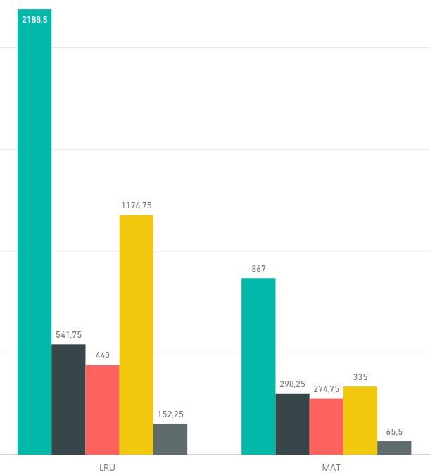
I have these different colors/cathegories because I put different value fields (sum mode) in the Values box of the visual object (no legenda used). Is there a way to have for each x-Axis element (LRU and MAT in this example) the first GREEN bar as it is, next to it the RED bar over the BLACK one, and next to it the GREY column over the YELLOW one?
- Mark as New
- Bookmark
- Subscribe
- Mute
- Subscribe to RSS Feed
- Permalink
- Report Inappropriate Content
Yes if You add a Category-column to Your data where the green is in a category for itself, while the others share same category.
- Mark as New
- Bookmark
- Subscribe
- Mute
- Subscribe to RSS Feed
- Permalink
- Report Inappropriate Content
Doing like this means to have a sum of the other 4 (three colours in total), I'd like to see them 4 with different colours but stacked in 2 columns (plus the green bar to the left).
- Mark as New
- Bookmark
- Subscribe
- Mute
- Subscribe to RSS Feed
- Permalink
- Report Inappropriate Content
Hi @AGo,
Based on test, currently clustered chart not support this feature. Since other users already shared this idea, you can vote it below :
Regards,
Xiaoxin Sheng
Helpful resources
| User | Count |
|---|---|
| 55 | |
| 37 | |
| 26 | |
| 17 | |
| 17 |
| User | Count |
|---|---|
| 69 | |
| 58 | |
| 39 | |
| 21 | |
| 21 |


