FabCon is coming to Atlanta
Join us at FabCon Atlanta from March 16 - 20, 2026, for the ultimate Fabric, Power BI, AI and SQL community-led event. Save $200 with code FABCOMM.
Register now!- Power BI forums
- Get Help with Power BI
- Desktop
- Service
- Report Server
- Power Query
- Mobile Apps
- Developer
- DAX Commands and Tips
- Custom Visuals Development Discussion
- Health and Life Sciences
- Power BI Spanish forums
- Translated Spanish Desktop
- Training and Consulting
- Instructor Led Training
- Dashboard in a Day for Women, by Women
- Galleries
- Data Stories Gallery
- Themes Gallery
- Contests Gallery
- QuickViz Gallery
- Quick Measures Gallery
- Visual Calculations Gallery
- Notebook Gallery
- Translytical Task Flow Gallery
- TMDL Gallery
- R Script Showcase
- Webinars and Video Gallery
- Ideas
- Custom Visuals Ideas (read-only)
- Issues
- Issues
- Events
- Upcoming Events
The Power BI Data Visualization World Championships is back! Get ahead of the game and start preparing now! Learn more
- Power BI forums
- Forums
- Get Help with Power BI
- Desktop
- Re: Persistent color and table conditional colorin...
- Subscribe to RSS Feed
- Mark Topic as New
- Mark Topic as Read
- Float this Topic for Current User
- Bookmark
- Subscribe
- Printer Friendly Page
- Mark as New
- Bookmark
- Subscribe
- Mute
- Subscribe to RSS Feed
- Permalink
- Report Inappropriate Content
Persistent color and table conditional coloring
Hello,
I have a couple things I can't figure out regarding conditional formating and colors
-Is there a way to bind a color to a field value? I have a True/false field in my report that I use a lot; I would like to always have Green/red colors when I use this field as a legend when I create a new chart. That seems like a basic functionality for report consistency but I can't find it.
-In Table conditional formating, how can I format based on the same value ? I want to have a green/red cell based on the value of the same boolean but it seems it only work with aggregation or color code. Do i need to have a 1/0 field or a color code field in addition to my boolean to achieve this ?
Thanks for your support
Solved! Go to Solution.
- Mark as New
- Bookmark
- Subscribe
- Mute
- Subscribe to RSS Feed
- Permalink
- Report Inappropriate Content
Hi @Anonymous ,
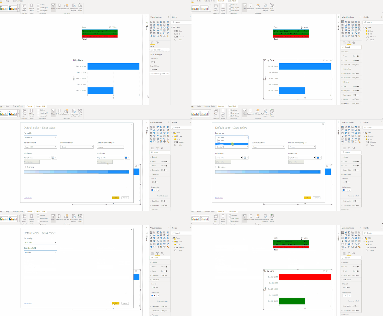
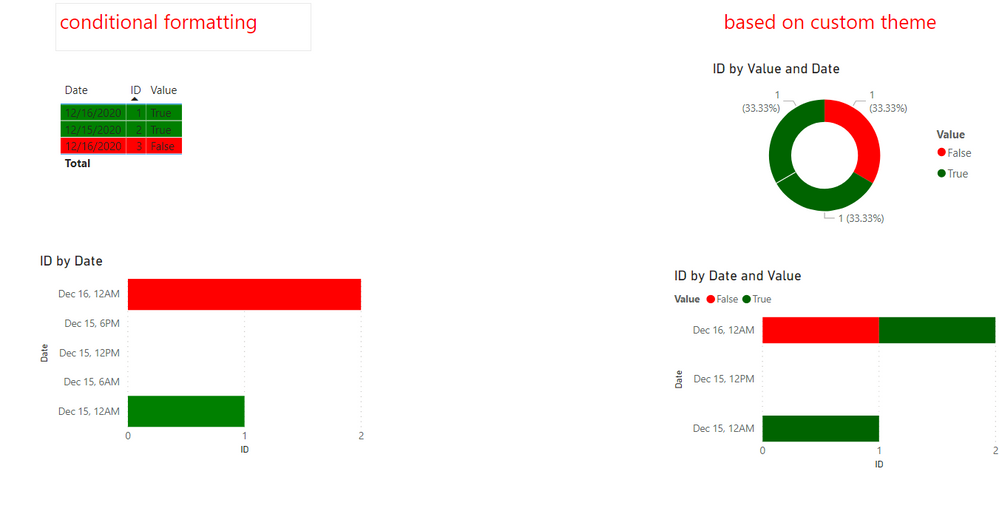
From my test, conditional formatting could be applied for Data color ,but it seems not reach the same output as in table.
I suggest you use custom theme instead like this:
Please take a look at the different output shown below:
But this is at idea/feedback level alone. Please let the power bi community to know this things and give your votes at power bi site's feedback - https://ideas.powerbi.com/ideas/idea/?ideaid=31fd95a4-308f-4a28-a3d4-10489b973642
If this post helps, then please consider Accept it as the solution to help the other members find it more quickly.
Best Regards,
Eyelyn Qin
- Mark as New
- Bookmark
- Subscribe
- Mute
- Subscribe to RSS Feed
- Permalink
- Report Inappropriate Content
Hi @Anonymous ,
To do this you can create a measure that will do the condittional formatting on all your visualizations. You need to do something similar to:
Condittional Formatting =
SWITCH(SELECTEDVALUE(Table[Column]);
True(); "Green";
False(); "Red"

)
The just use this measure on all the formatting fields you needs.
Two remarks about the measure above:
- I have use SELECTEDVALUE but for example only this can be used with a measure value with a MAX, MIN, and so on, the trick is to pickup the value you need and on the rest of the parameters set the different options and corresponding colours
- The "Green" and "Red" part can be changed to HEX codes that have the following pattern "#000000"
Regards
Miguel Félix
Did I answer your question? Mark my post as a solution!
Proud to be a Super User!
Check out my blog: Power BI em Português- Mark as New
- Bookmark
- Subscribe
- Mute
- Subscribe to RSS Feed
- Permalink
- Report Inappropriate Content
Hi Miguel,
Thanks for the tip, having this in a measure works works well for formating my table.
However in other charts (ex: stacked bar charts or donut), I don't see any way to use this, I have no formula option in the "Data color" pane when I have a field used as a legend. So I see no way of permanently bind a field value to a color. As a previous Tableau and Qlik user, that seems like a serious shortcoming for PowerBI .
- Mark as New
- Bookmark
- Subscribe
- Mute
- Subscribe to RSS Feed
- Permalink
- Report Inappropriate Content
When you use the legend on a visualization some of the features aren't available that is the case of the condittioonal formatting you need to use measures or columns on your visualization.
I don't know the exact setup of your model but if you create a measure for true and false you are able to then make the condittioonal formatting
Regards
Miguel Félix
Did I answer your question? Mark my post as a solution!
Proud to be a Super User!
Check out my blog: Power BI em PortuguêsHelpful resources

Power BI Dataviz World Championships
The Power BI Data Visualization World Championships is back! Get ahead of the game and start preparing now!

| User | Count |
|---|---|
| 38 | |
| 37 | |
| 33 | |
| 32 | |
| 29 |
| User | Count |
|---|---|
| 132 | |
| 88 | |
| 82 | |
| 68 | |
| 64 |


