FabCon is coming to Atlanta
Join us at FabCon Atlanta from March 16 - 20, 2026, for the ultimate Fabric, Power BI, AI and SQL community-led event. Save $200 with code FABCOMM.
Register now!- Power BI forums
- Get Help with Power BI
- Desktop
- Service
- Report Server
- Power Query
- Mobile Apps
- Developer
- DAX Commands and Tips
- Custom Visuals Development Discussion
- Health and Life Sciences
- Power BI Spanish forums
- Translated Spanish Desktop
- Training and Consulting
- Instructor Led Training
- Dashboard in a Day for Women, by Women
- Galleries
- Data Stories Gallery
- Themes Gallery
- Contests Gallery
- Quick Measures Gallery
- Notebook Gallery
- Translytical Task Flow Gallery
- TMDL Gallery
- R Script Showcase
- Webinars and Video Gallery
- Ideas
- Custom Visuals Ideas (read-only)
- Issues
- Issues
- Events
- Upcoming Events
Join the Fabric FabCon Global Hackathon—running virtually through Nov 3. Open to all skill levels. $10,000 in prizes! Register now.
- Power BI forums
- Forums
- Get Help with Power BI
- Desktop
- Paginated Report Builder Line Chart Showing Displa...
- Subscribe to RSS Feed
- Mark Topic as New
- Mark Topic as Read
- Float this Topic for Current User
- Bookmark
- Subscribe
- Printer Friendly Page
- Mark as New
- Bookmark
- Subscribe
- Mute
- Subscribe to RSS Feed
- Permalink
- Report Inappropriate Content
Paginated Report Builder Line Chart Showing Displaying Value For Empty Data Points
Hi All,
I am using the new paginated report builder and wonder if anyone knows how does the line chart handles empty values in the data?
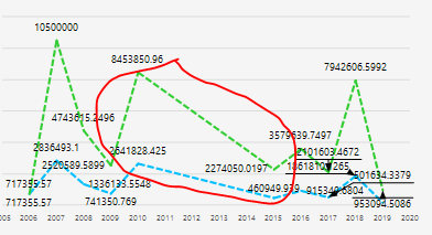
My line chart has a region where we don't have any data, so ideally it should just go to zero/show an empty space. However, it is connecting the two adjacent data points and create a line as if it changes constantly over that period of time. See attached.
Thanks in advance,
JC
Solved! Go to Solution.
- Mark as New
- Bookmark
- Subscribe
- Mute
- Subscribe to RSS Feed
- Permalink
- Report Inappropriate Content
Hi @Anonymous ,
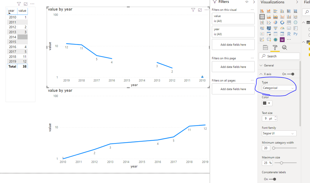
Setting the X-axis to Categorical should help you.
If this post helps, then please consider Accept it as the solution to help the others find it more quickly.
- Mark as New
- Bookmark
- Subscribe
- Mute
- Subscribe to RSS Feed
- Permalink
- Report Inappropriate Content
Hi @Anonymous ,
Setting the X-axis to Categorical should help you.
If this post helps, then please consider Accept it as the solution to help the others find it more quickly.
- Mark as New
- Bookmark
- Subscribe
- Mute
- Subscribe to RSS Feed
- Permalink
- Report Inappropriate Content
Forgot to add that I have googled this and tried several ways people suggested, including:
- Changing the value of the series to an expression where it shows 0/nothing if it IsNothing
- Changing the color of the series using an expression where it shows no colour if value of the series IsNothing
- Setting the EmptyPoint Value = Zero and changing the properties of the empty point in the Properties pane.
None of the above work. Does anyone have a clue?
- Mark as New
- Bookmark
- Subscribe
- Mute
- Subscribe to RSS Feed
- Permalink
- Report Inappropriate Content
Hi,
Dit you found a sloution in Report builder?
Thanks in advance
Frank


