Get Fabric certified for FREE!
Don't miss your chance to take the Fabric Data Engineer (DP-700) exam on us!
Learn more- Power BI forums
- Get Help with Power BI
- Desktop
- Service
- Report Server
- Power Query
- Mobile Apps
- Developer
- DAX Commands and Tips
- Custom Visuals Development Discussion
- Health and Life Sciences
- Power BI Spanish forums
- Translated Spanish Desktop
- Training and Consulting
- Instructor Led Training
- Dashboard in a Day for Women, by Women
- Galleries
- Data Stories Gallery
- Themes Gallery
- Contests Gallery
- QuickViz Gallery
- Quick Measures Gallery
- Visual Calculations Gallery
- Notebook Gallery
- Translytical Task Flow Gallery
- TMDL Gallery
- R Script Showcase
- Webinars and Video Gallery
- Ideas
- Custom Visuals Ideas (read-only)
- Issues
- Issues
- Events
- Upcoming Events
We've captured the moments from FabCon & SQLCon that everyone is talking about, and we are bringing them to the community, live and on-demand. Starts on April 14th. Register now
- Power BI forums
- Forums
- Get Help with Power BI
- Desktop
- Re: Number Formatting on Card Visualization
- Subscribe to RSS Feed
- Mark Topic as New
- Mark Topic as Read
- Float this Topic for Current User
- Bookmark
- Subscribe
- Printer Friendly Page
- Mark as New
- Bookmark
- Subscribe
- Mute
- Subscribe to RSS Feed
- Permalink
- Report Inappropriate Content
Number Formatting on Card Visualization
I have a card visualization that totals the number of ticket scans for a tourist attraction. This is a direct query dataset, so it is essentially giving real time data, updated every minute. The number in the dataset is an int data type and I have set it as a comma seperated whole number in the Modelling tab, and the format is also set as a whole number. In the card format for Data Label Display units is set to None. The issue is that is displays properly as a comma seperated number up until it reaches 10,000, but then the display switches to 10.1 K instead of 10,100 (or 10,125) which is how I want it to display. The attraction manager wants it to show it as a comma seperated number no matter how high the number goes. Any help would be appreciated.
Solved! Go to Solution.
- Mark as New
- Bookmark
- Subscribe
- Mute
- Subscribe to RSS Feed
- Permalink
- Report Inappropriate Content
I managed to get this to display properly, using the following settings:
Data Modeling in PBI model
- Data Type - Whole Number
- Format - Whole Number
- Thousands Seperator - Enabled
- Decimal Places - 0
Visualization for Card
- Display Units - None
Thanks for everyone's input!
Herb
- Mark as New
- Bookmark
- Subscribe
- Mute
- Subscribe to RSS Feed
- Permalink
- Report Inappropriate Content
select the card visual > Format > Data label > Display unit.... In this way, we can format our display unit to auto, none, thousand, million, trillion, billion....
Thank you
🙂
- Mark as New
- Bookmark
- Subscribe
- Mute
- Subscribe to RSS Feed
- Permalink
- Report Inappropriate Content
Hi @hhuddleston,
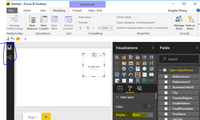
I import data in direct query mode, and add the date into a card, it also shows correctly, please see the following screenshot.
Best Regards,
Angelia
- Mark as New
- Bookmark
- Subscribe
- Mute
- Subscribe to RSS Feed
- Permalink
- Report Inappropriate Content
Hi @hhuddleston,
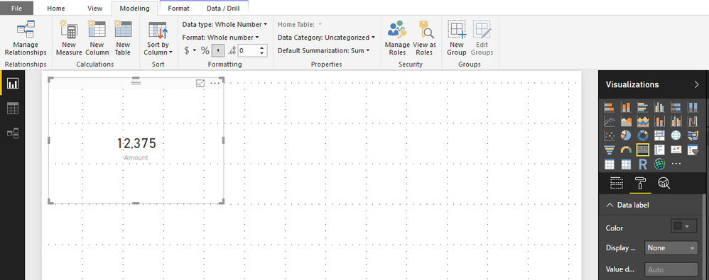
It is weird, I tried as you explained and I have this visual.
Can you please show us a sample in order to better understand your request.
Thank you,
- Mark as New
- Bookmark
- Subscribe
- Mute
- Subscribe to RSS Feed
- Permalink
- Report Inappropriate Content
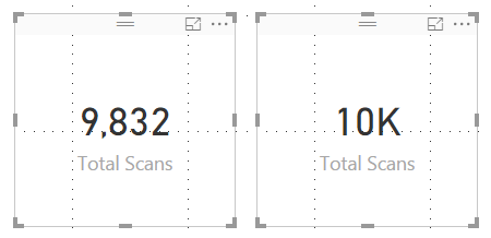
The card on the left is what I want to display - no matter how high the number goes.
The card on the right is what happens when it crosses the 10,000 mark.
- Mark as New
- Bookmark
- Subscribe
- Mute
- Subscribe to RSS Feed
- Permalink
- Report Inappropriate Content
Hi @hhuddleston,
Either you give us your sample in order to test it again, but I still have the right visual ( on the left) when I tested on my computer.
Perhaps another person can elaborate the issue ( if it is )....
Thank you
- Mark as New
- Bookmark
- Subscribe
- Mute
- Subscribe to RSS Feed
- Permalink
- Report Inappropriate Content
I managed to get this to display properly, using the following settings:
Data Modeling in PBI model
- Data Type - Whole Number
- Format - Whole Number
- Thousands Seperator - Enabled
- Decimal Places - 0
Visualization for Card
- Display Units - None
Thanks for everyone's input!
Herb
- Mark as New
- Bookmark
- Subscribe
- Mute
- Subscribe to RSS Feed
- Permalink
- Report Inappropriate Content
It works. Thank you!
- Mark as New
- Bookmark
- Subscribe
- Mute
- Subscribe to RSS Feed
- Permalink
- Report Inappropriate Content
Modeling Ribbon > New Column
Count = 1
Drag the Card Visual to the Report Canvas
Drag the new Count column from the Fields area to the Card Visual
Modeling Ribbon
- Data Type - Whole Number
- Format - Whole Number
- Thousands Seperator - Enabled
- Decimal Places - 0
Visualization for Card > Format Roller
- Display Units - None
Helpful resources

New to Fabric Survey
If you have recently started exploring Fabric, we'd love to hear how it's going. Your feedback can help with product improvements.

Power BI DataViz World Championships - June 2026
A new Power BI DataViz World Championship is coming this June! Don't miss out on submitting your entry.

Join our Fabric User Panel
Share feedback directly with Fabric product managers, participate in targeted research studies and influence the Fabric roadmap.

| User | Count |
|---|---|
| 53 | |
| 37 | |
| 35 | |
| 19 | |
| 17 |
| User | Count |
|---|---|
| 74 | |
| 70 | |
| 39 | |
| 35 | |
| 23 |


